Role
Product Design Consultant (Contract)
Duration
September - December 2023
Disciplines
User Research, Mobile Design, Product Strategy, Prototyping
Team
Sarah Suen, Michid Byambajav, Angie Nguyen, Heli Balsara
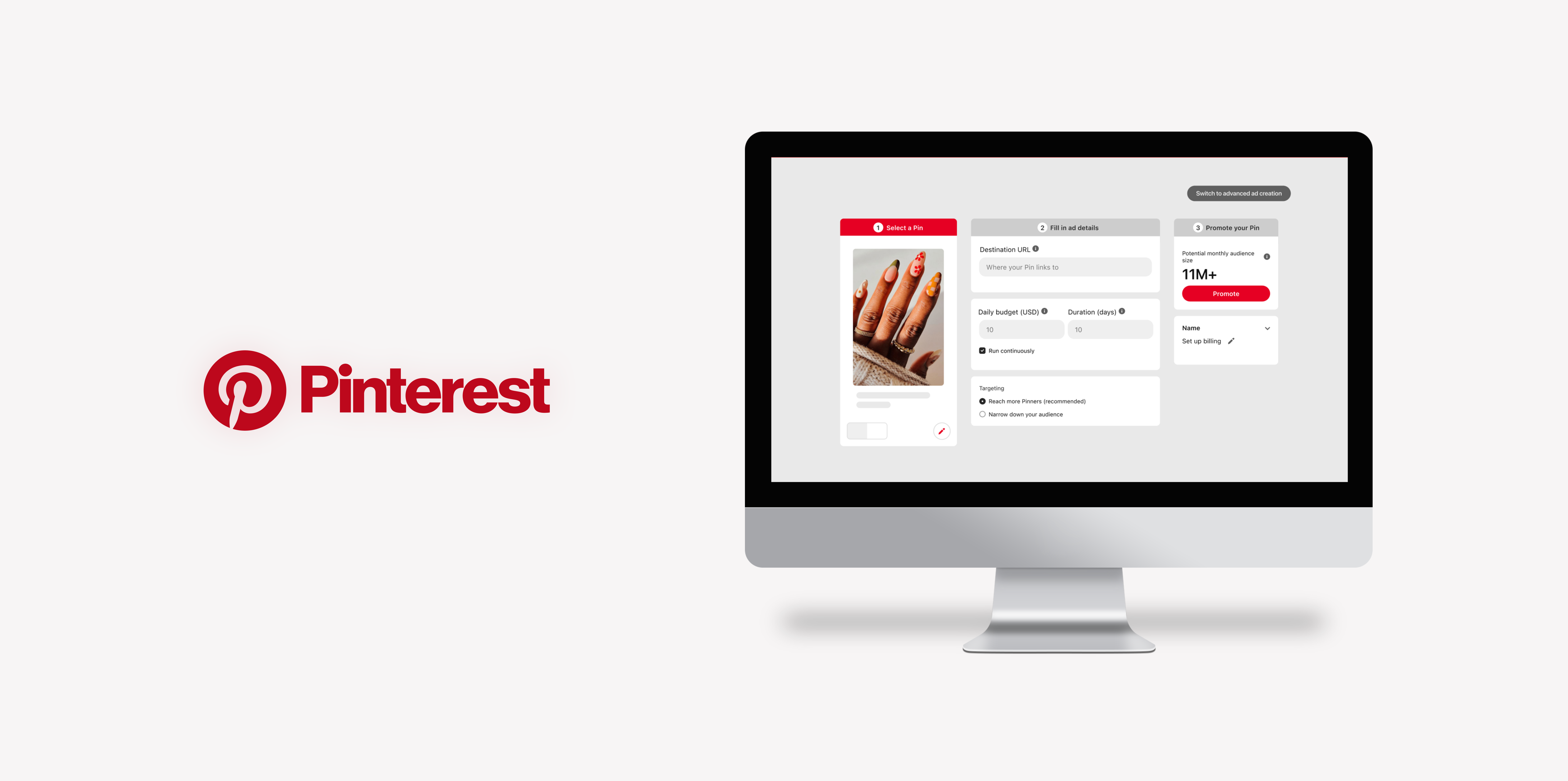
Pinterest’s mission is to “bring everyone the inspiration to create a life they love”, a platform loved not only by designers (like myself) but for over 482 million users monthly worldwide. However, not many see Pinterest as a business hub.
With that, the Product Team at Pinterest asked us, Berkeley Innovation, to increase awareness to their business side. This sounds pretty daunting and big in scope, so the team tasked us with honing in on a not fully developed “Quick Promote” feature that aims for SMBs (small-medium business) to effectively promote their business.

[END DESIGNS] CORE CHANGES TO THE 3-STEP AD CREATION PROCESS
To enhance the user flow and usability of the current three-step process, we refined each stage to specifically address users' pain points and frustrations at every step of the process.
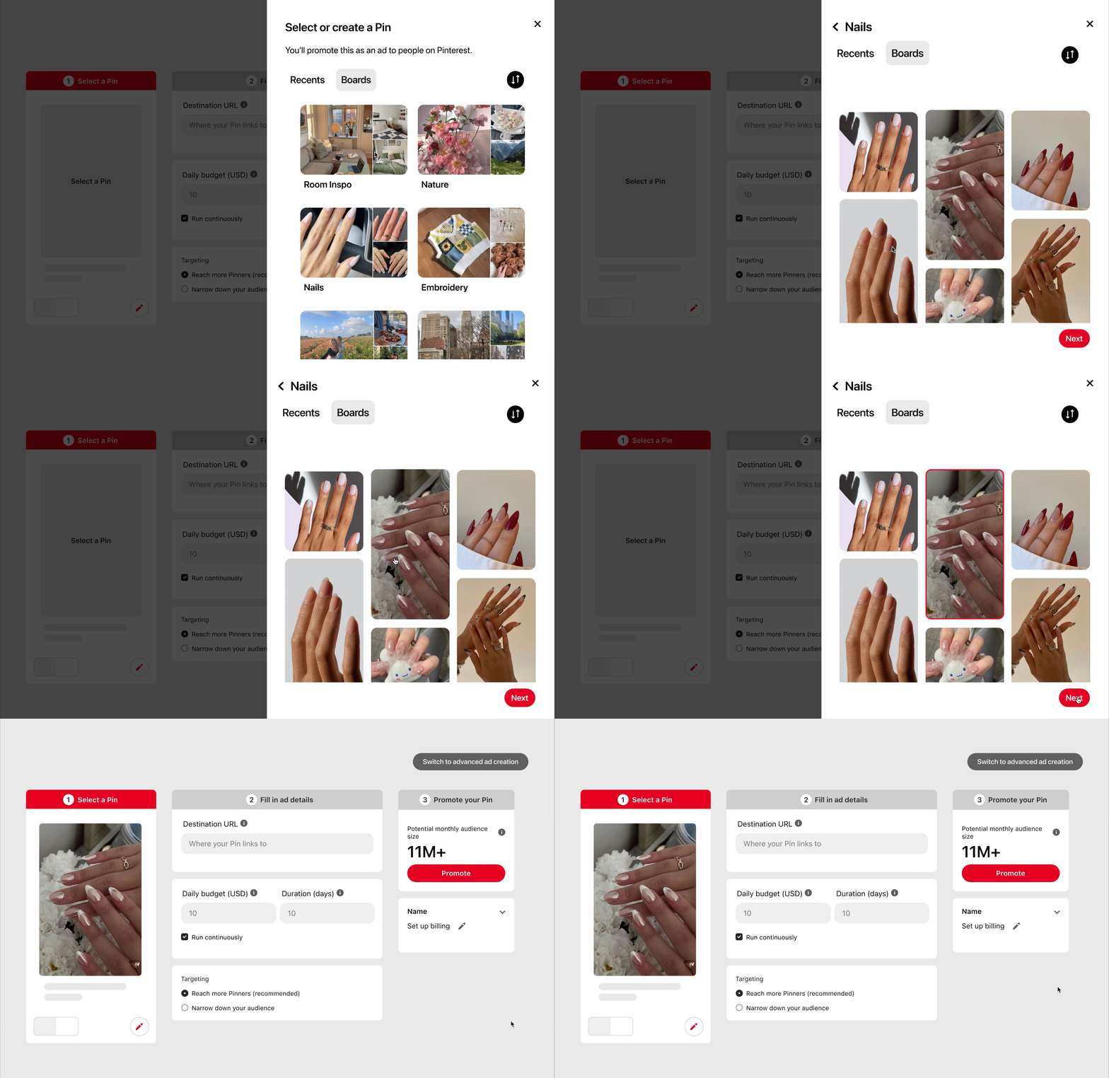
#1 EASY NAVIGATION TO PRE-EXISTING PINS
Selecting a pin to promote is the first step in promoting a pin. The existing user flow for promoting a pin is unclear and confusing, resulting in user frustration and a diminished overall experience. To establish a more intuitive user flow for pin selection, we introduced a side pop-up organized by boards and most recent.
This design eliminates endless scrolling by consolidating everything into one space, enabling users to easily promote their most recently uploaded pin creating a more efficient and smoother process.
#2 SPECIFIED TARGETED AUDIENCE
Understanding the target audience for the promoted pin is a key factor in a successful ad. The current method for selecting an audience on Pinterest involves embedded lists of interests that delve into specific details (e.g., beauty -> makeup -> lipstick). This results in users mindlessly selecting what appears to be an endless array of options, making it challenging to keep track.
To address this, we introduced a box above to monitor all selected items enabling users to be more intentional in their choices.

#3 UI IMPROVEMENT + DELIGHTFUL DESIGNS
"It takes 1/10th of a second to form a first impression of a website." Pinterest's ad creation process is still in its early stages, implying that many users utilizing the three-step ad creation are first-timers or new to the advertising space. By enhancing the UI of the ad creation to be more vibrant, we aim not only to enhance first impressions but also to alleviate the intimidation associated with creating an ad for the first time.
HOLD UP, HOW DID WE GET HERE? LET’S BEGIN HERE ⬇️
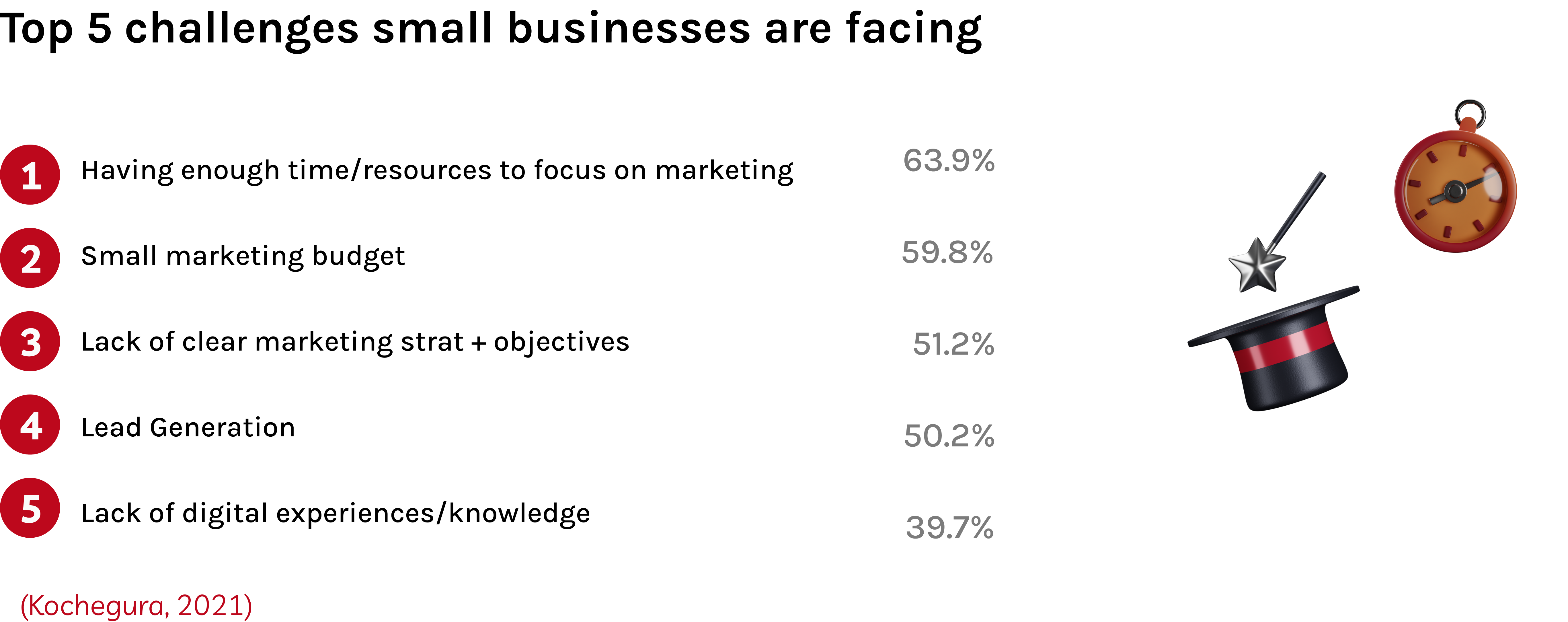
WHY ARE WE FOCUSING ON SMALL-MEDIUM BUSINESSES? (SMBs)
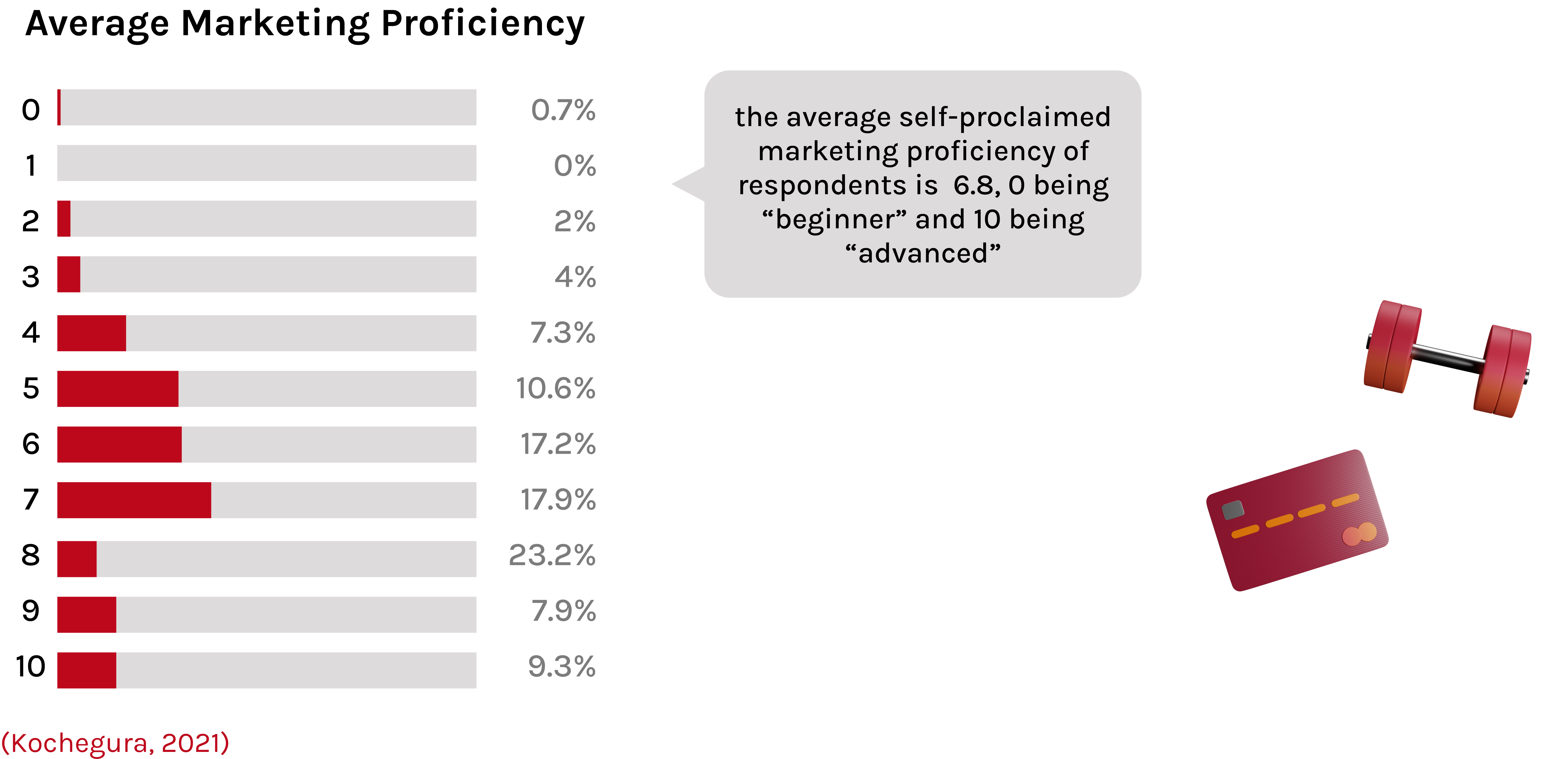
Small and medium businesses (SMBs) often juggle multiple responsibilities. It can be overwhelming creating a campaign for the first time.

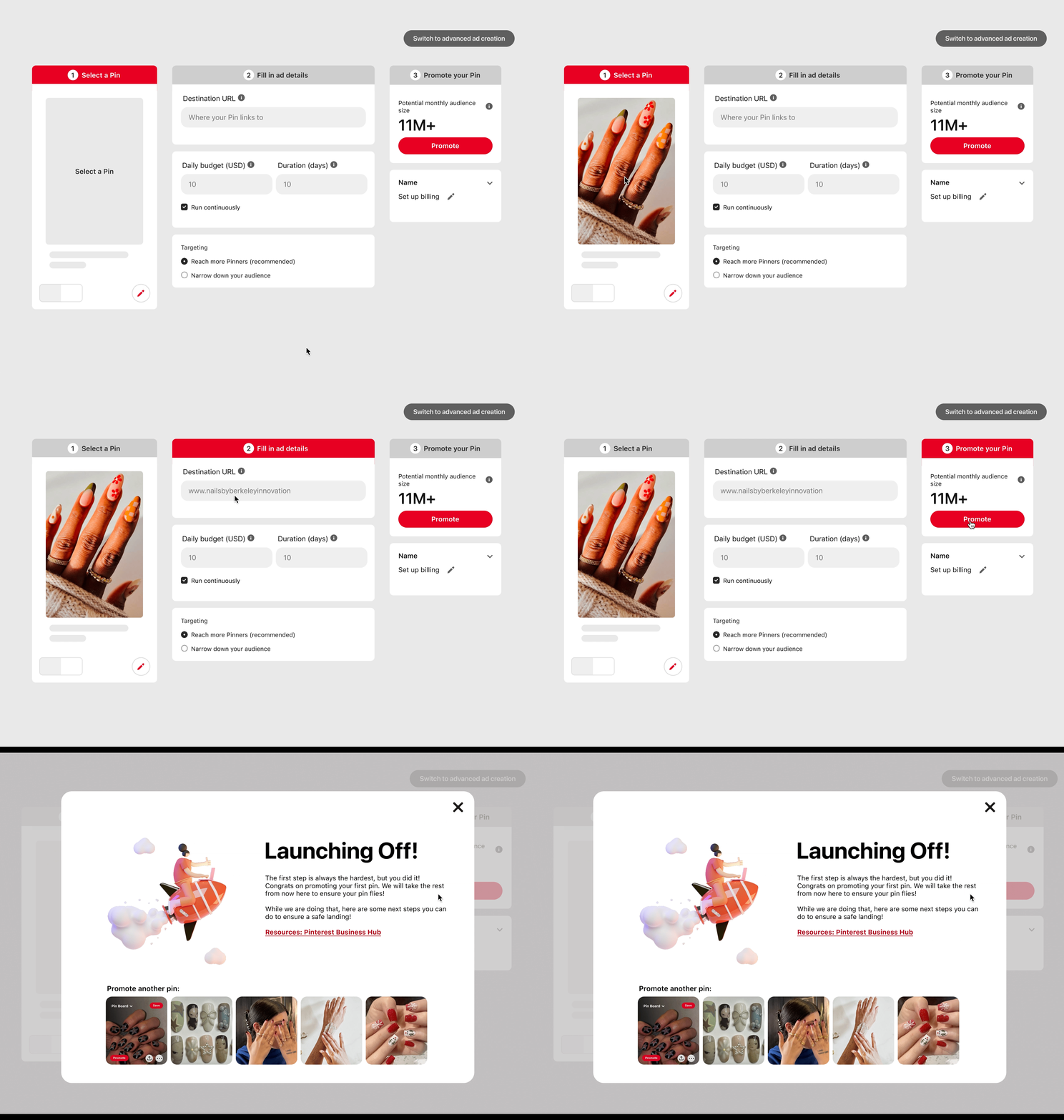
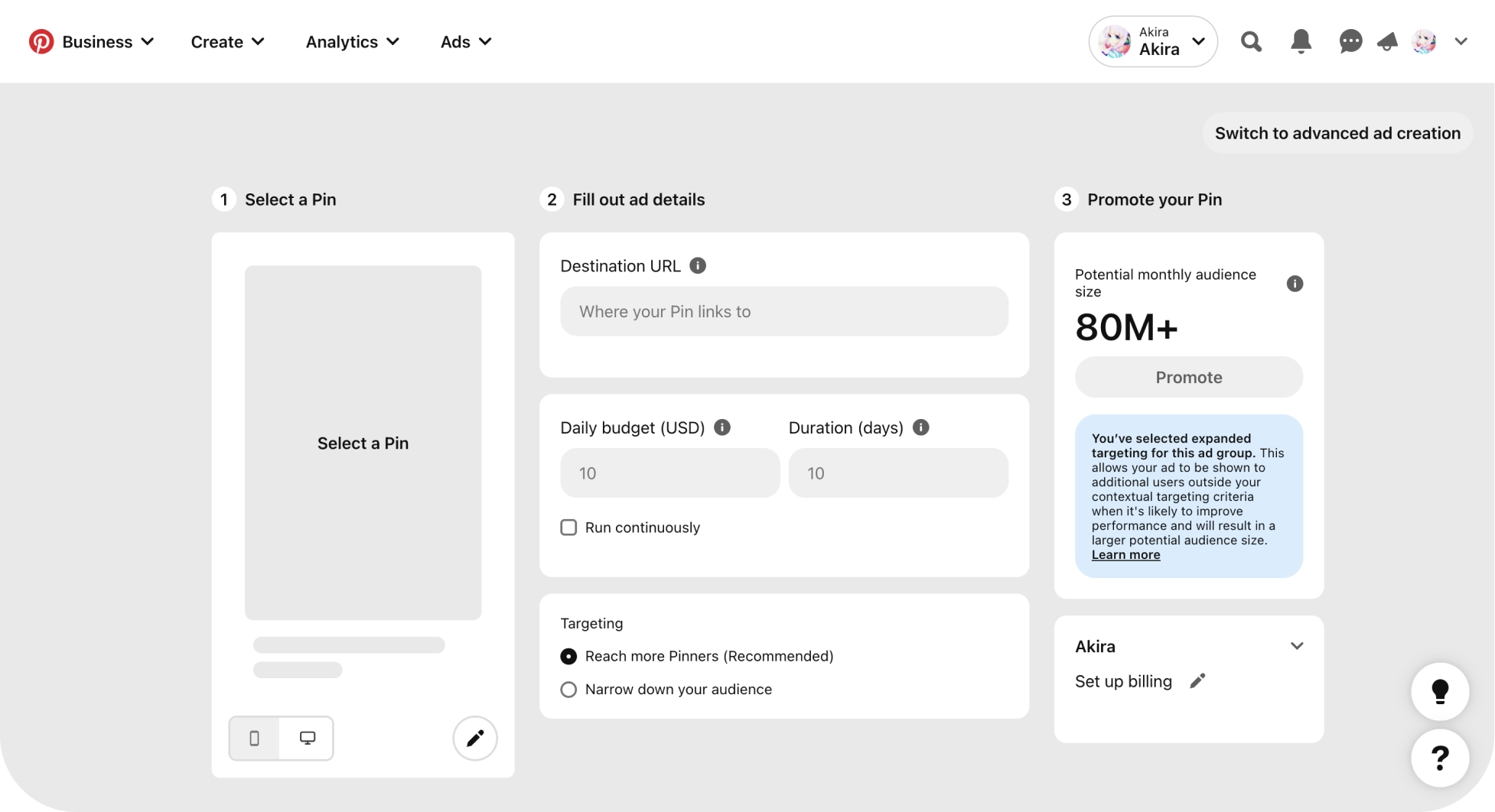
SO, WHAT IS THE CURRENT AD CREATION PROCESS ON PINTEREST?
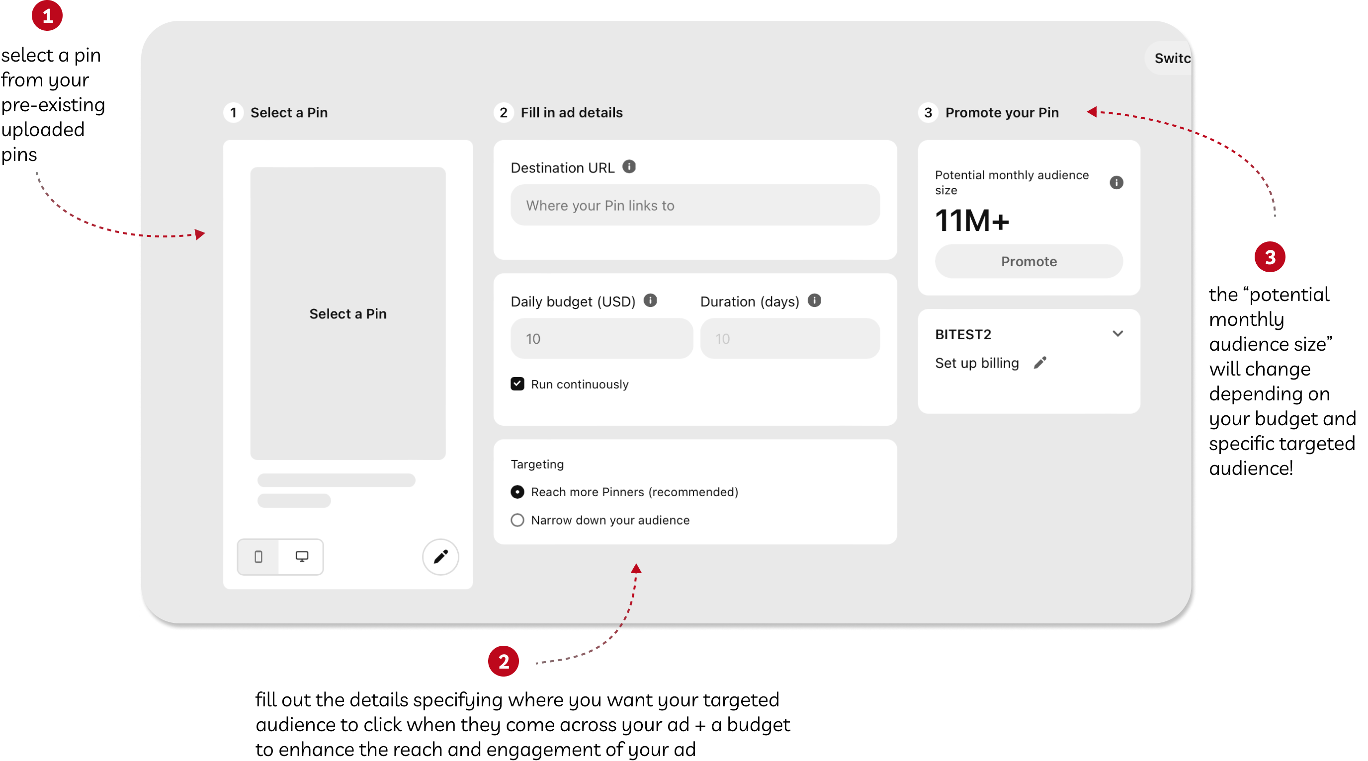
Just like the name, “Quick Promote” are broken down to three simple steps.
DIVING DEEPER TO THE STRUGGLES OF SMBs
The biggest challenge we faced during this research stage was finding the specific audience (funnily enough, in a smaller scale, this is a similar process SMBs have to go through to find their specific audience to promote their business). Although the number of respondents were not as much as we would’ve wanted, we still gained valuable information such as why Pinterest were not there first choice in promoting their products/businesses.
USER SURVEYS
User surveys serve as our starting point! After secondary research, we know that providing SMBs with an easy-to-use ad platform is a huge opportunity to be discover. With that we asked questions to help us understand SMBs....

Ad Creation Challenges
- Lack of knowledge, budgeting, advertising
- Time spent
- Creative knowledge
- Determining effectiveness

Goals in Ad Creation
- Increase in sales, revenue, and engagement are the top goals in ad creation
- Cost effectiveness & targeted audience are the top two factors influencing users preferred platform
CONTEXTUAL INQUIRES + USER INTERVIEWS
With a better understanding of SMBs' challenges and goals in the ad creation world, we interviewed six individuals who participated in our survey to navigate through Pinterest's current three-step ad creation process, starting from uploading a pin to completing the promotion of the pin. We requested them to articulate their thoughts and experiences aloud as they progressed through each step. Finally, we concluded with some closing questions.
Guidance & Experience
Users have limited knowledge in using Pinterest in an ad creation setting and prefer a guided experience.
Targeting Users
Having a specific and personalized targeting allow users to benefit with their resources. 4/6 expressed confusion in choosing the specific audience.
Confusing UI
New users of Pinterest find it hard to navigate to the “Promote Pin” feature as well as how to upload a pin to promote leading many feeling frustrated/confused.

KEY INSIGHTS GAINED....
We then gathered up all the research, and affinity diagram in order to find the most common clusters to base our insights around.
SMBs often face challenges due to their limited experience regarding marketing.

Users experience confusion distinguishing between creating and promoting a pin.
SMBs highly value specific targeting options to personalize their advertising.
Certain features aren’t highlighted leading to difficulty and confusion while making an ad.
COMPETITIVE ANALYSIS
Our research reveals that 50% of users prefer Instagram as their primary ad creation platform, followed by 25% on Facebook and 20% on Google. Thus we ask: "What specific aspects of these platforms contribute to enhancing the ad creation process for SMBs and how?". We navigated through each platform from initiating an ad to filling in details and finally publishing it. Our focus centered on key features crucial to addressing the specific needs of SMBs.

We then score each category and ranked which platform is best for each needs.
Instagram overall is the most intuitive to use without much knowledge in the ad creation world.
Facebook and Google Ads offer advanced features that differ from those on other existing platforms. For example, Google Ads provides a 'Bid Strategy,' allowing you to choose between manual or automated bidding based on your campaign objectives.
All pricing across all platforms is subject to personal budgets. A special mention goes to Google Ads for offering an 800% profit in the ad creation process, where every $1 spent results in users gaining $8 in profit.
TikTok is the only platform among the six that offers 1-1 consulting with an ad creation specialist. This personal and unique experience is provided to users.
In terms of ease of use, Instagram and Pinterest have the most straightforward processes, avoiding overwhelming users with lengthy procedures or business jargon.
Facebook targets the largest demographic, ensuring the highest success in the ad creation process for small to medium-sized businesses. This is attributed to its long-term credibility not only as a platform but also as a company
FINAL RANKINGS


PINTEREST VS OTHER PLATFORMS
Findings from competitive analysis suggest that...
Ad creation platforms such as Facebook and Google Ads, which emphasize careful attention to budgeting and audience selection, they cater to more marketing veterans with a deeper understanding of marketing techniques. Because of this, these platforms incorporate multiple pages without various steps, making the process of ad creation more optimal, but time-consuming.
Pinterest is unique in the way it prioritizes ease of use and efficiency, enabling users to promote one pin at a time. Due to this, the 3-step ad creation process stands out by being condensed onto a single page, reducing overwhelmness for first-time users. We can leverage its simplicity as a means for SMBs to get their foot in the door when entering the ad creation world.

CORE CHANGES TO THE 3-STEP AD CREATION PROCESS
To enhance the user flow and usability of the current three-step process, we refined each stage to specifically address users' pain points and frustrations at every step of the process, without diminishing the uniqueness of Pinterest ad creation process.
STEP 1: SELECT A PIN
Establish a clear flow for selecting a pin to upload, ensuring it is intuitive and familiar to users. This approach aims to reduce frustration, enhancing overall ease of use and efficiency.
PIN UPLOAD FLOW
currently
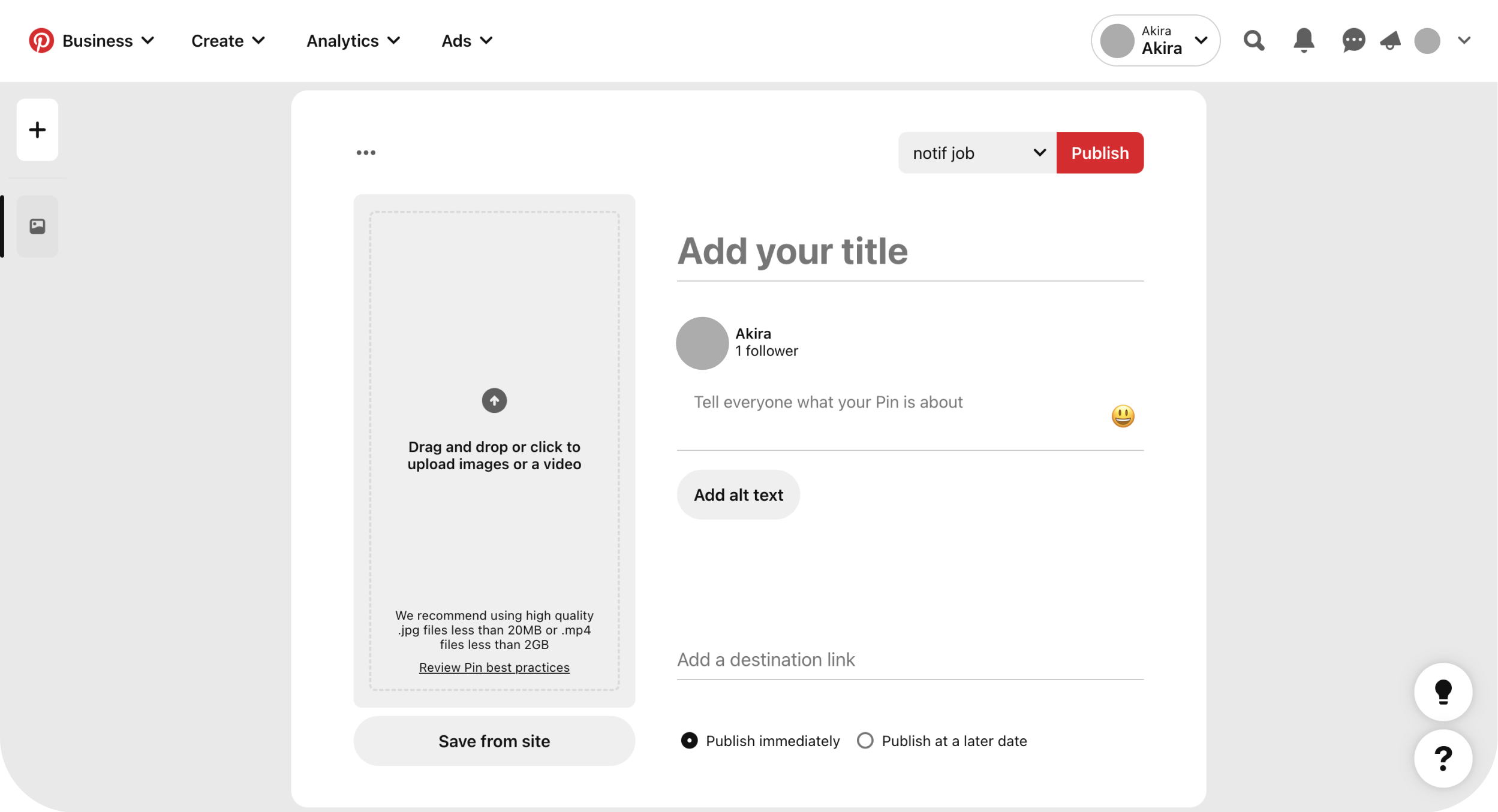
Users are lead to another page in order to upload a pin, convoluting the process.

Selecting a pin to promote is the first step in promoting a pin.
The existing user flow for promoting a pin is unclear and confusing, resulting in user frustration and a diminished overall experience.
new designs
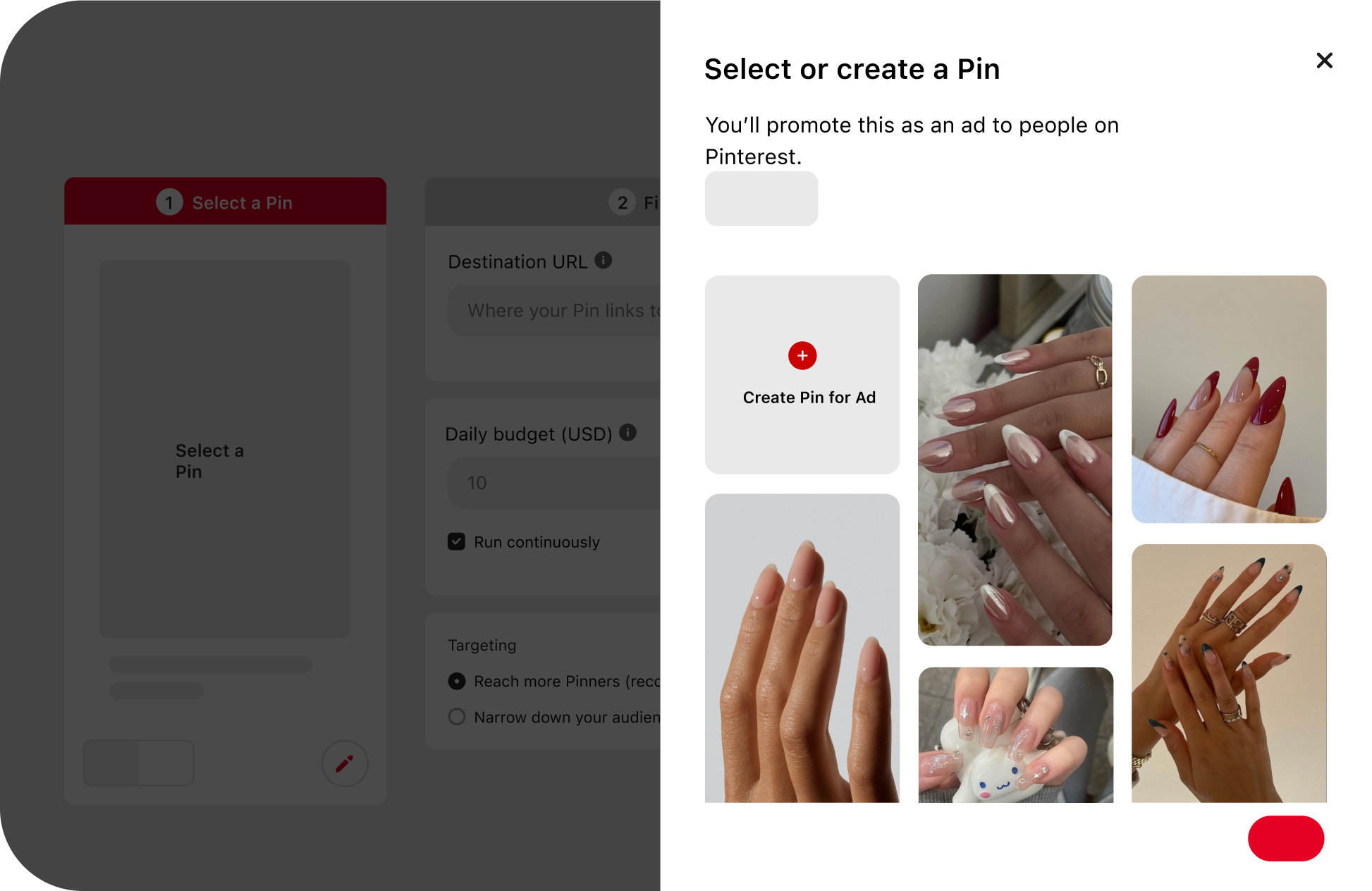
Introducing a side pop-up organized by boards and most recent eliminating endless scrolling.
EASY NAVIGATION TO PRE-EXISTING PINS

EASE OF USE
To establish a more intuitive user flow for pin selection, we introduced a side pop-up organized by boards and most recent.
EFFICIENCY
Eliminates endless scrolling by consolidating all content into one space, allowing users to easily promote their most recent pin.

STEP 2: FILL OUT AD DETAILS
Provide interface that assists users in selecting their target audience more intentionally. Additionally, provide inspiration and guidance through suggestions from similar ads."

TARGETING
currently
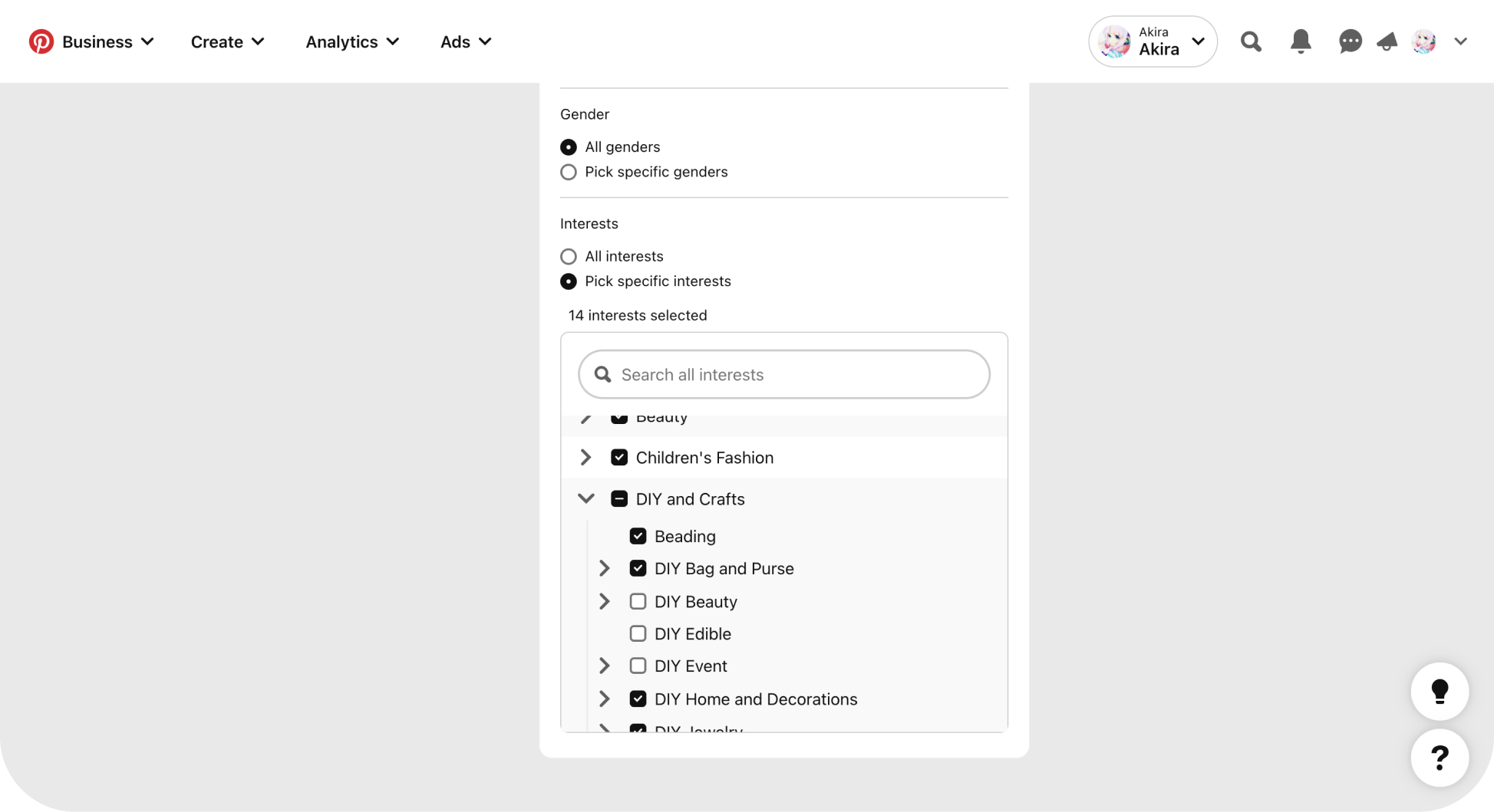
Users scroll through an endless list of embedded lists without knowing what they are choosing.

The current method for selecting an audience on Pinterest involves embedded lists of interests.
This results in users mindlessly selecting what appears to be an endless array of options, making it challenging to keep track.
new designs
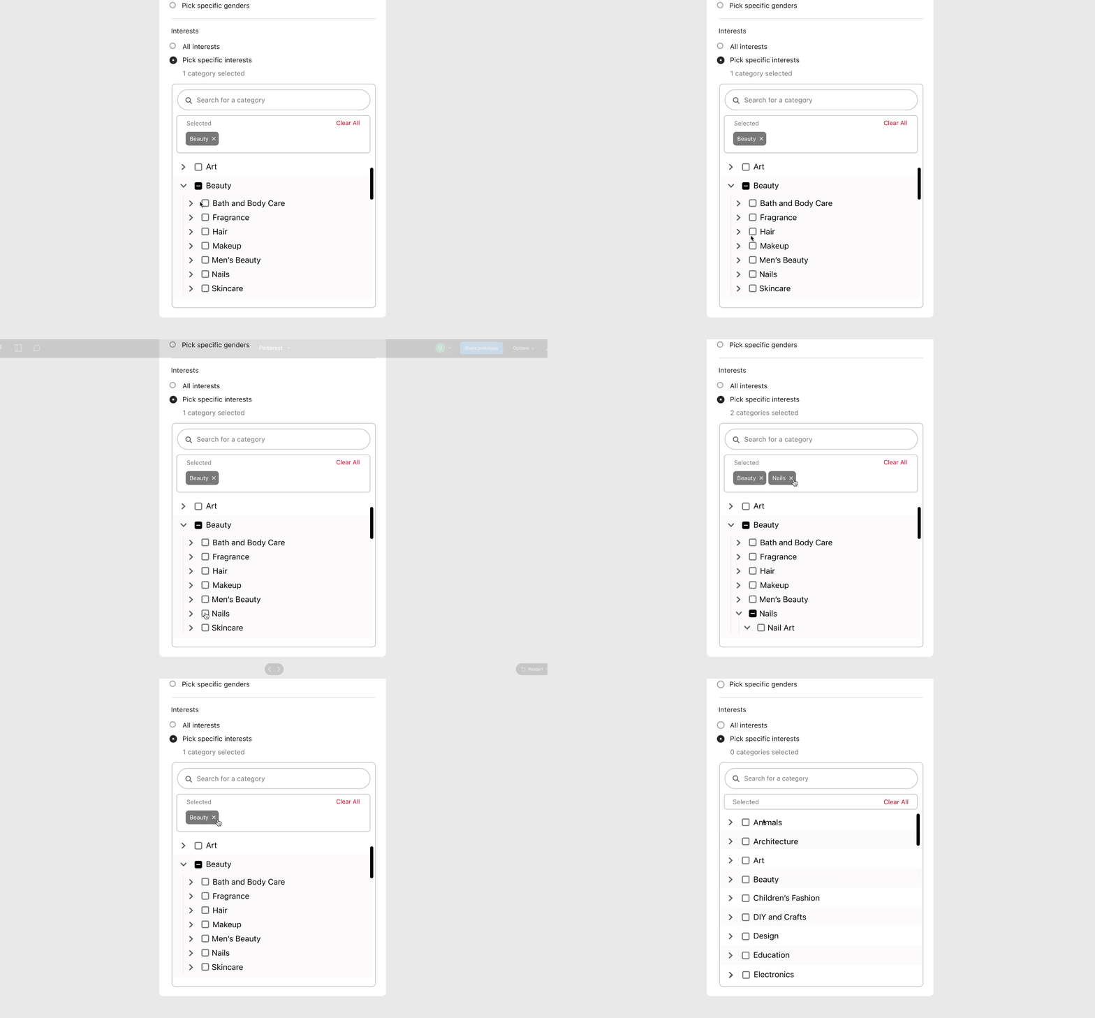
Integrating a “selected-box” for users to keep track of the interests they are picking - allowing users to be intentional in the audience they are choosing in order to optimize the promoted ad.
SPECIFIED TARGETED AUDIENCE

EASE OF USE + EFFICIENCY
Introduced a box above to monitor all selected items enabling users to be more intentional in their choices.

STEP 3: PUBLISH PIN
Enhance the overall feel of the interface to reduce the intimidation associated with starting an ad for the first time. Include inspiring words of encouragement to provide an extra boost of encouragement. through adding delights & providing guidance.

ADDING DELIGHTS
currently

No reassurance if their ad published, leaving users confused and anxious.
As an inexperienced ad creator, there are no indicators of next steps, leaving users to figure it out themselves.
new designs
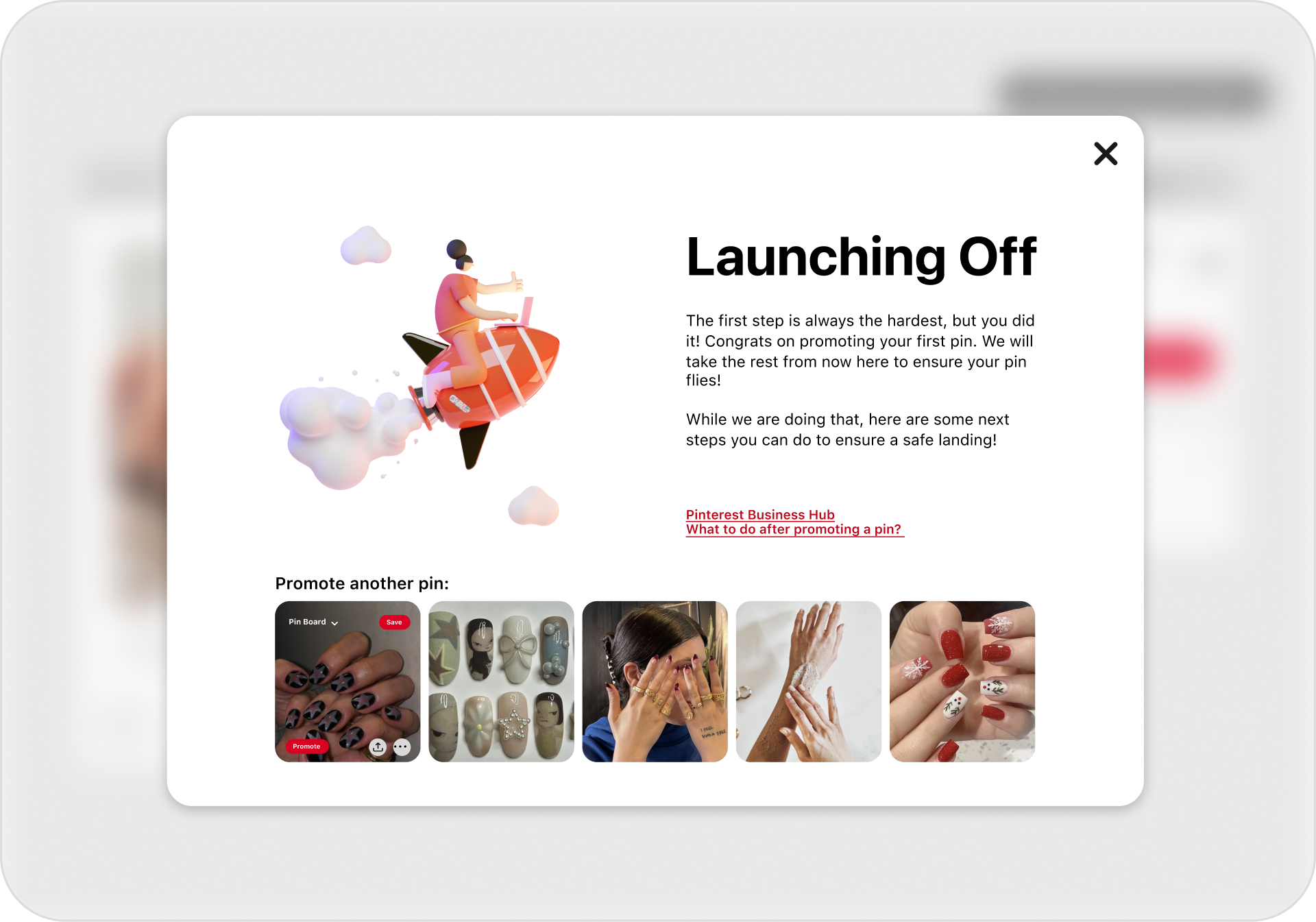
A confirmation page pops up after a user promotes their pin for the first time. This adds a touch of delight, providing additional resources to guide new users on the next steps.
Promoting another pin is also a choice if users want to do another one!

PROVIDING GUIDANCE
currently

"It takes 1/10th of a second to form a first impression of a website."
The current designs are dull with no designs of delight and encouragement.
UI IMPROVEMENT + DELIGHTFUL DESIGNS

APPROACHABILITY
By enhancing the UI of the ad creation to be more vibrant and encouraging, we aim not only to enhance first impressions but also to alleviate the intimidation associated with creating an ad for the first time.

SETTING UP THE STAGE FOR FUTURE
currently
Focusing on enterprising merchants instead of SMBs, haven’t had time to understand SMBs needs.
Center the stage
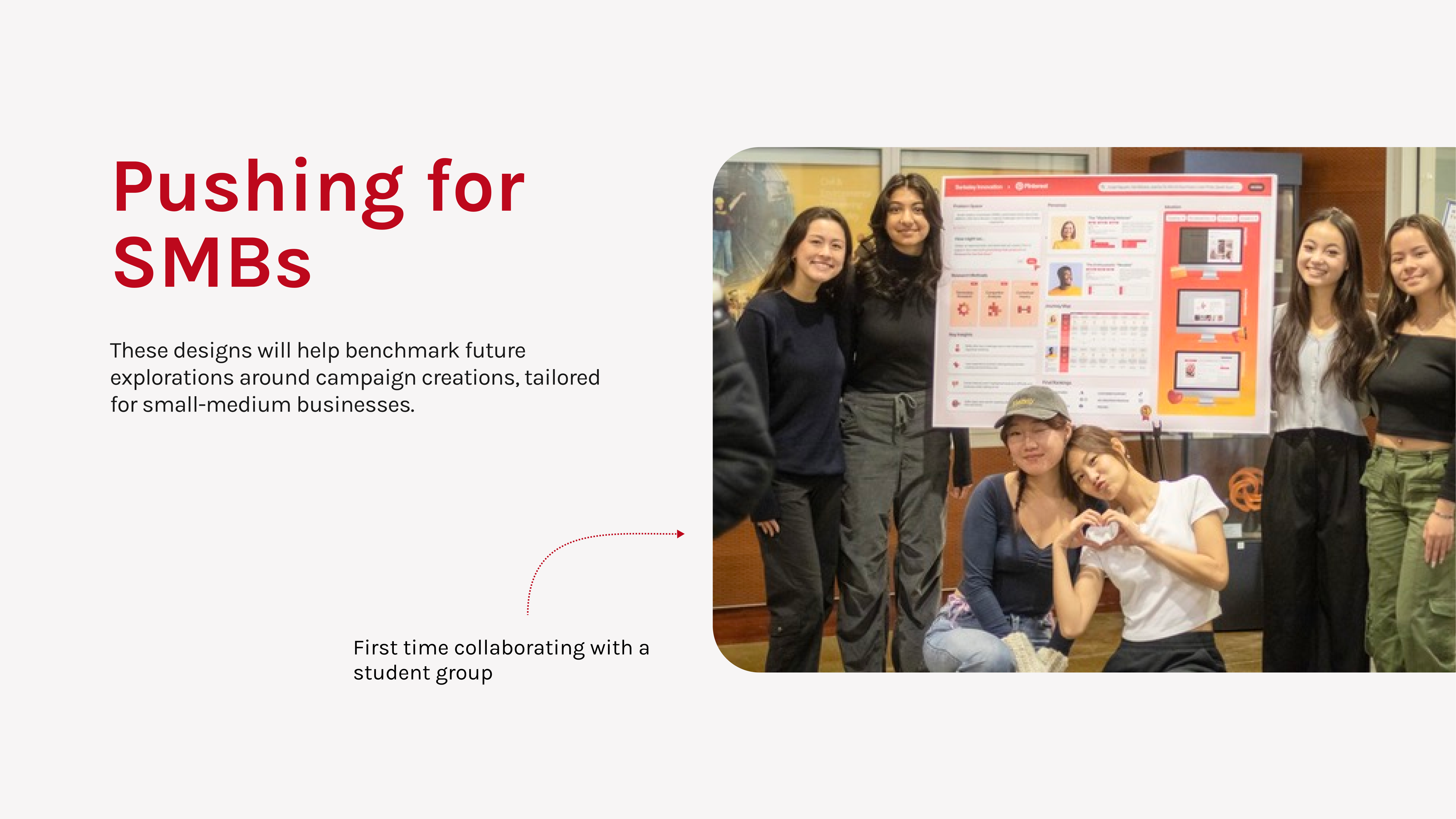
Address neglected areas of the product, larger business needs, pushing for SMBs
HOW WOULD THESE METRICS BE MEASURED?

1. COMPLETION RATE
Measure the percentage of users who successfully complete the entire ad creation process.
2. TIME TO COMPLETION
A decrease in time to completion would indicate a more efficient process.

3. DROP OFF RATE
Measure the percentage of users who abandon the ad creation process at each step
REFLECTIONS
My parents, who are business owners of their small nail salon shop, became the center stage of this project. Weaving in their struggles as SMBs along with others allowed me to constantly question “why?” behind my every move – enabling me to learn storytelling and design with people, rather than for them. Working with product designers at Pinterest has given me the chance to learn what bigger companies are doing to support users that are often overlooked. Being able to advocate for small businesses and be at the forefront of Pinterest’s mission to support them has made me realize the importance of designing for a diverse group of users. After all, regardless of a company’s size or the product, one common thread unites them all: humanity.
LET'S CHAT!