

ROLE
Product Design Intern, Mobile Team
DURATION
May - August 2023
DISCIPLINES
Product Design, User Research, User Interface, Interaction Design, Mobile Design
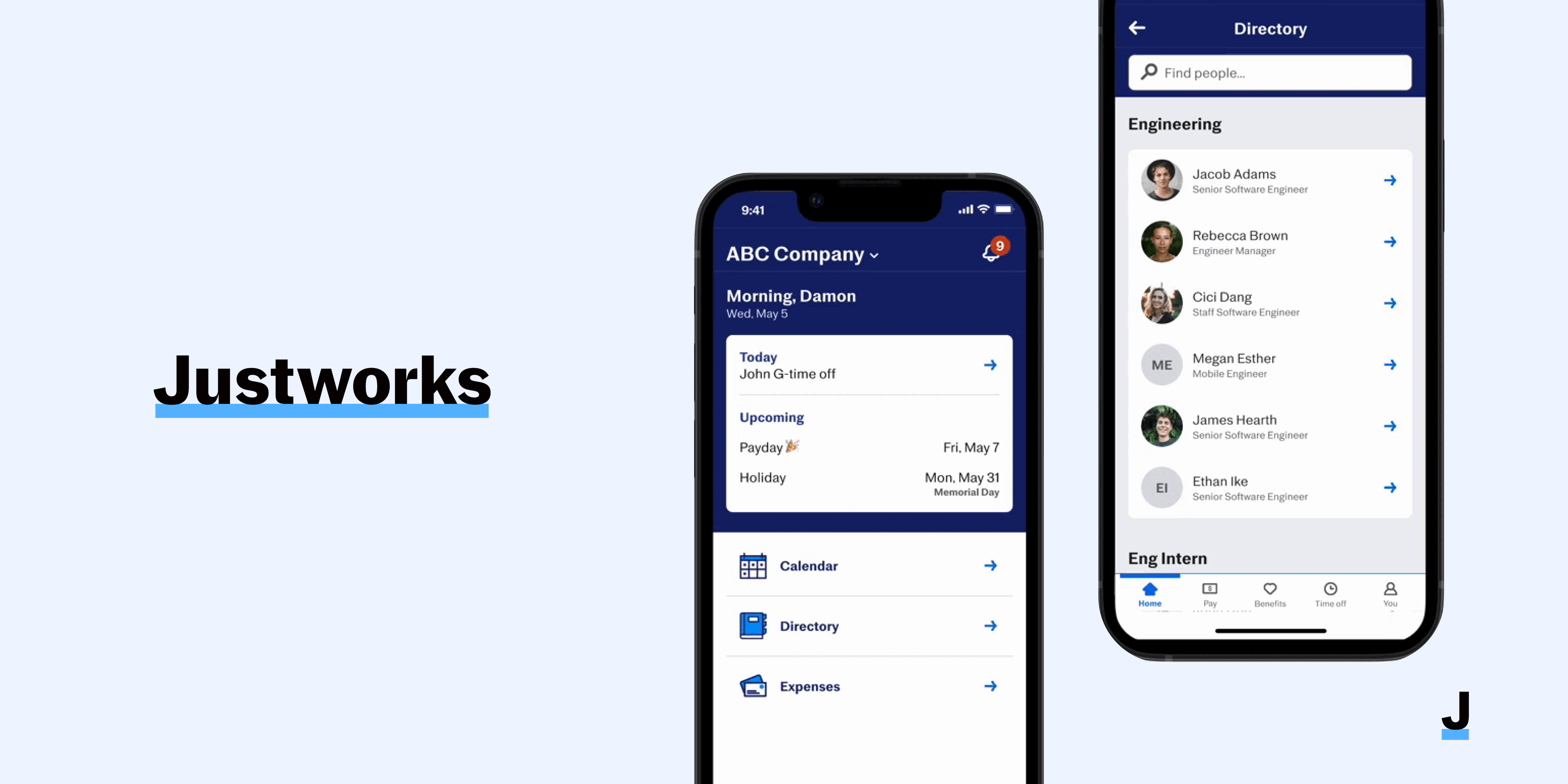
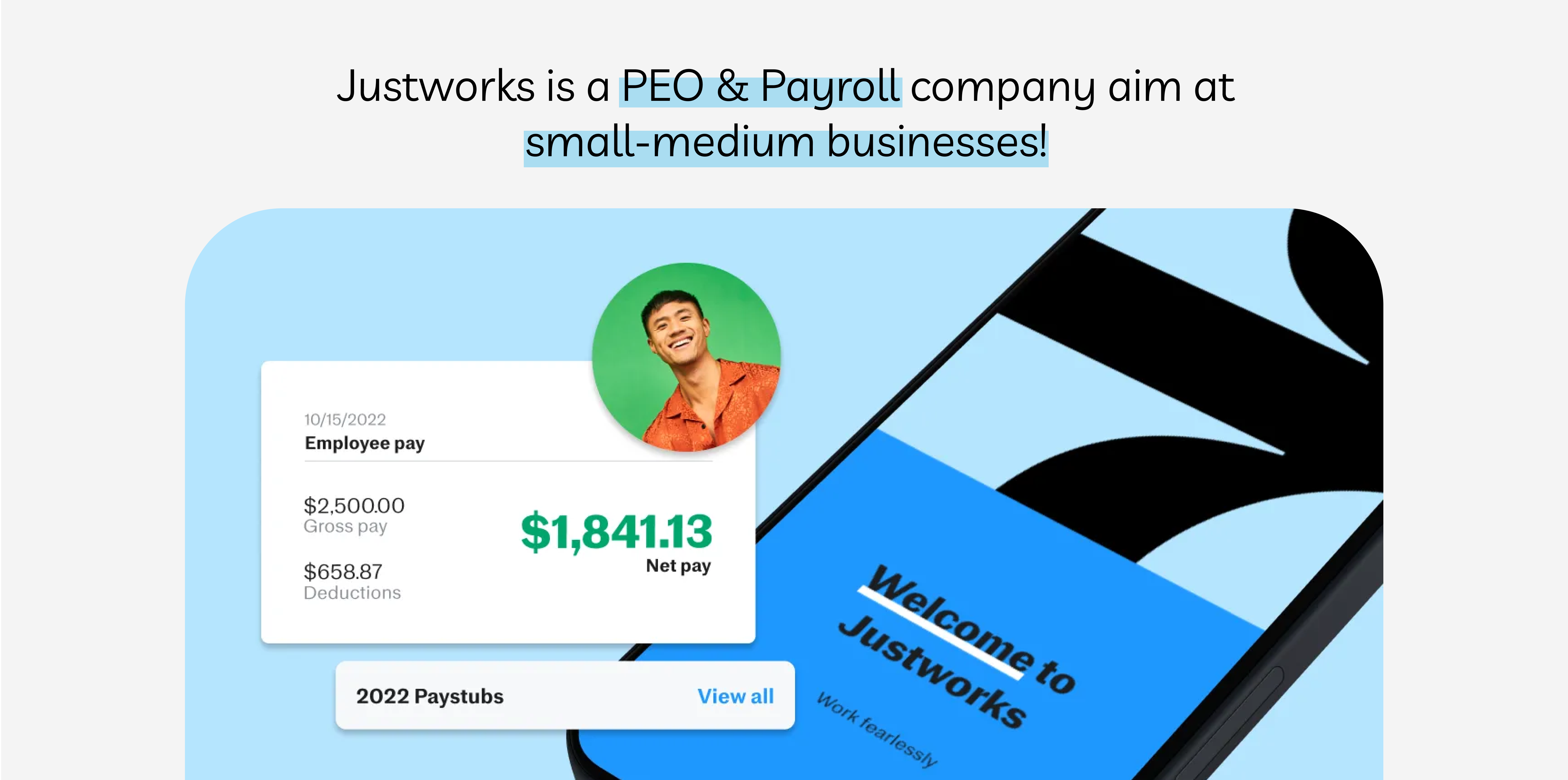
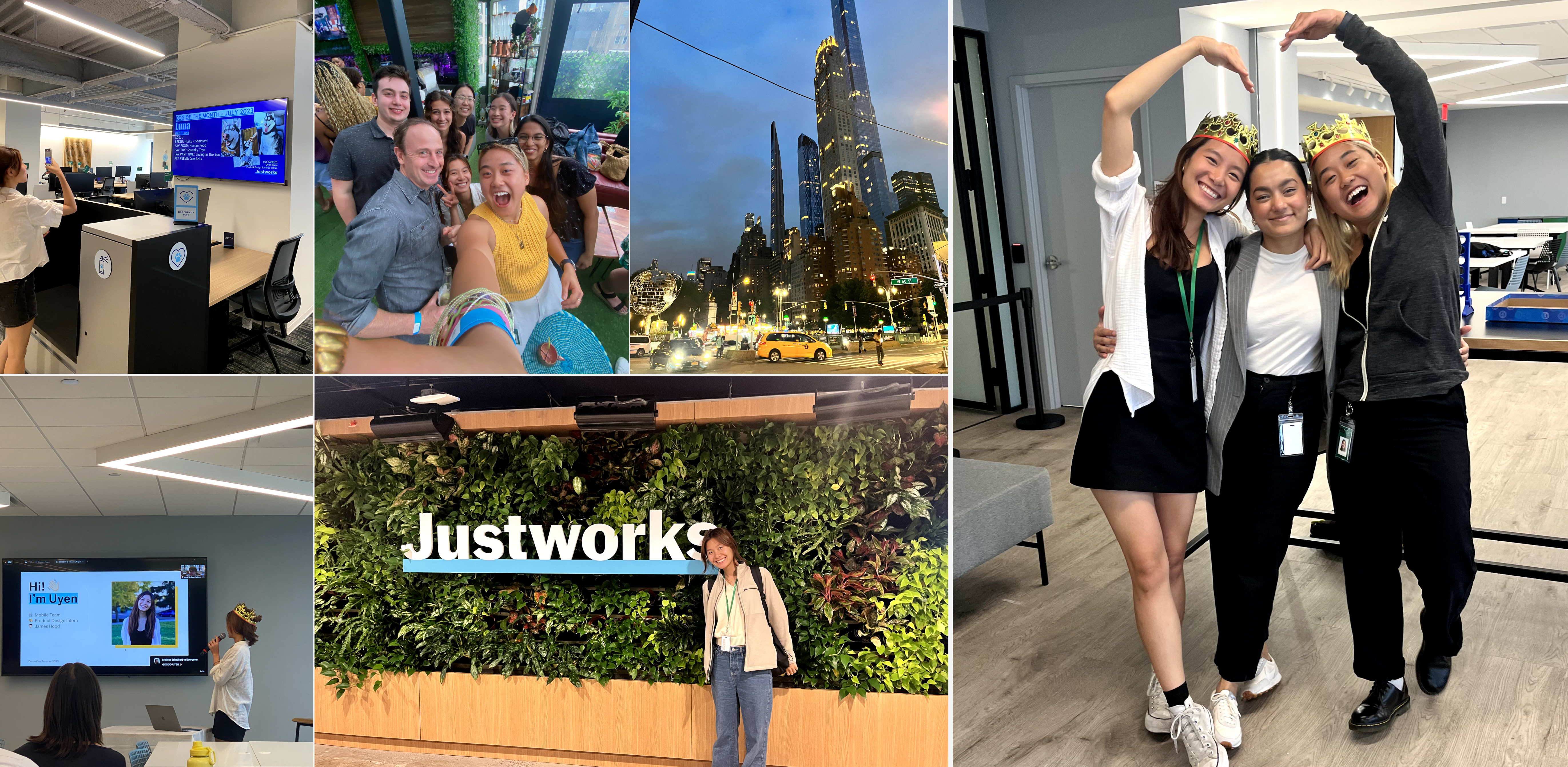
In the summer of 2023, I interned at Justworks, a financial tech company that aims to level the playing field for small businesses. I designed an end-to-end project, seamlessly integrating a mobile directory into their new platform, enhancing internal communication for employees. This feature was shipped in February 2024.
Additionally, I built design components for a smooth directory integration into the company's mobile product ecosystem.
CONTEXT: GROWING PAINS OF A GROWING BUSINESS
As a growing company, Justworks offers a simple and friendly platform helping businesses “manage, grow & run easily.”
Justworks understand the growth pains of a growing company - onboarding new employees, streamlining communication, and ensuring all part of their company is well integrated and structured. This project focuses on streamlining communication between all employees.

INFORMATION IS NOT ACCESSIBLE 🚫
Having a mobile directory helps with....
- Efficient Communication: streamlines communication within a company by providing quick access to contact details reducing time and effort.
- Accessibility: employees can access important contact information anytime, anywhere, making it easier to reach colleagues especially when working remotely or on the go.
- Integration: Mobile directories can integrate with other communication tools and systems.

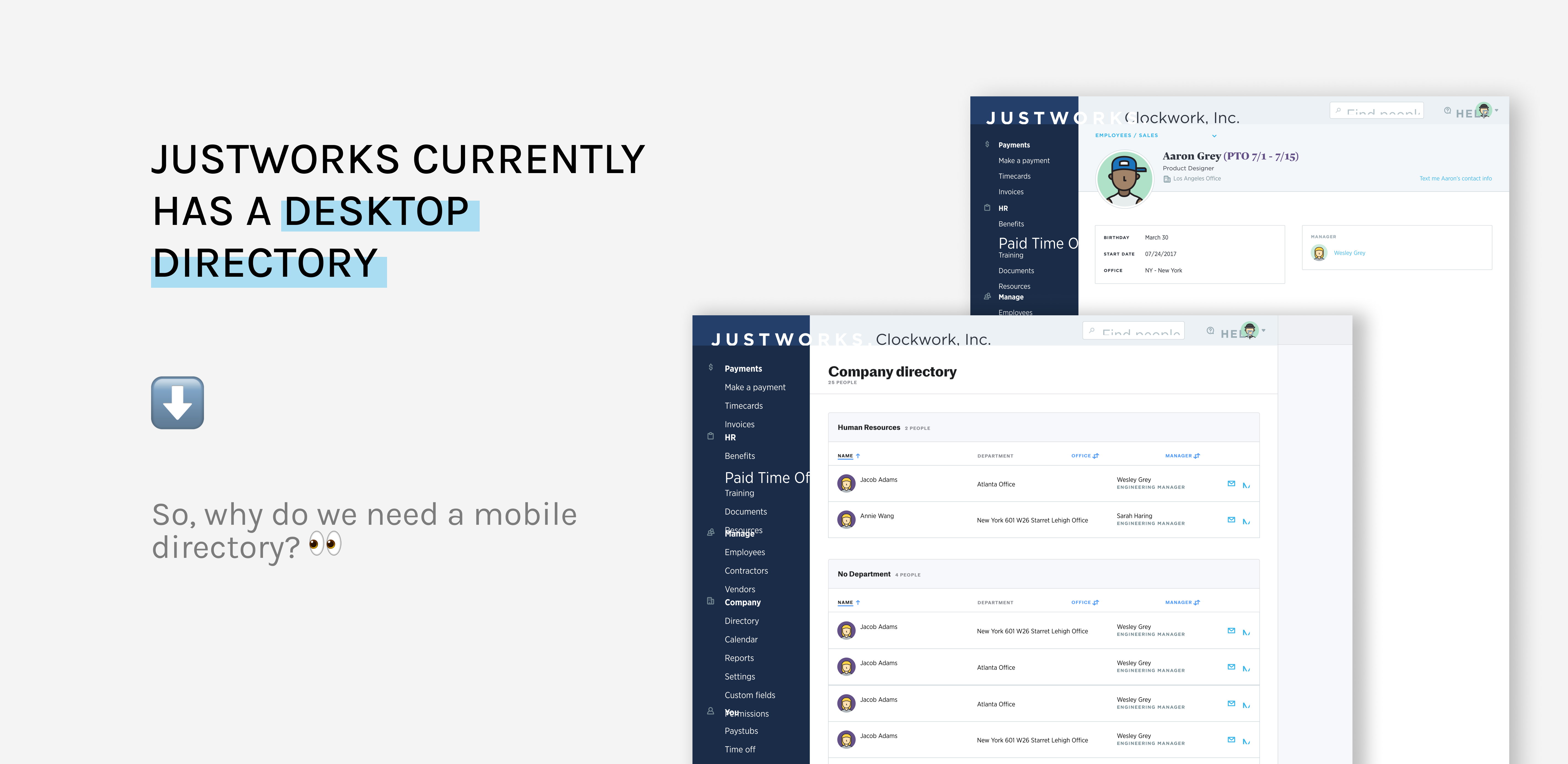
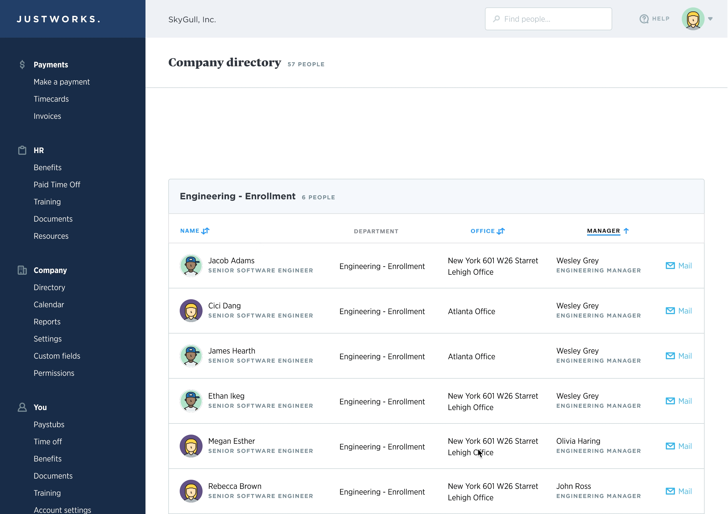
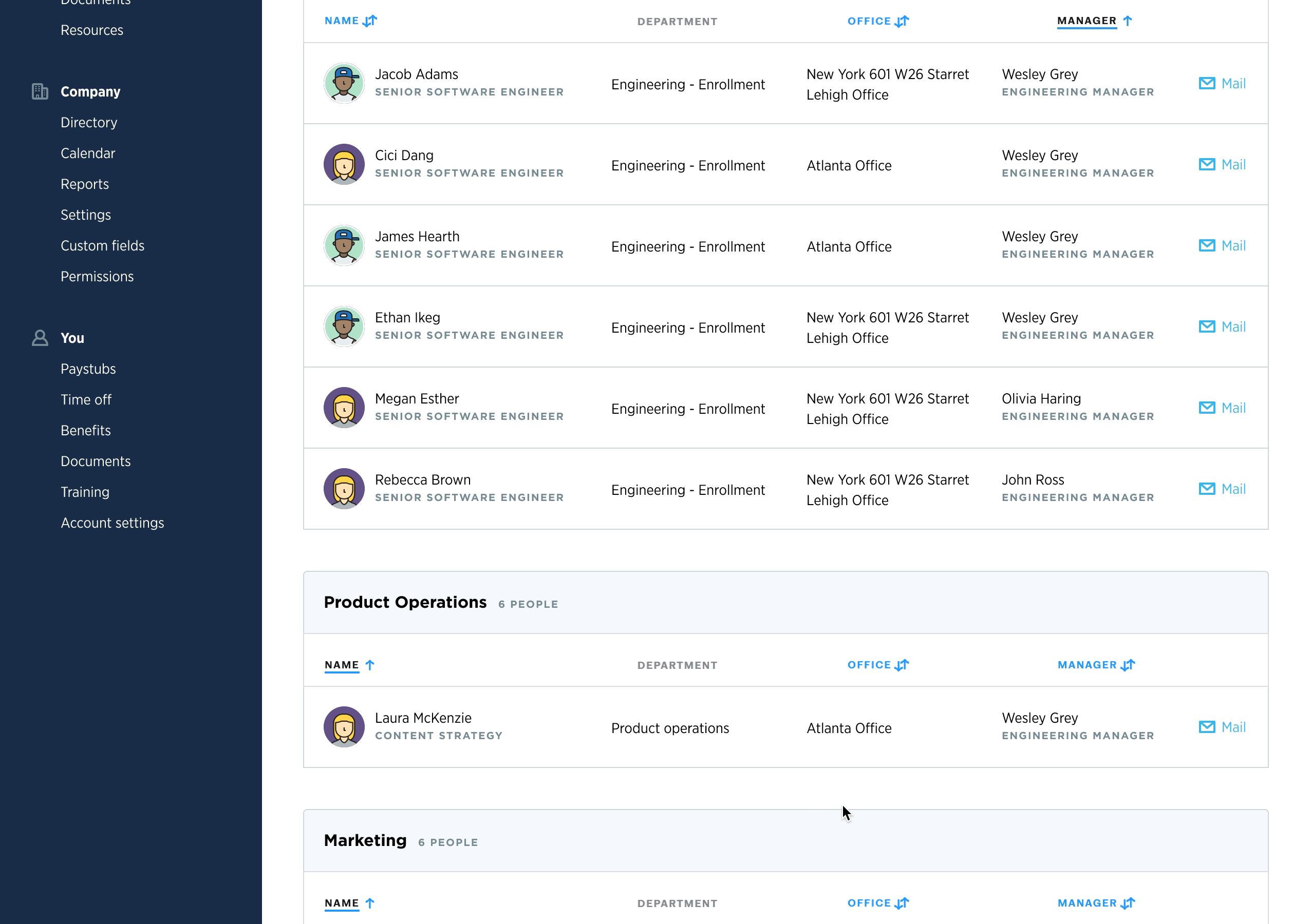
EXPLORING THE CURRENT DESKTOP DIRECTORY
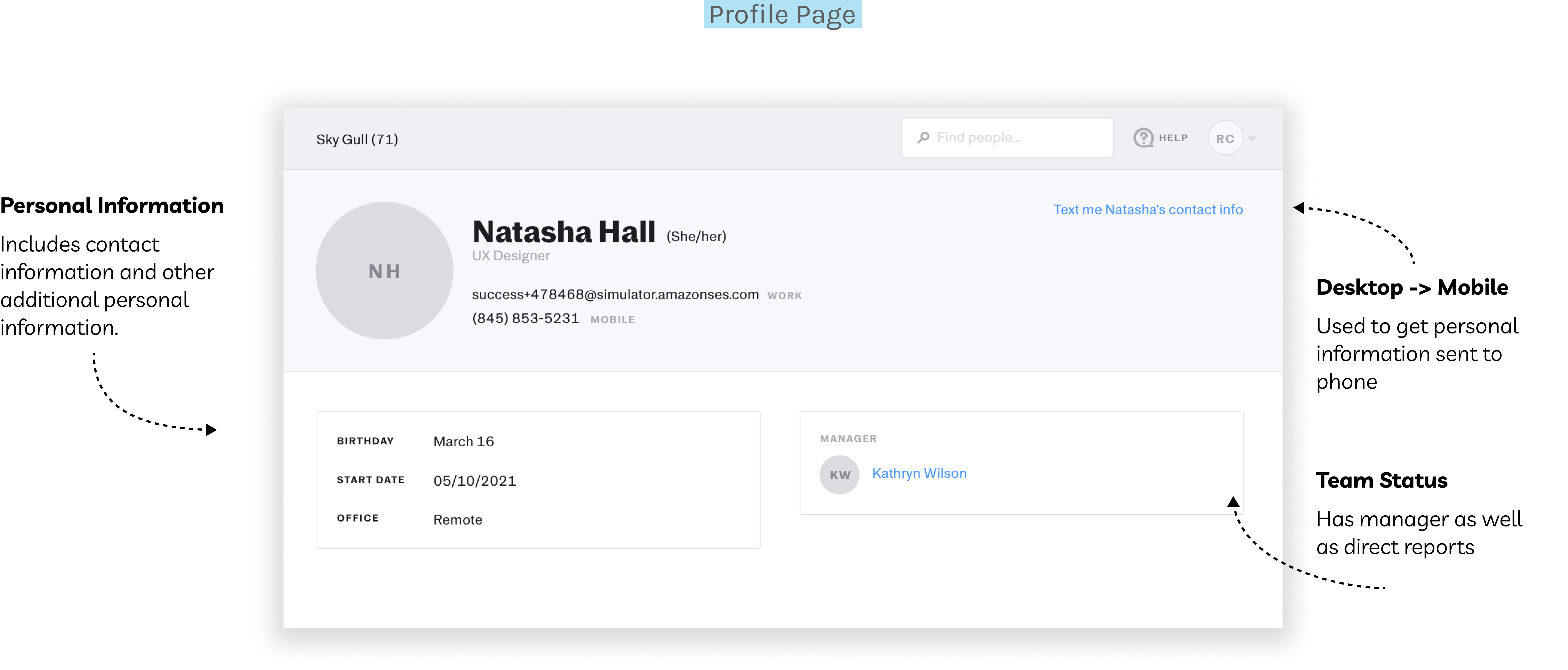
ULTIMATELY ASKING THE QUESTION
How might we make and design our directory feature to be most relevant to mobile users?
FOCUS: SMALL COMPANIES
Conducted sessions of unmoderated research on employees at companies between the sizes of 10 to 50 total employees.
Split the test into four sections
- Preliminary questions
- Overview of the current Justworks Web browser directory
- Finding a specific person in the Directory
- Post questions

List page prototype
Profile page prototype
TOP THREE INSIGHTS

THUS, BEGAN THE MANY ITERATIONS (8 in fact!)
For the starting point, I replicated the desktop version of the directory to observe how the layout and information would appear on a mobile screen. From there, I listed the pros and cons of the design, with each iteration addressing specific pain points. Below are the highlights from my eight iterations, which led to the final designs that address all requirements.
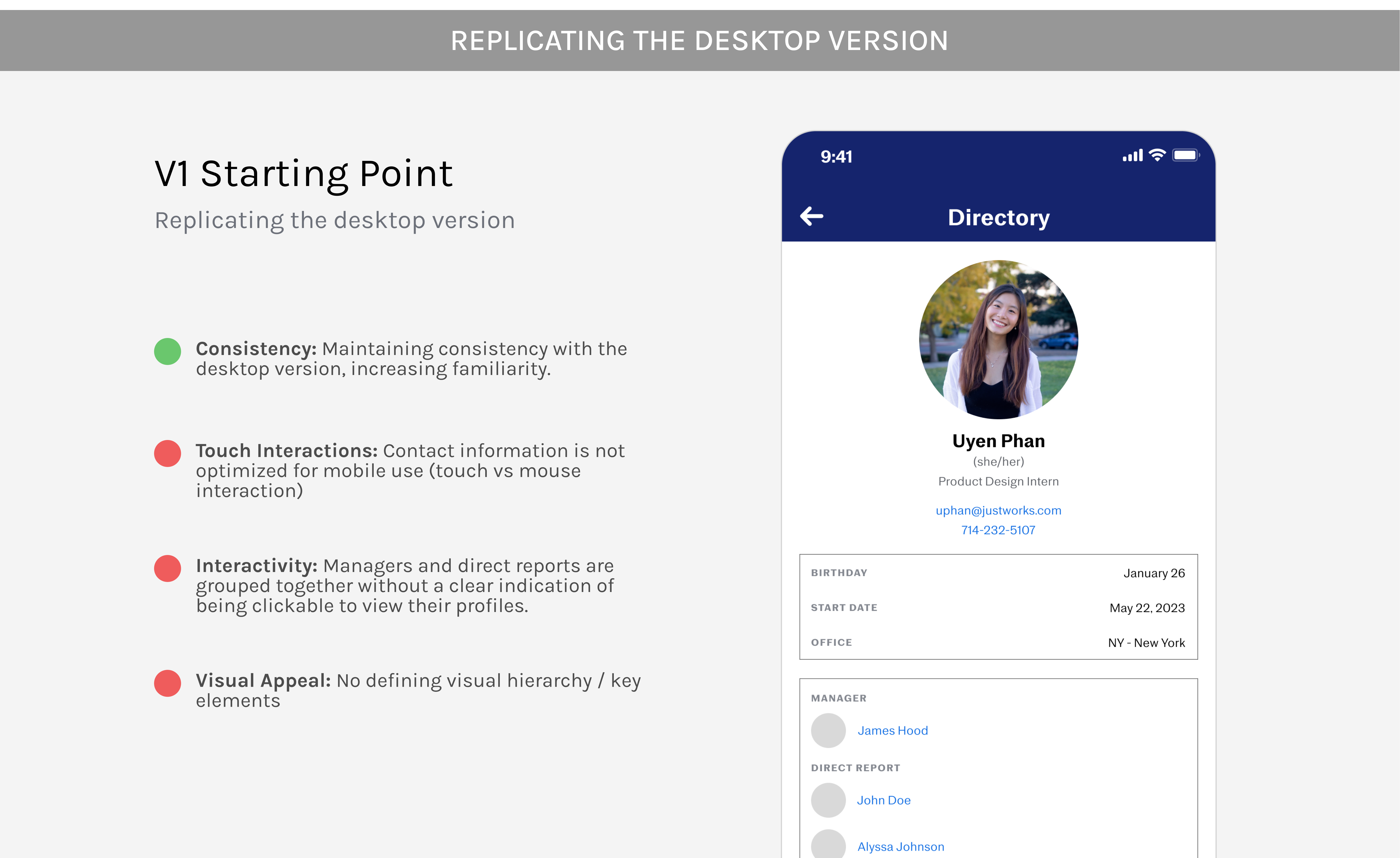
While replicating the desktop directory offers users a sense of consistency and familiarity, the designs were originally intended for larger screens and touchpoints, posing challenges on mobile devices regarding touch interactions and interactivity. Additionally, the visual appeal suffers due to the boxed layout, which constrains information within the space available.
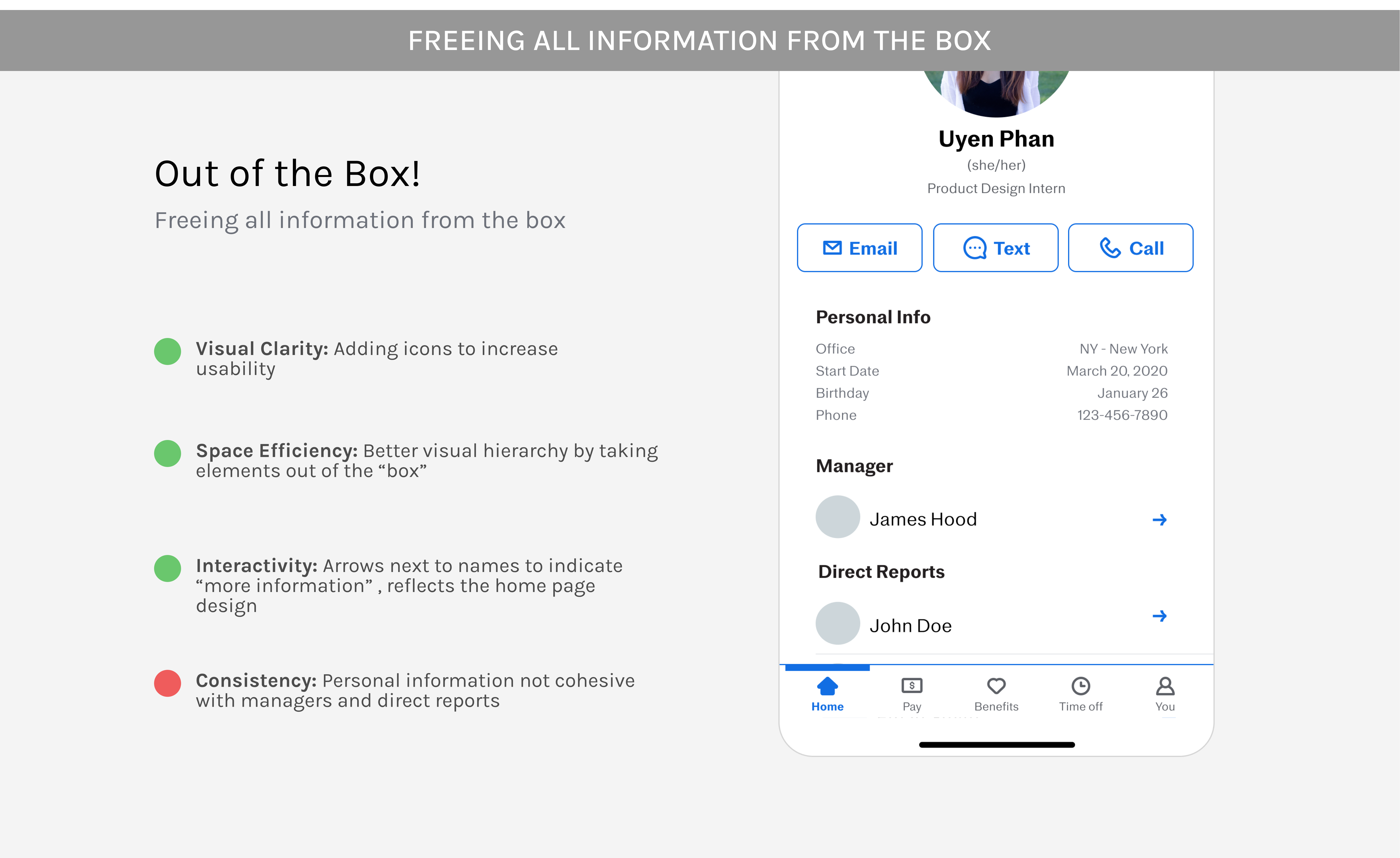
Removing the boxed design improved visual clarity for mobile users. Icons now replace traditional desktop hyperlinks to guide navigation to subsequent pages. This change was made possible by utilizing more screen space without boxed layouts, which enhanced efficiency and allowed for interactive icons. However, there’s now a lack of consistency between all the information on the page. .
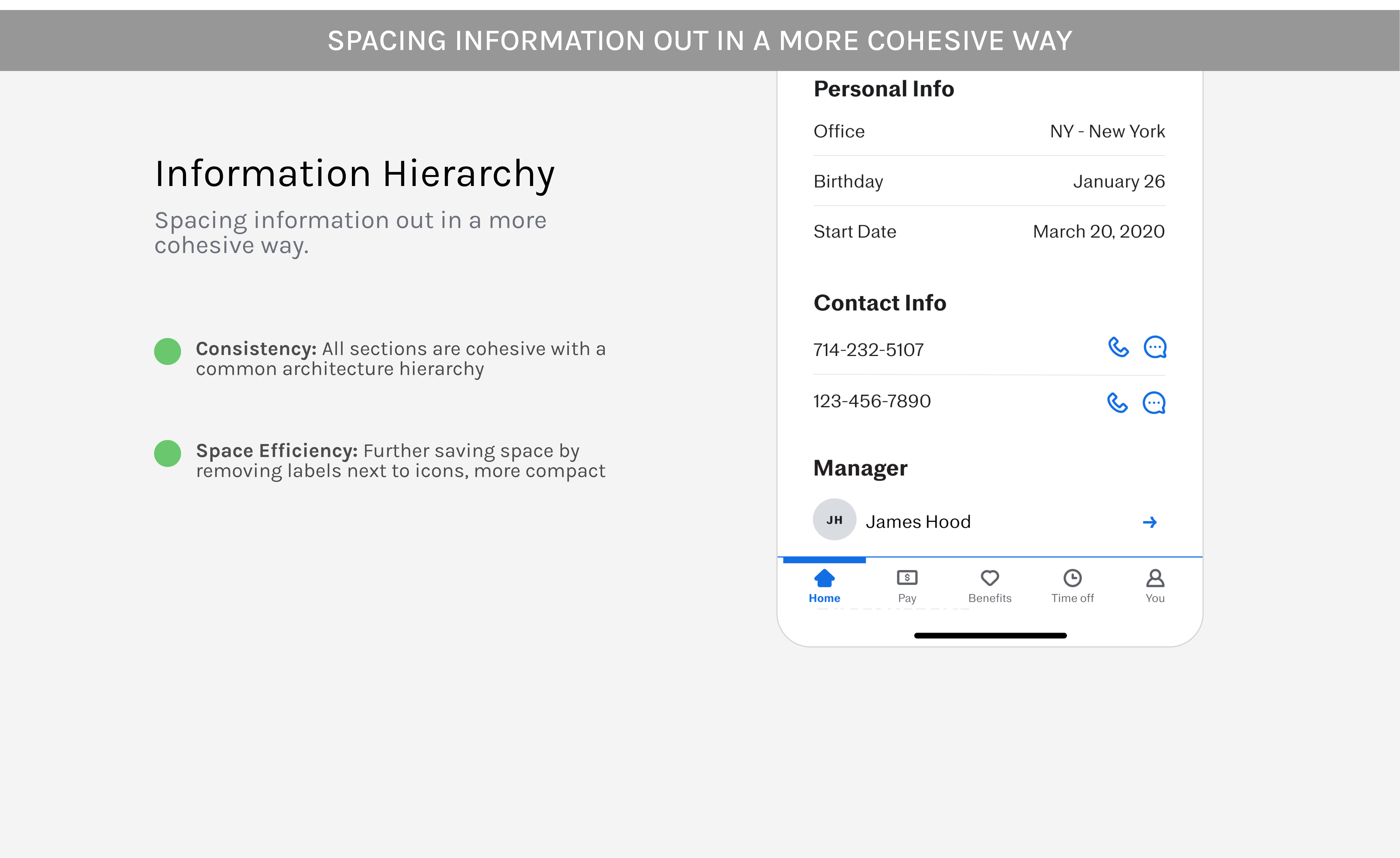
Now all types of information (personal information, contact information, manager & direct reports) are laid out more cohesively with a common architectural hierarchy. I initially believed this was a solid design. However, after discussing it with other designers on the team and externally, I realized one crucial aspect I had overlooked: Does this design align with the current mobile design system?
❗A RAISING CONCERN: THIS WORKS AS A MOBILE DIRECTORY IN GENERAL, BUT WOULD IT FIT WITH THE CURRENT MOBILE DESIGN SYSTEM?
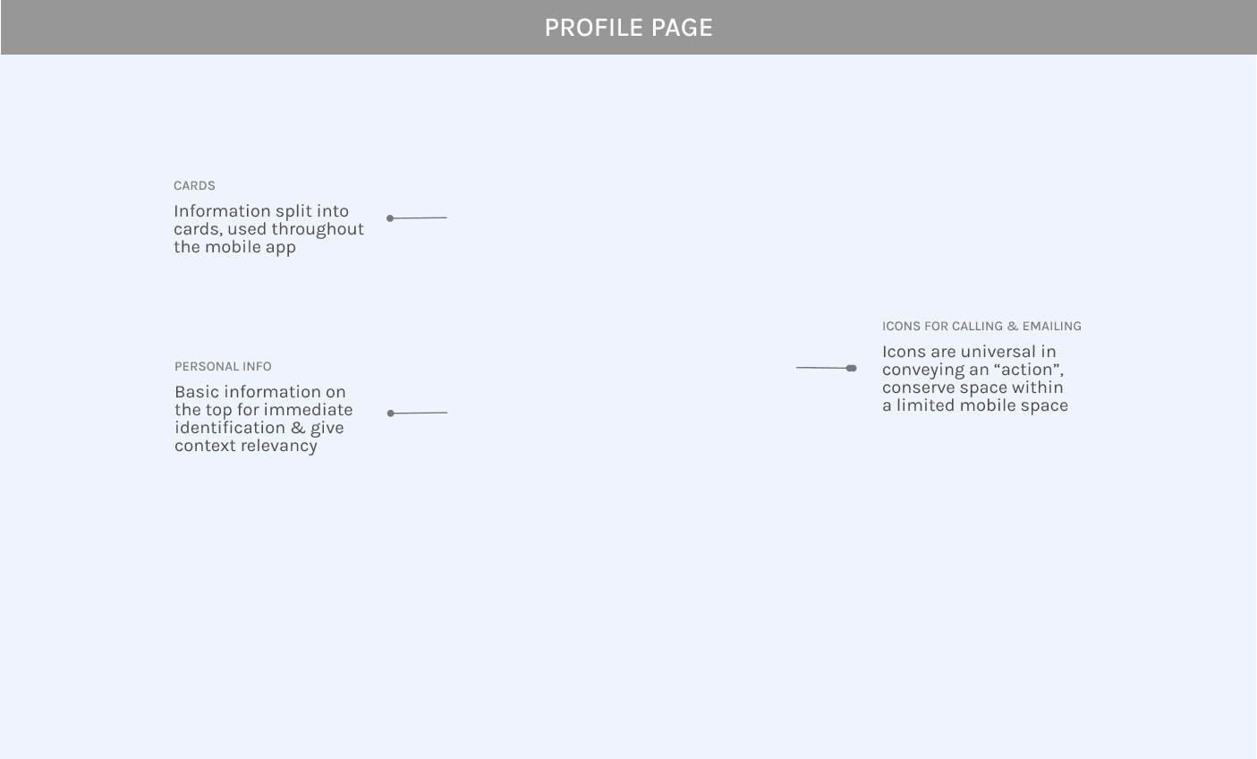
Justworks’ mobile design system currently heavily relies on “cards” in order to separate information
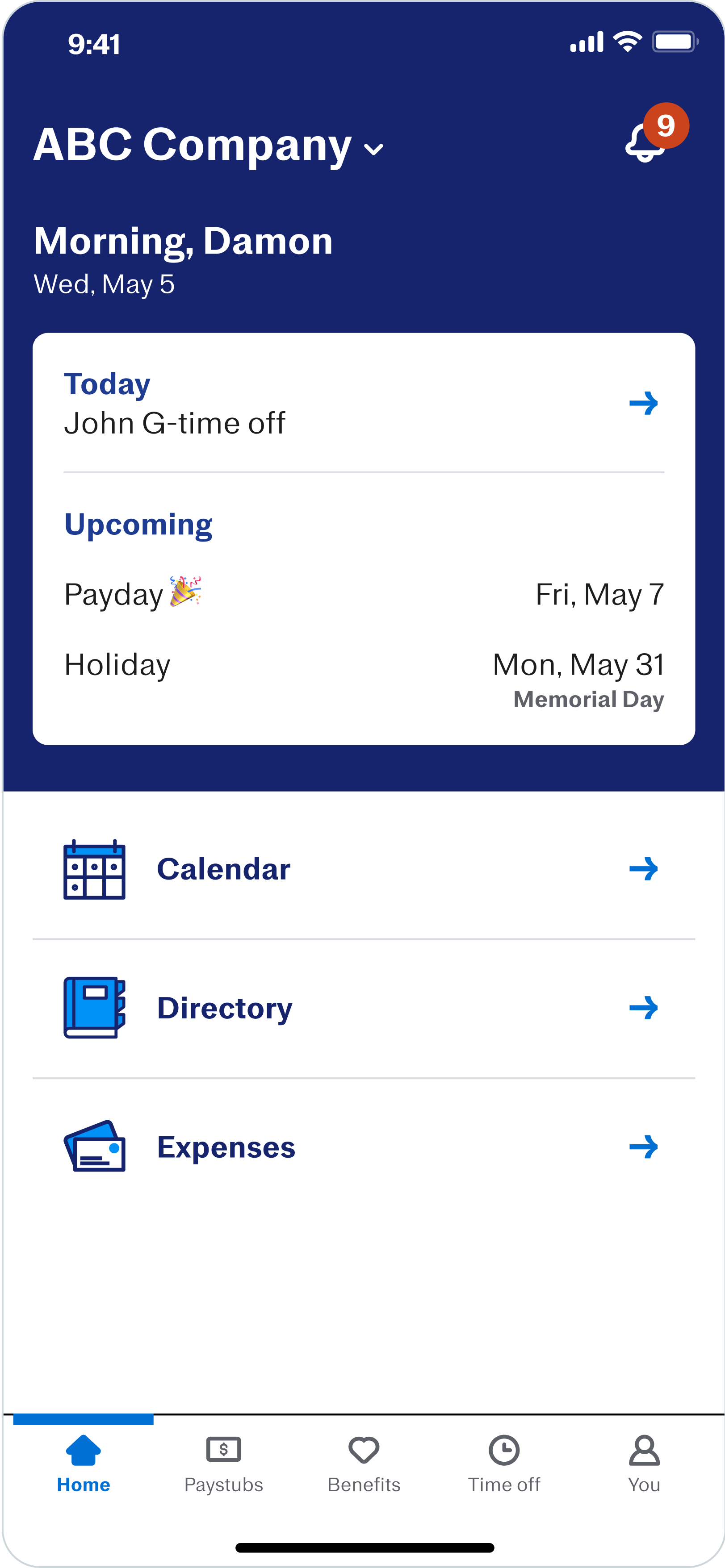
EXPENSE PAGE
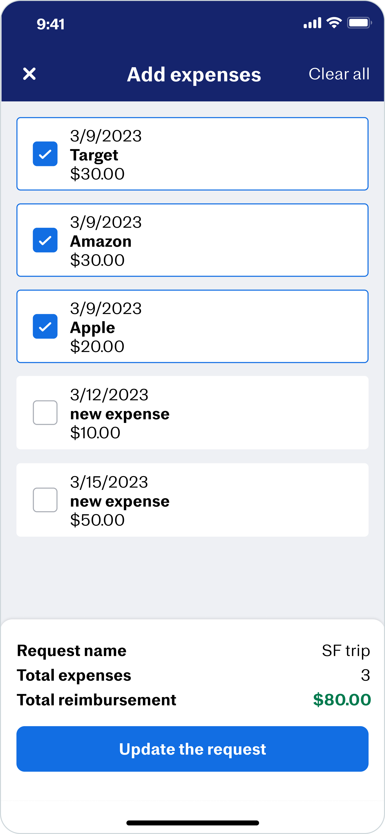
EXPENSE REQUEST
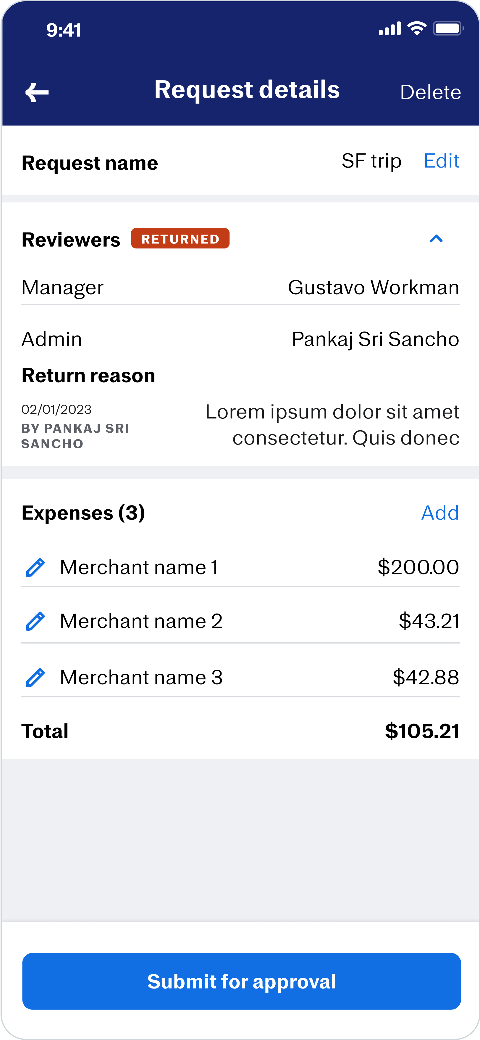
HOME PAGE
AFTER GETTING FEEDBACK FROM THE TEAM....BACK TO THE DRAWING BOARD
Maintaining consistent architecture hierarchy provides users with a sense of cohesion and familiarity as they navigate through the pages.
BACK TO THE DRAWING BOARD
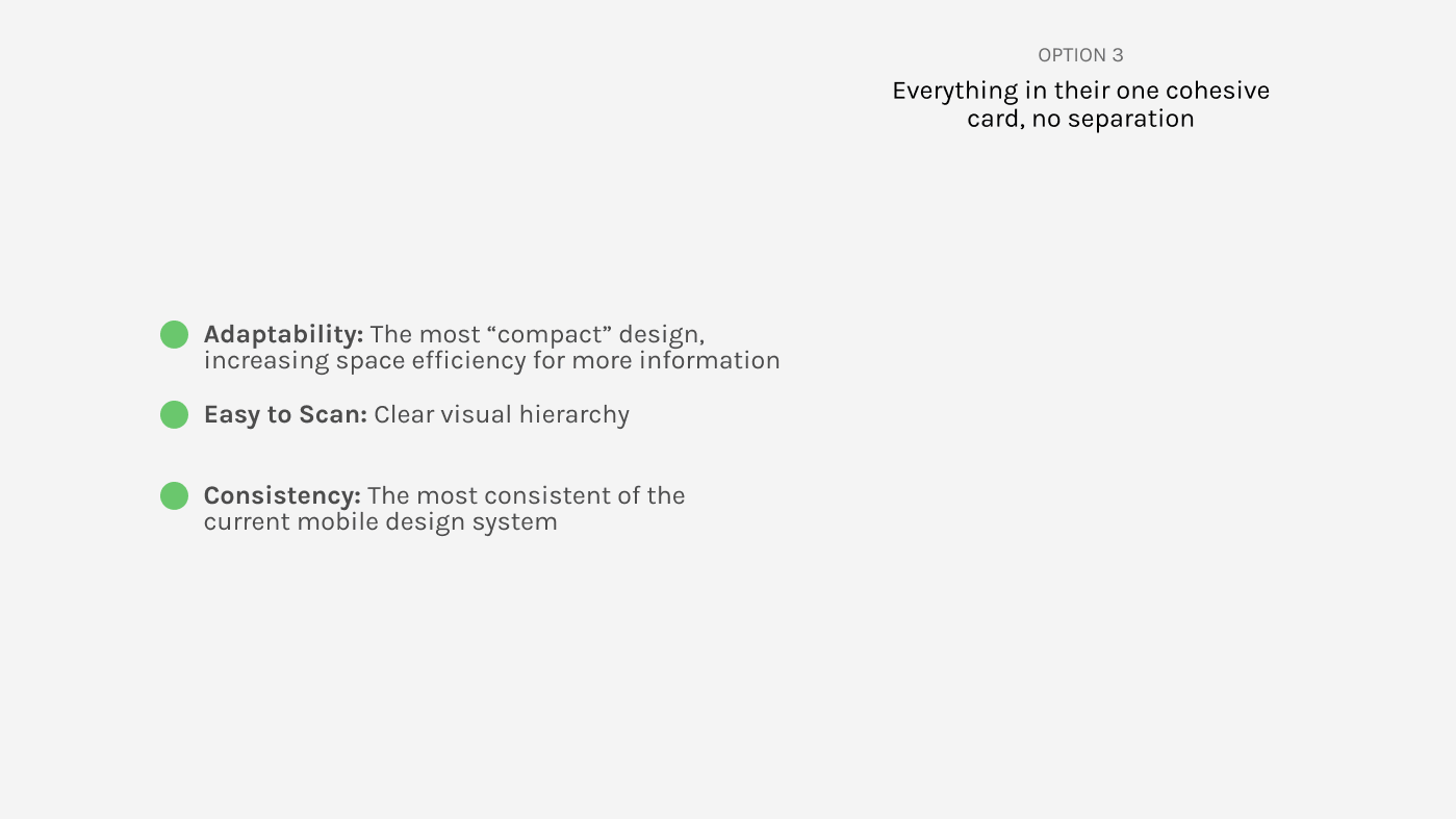
After getting feedback from the team to keep in mind the current mobile design system, back to the drawing board we go! (but we are close!) With these card iterations, I tested out three main options.
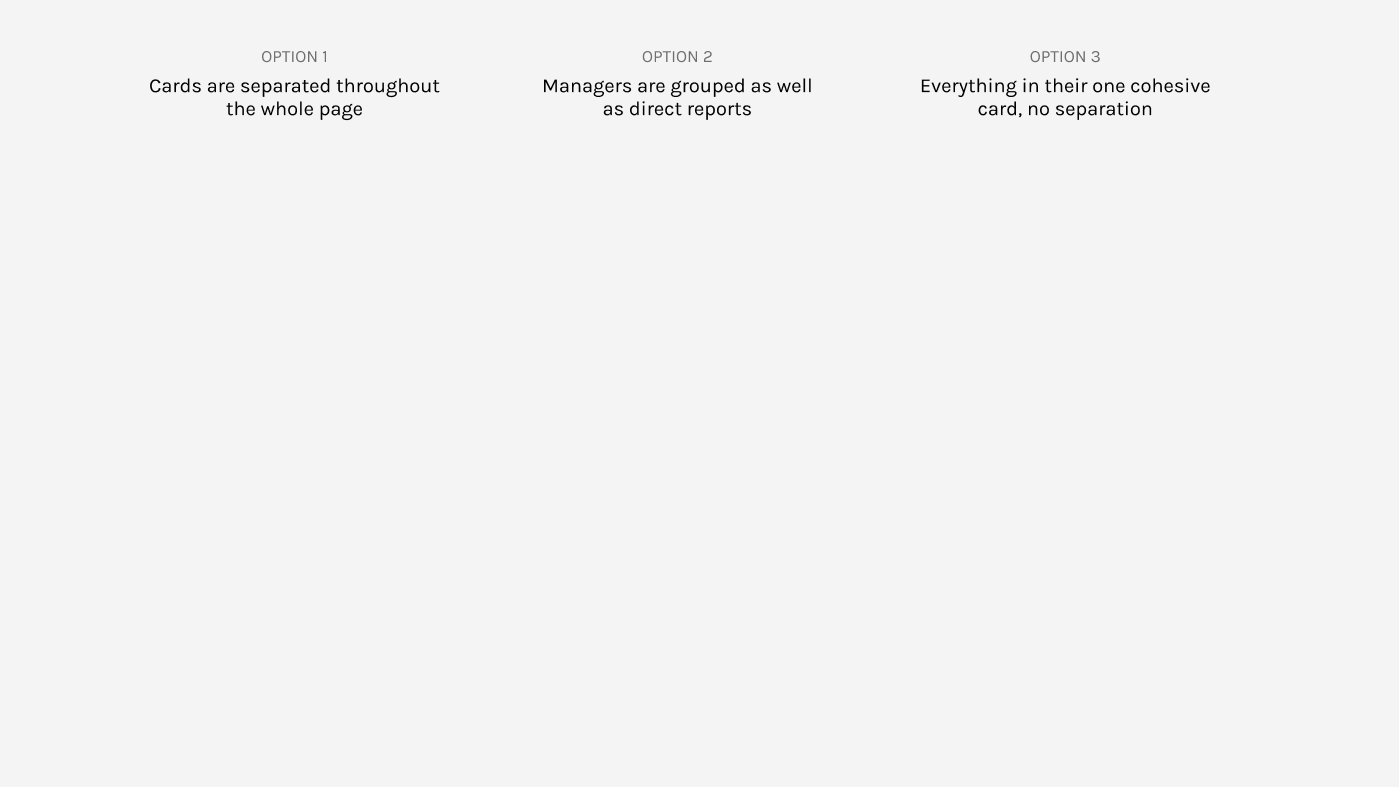
LANDING ON OPTION 3: Everything in their own cohesive card with no separation.
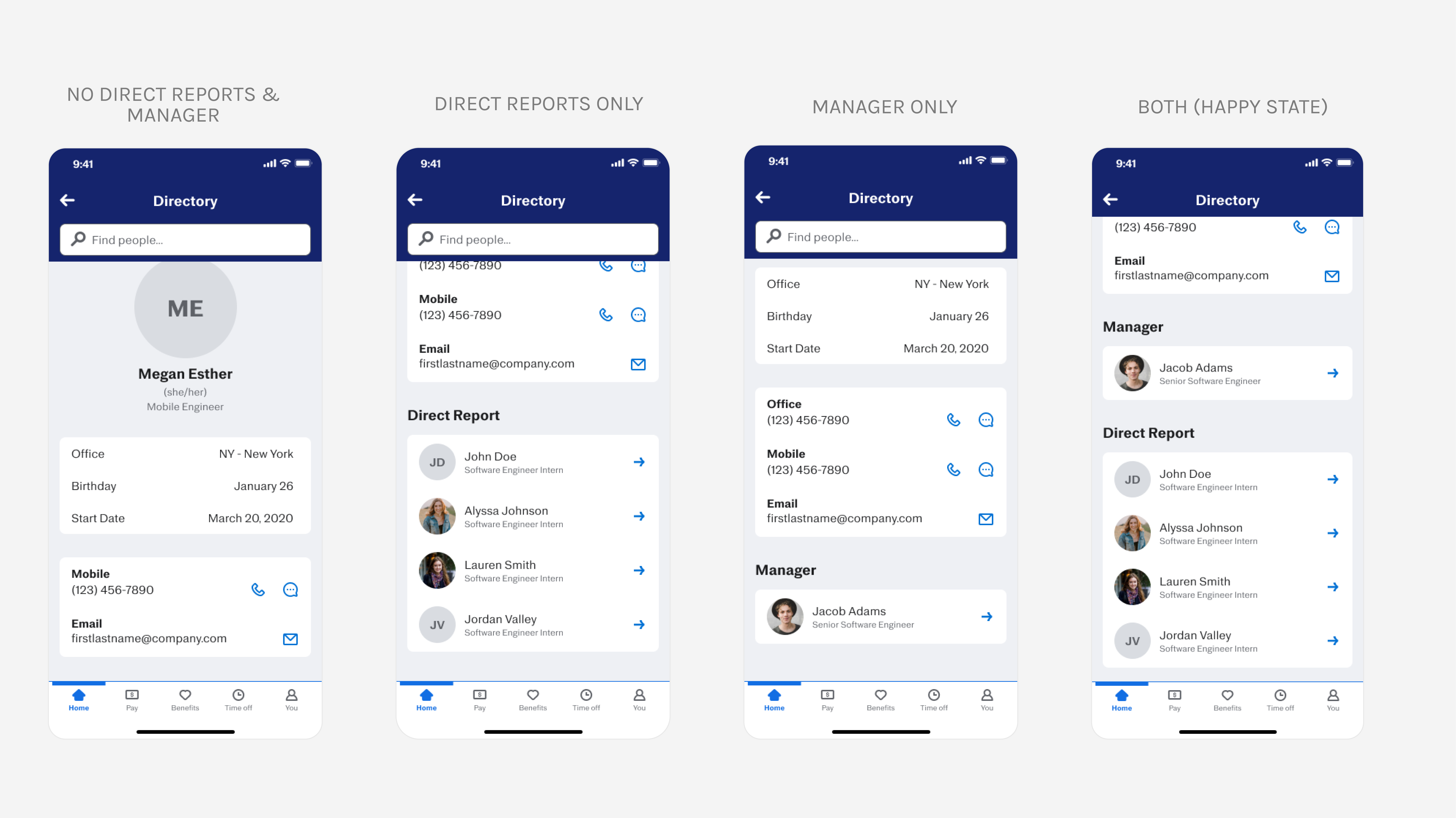
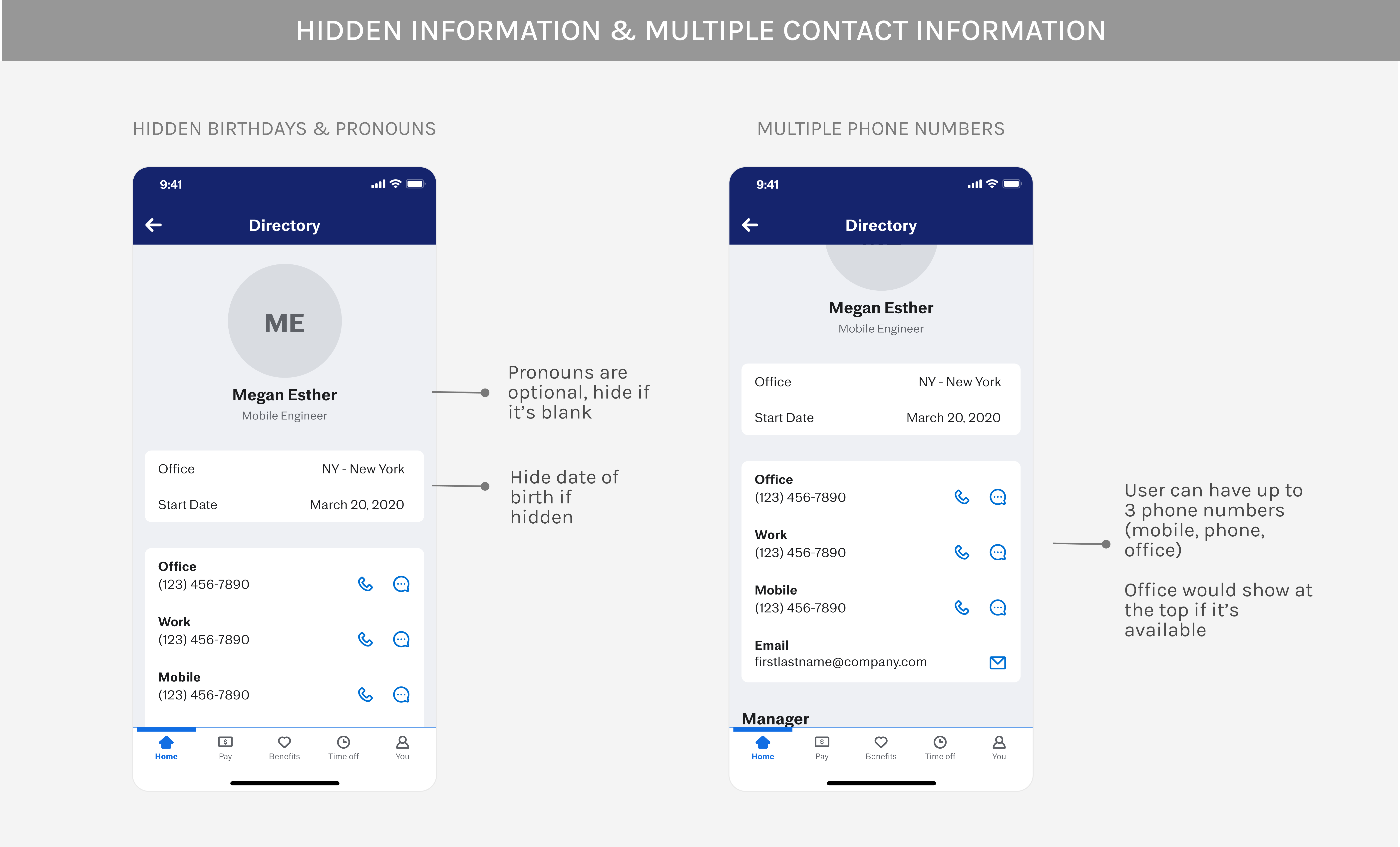
TAKING INTO ACCOUNT THE VARIOUS STATES OF THE PROFILE PAGE.
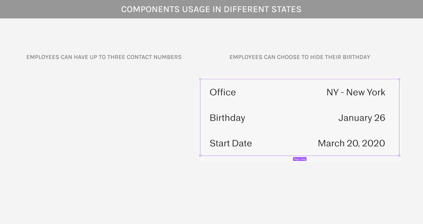
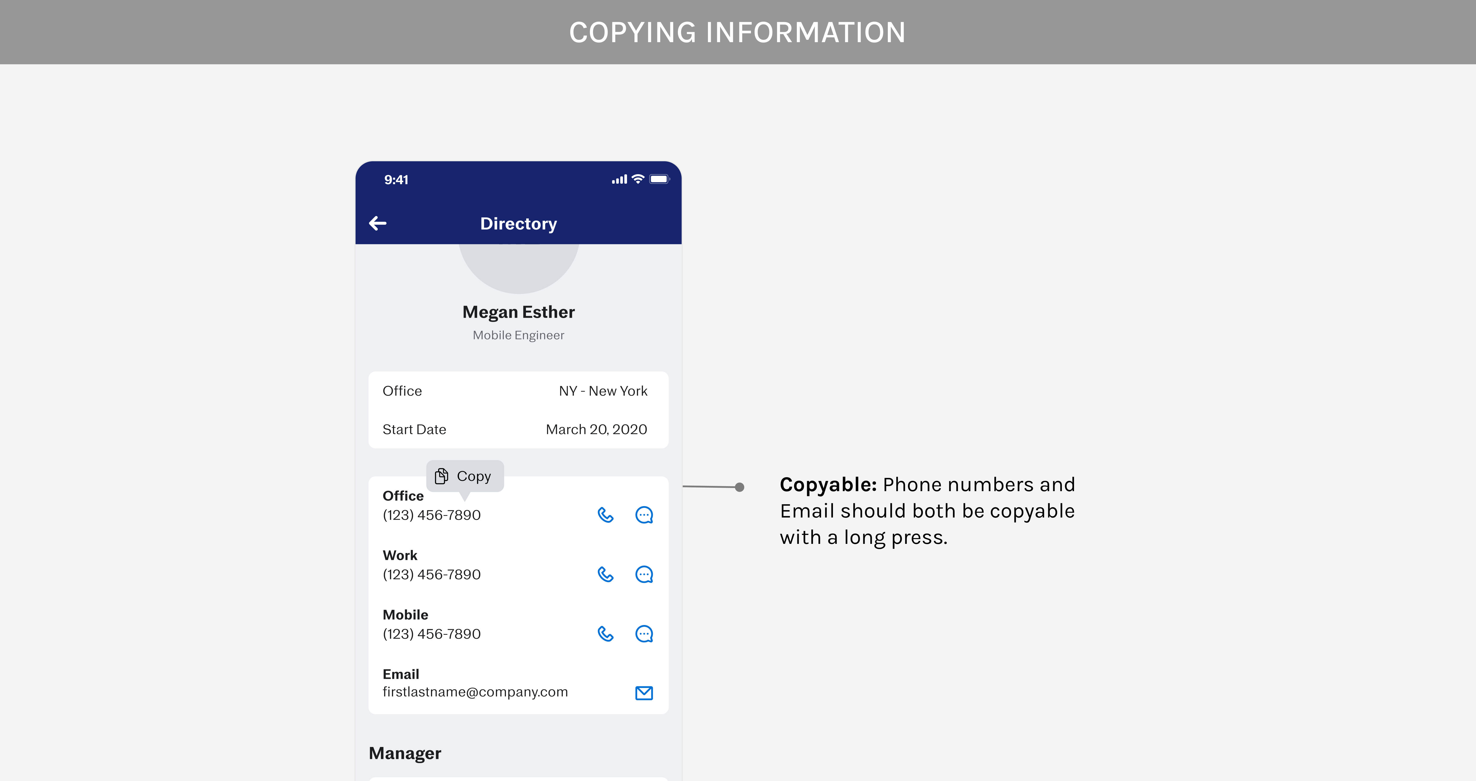
In the process of refining the user experience, various scenarios were taken into account, including cases where certain information, such as birthdays or pronouns, can be hidden, or situations where an employee lacks direct reports or both a manager and direct reports. To enhance the design of these unique states and promote efficiency, I developed a comprehensive design system. This system not only streamlines the design process for these scenarios but also provides a versatile set of design components that can be leveraged for future use.
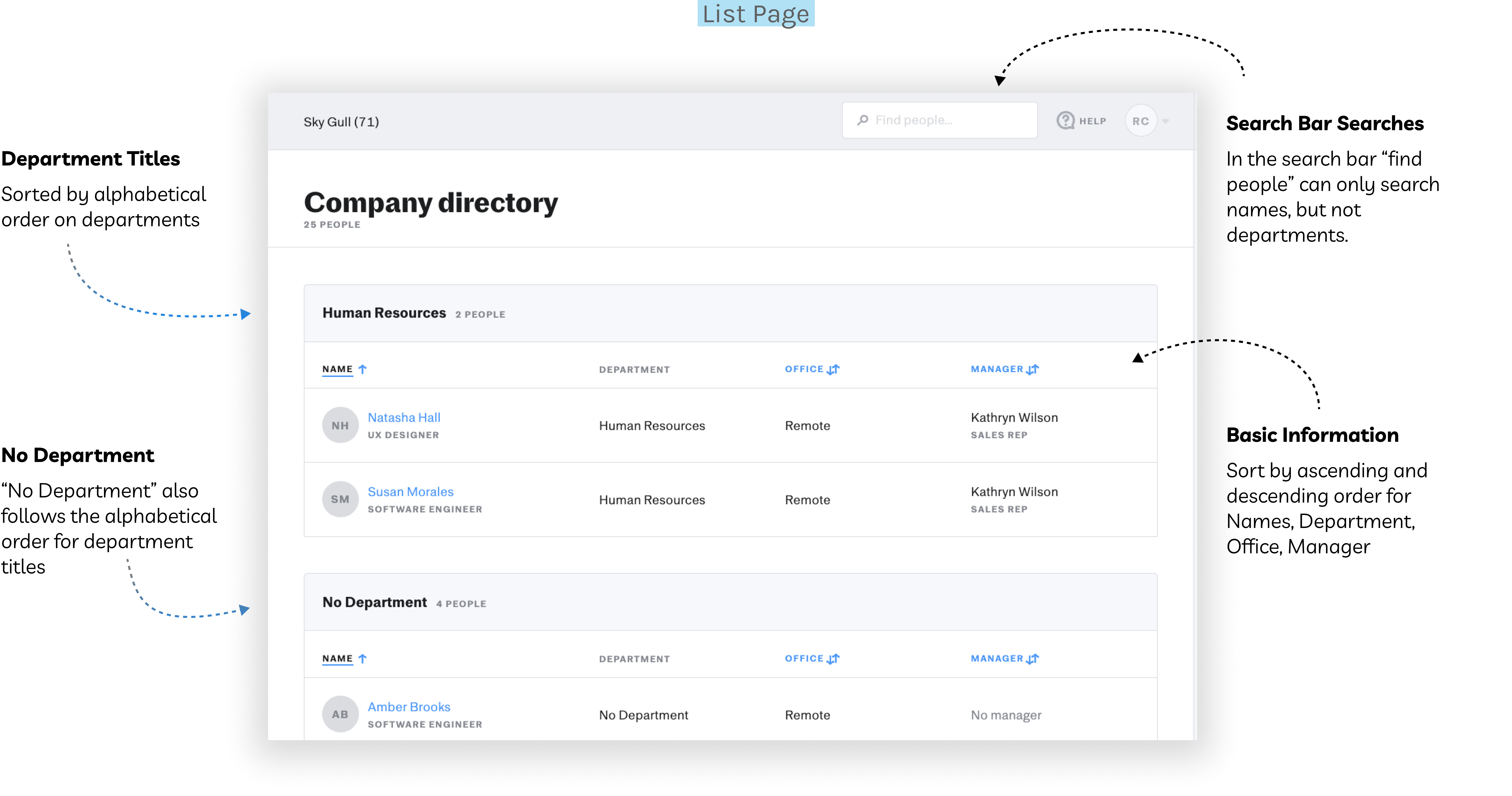
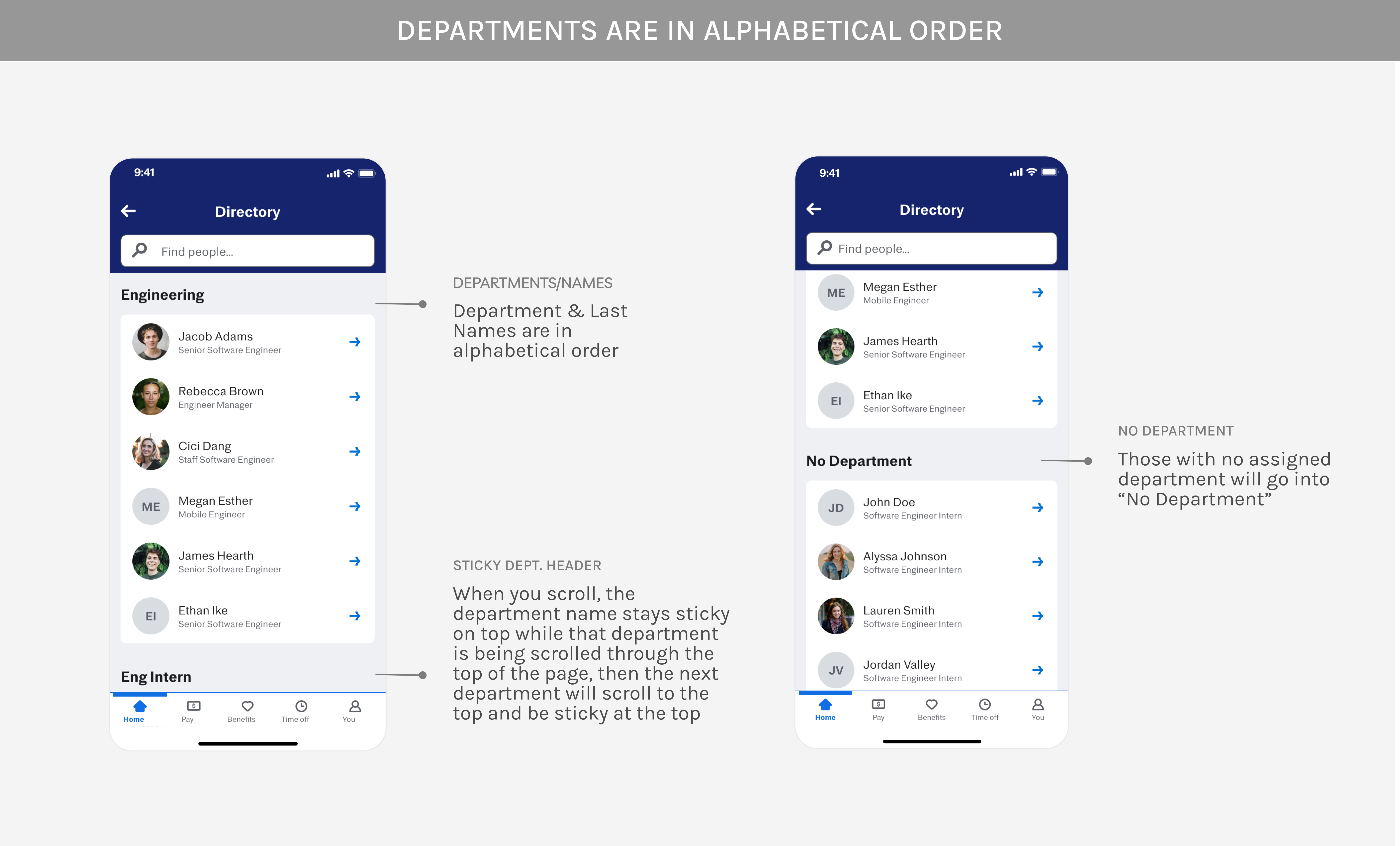
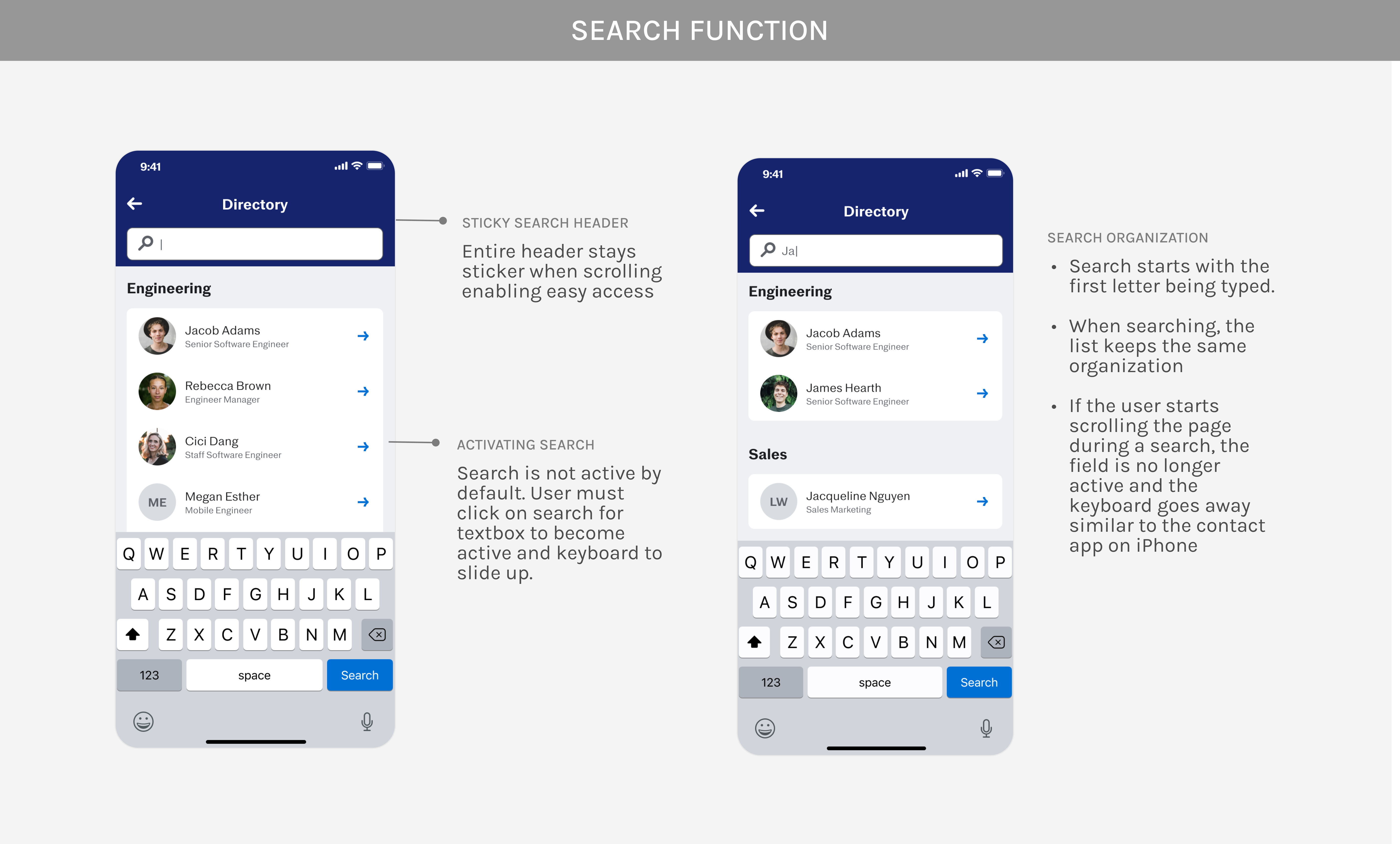
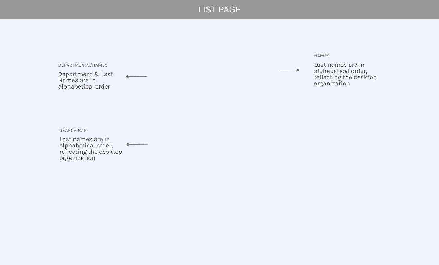
DESIGNING THE LIST PAGE
With the profile page finalized, the designs for the list page became a lot easier
INFINITE SCROLLING
While the endless possibilities exist, loading all employees simultaneously poses a threat to user experience, potentially causing sluggishness or lag within the app. To tackle this issue, I collaborated closely with our engineering team to pinpoint the optimal solution.
For the initial page load, we've strategically chosen to load the first set of 50 employees. As users navigate through the list, and they approach the last 25 names displayed, our system initiates the loading of an additional 50 names. This sweet spot ensures that users experience a smooth and uninterrupted browsing experience, maintaining a harmonious balance between usability and performance.
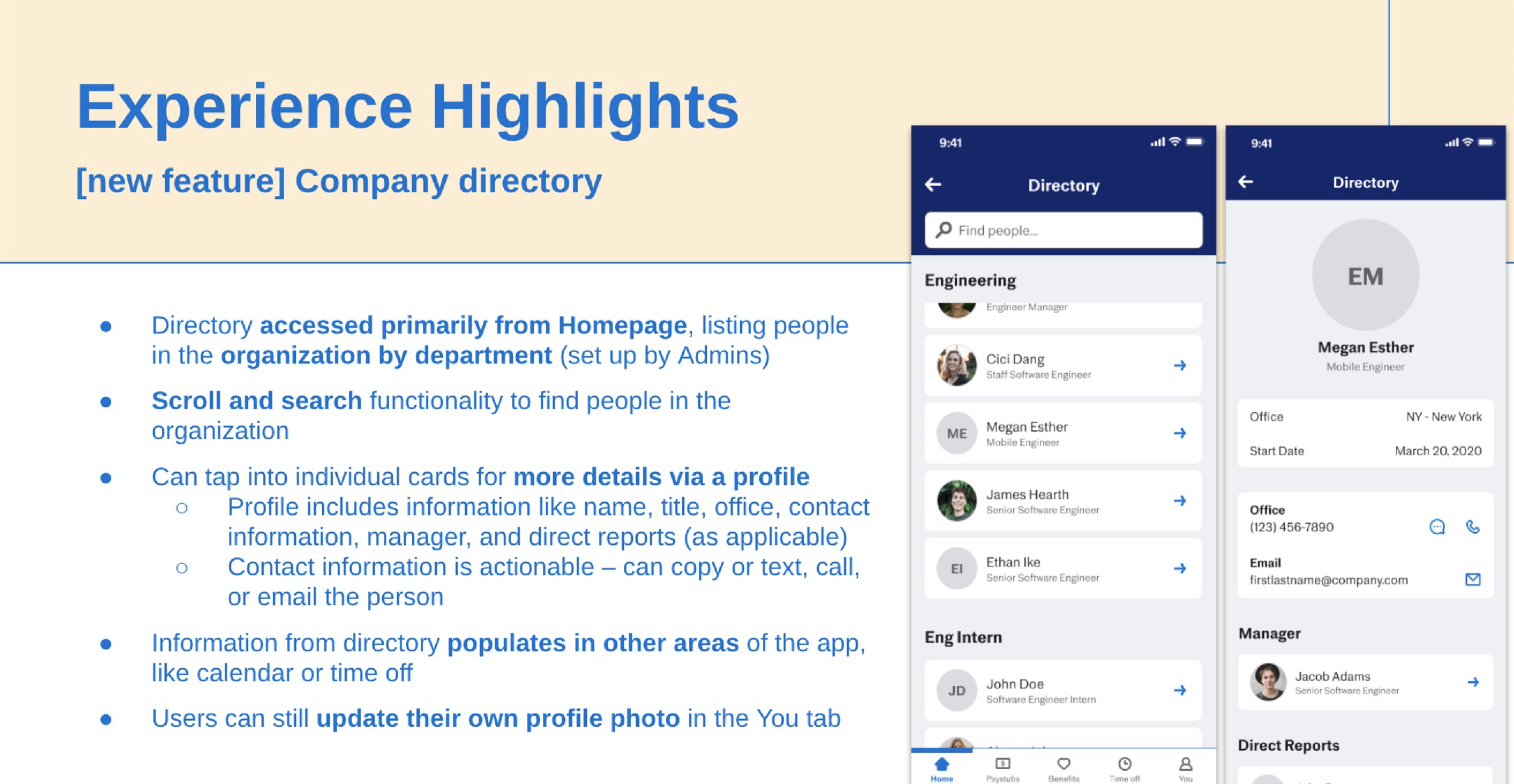
🪄 FINAL DESIGNS (TA-DA!)
After many iterations and feedback from everyone from the team, these are the final designs.
THE MOBILE DIRECTORY WAS SHIPPED! ⛵
My team sent me this slide from their launch meeting to let me know the designs were shipped!
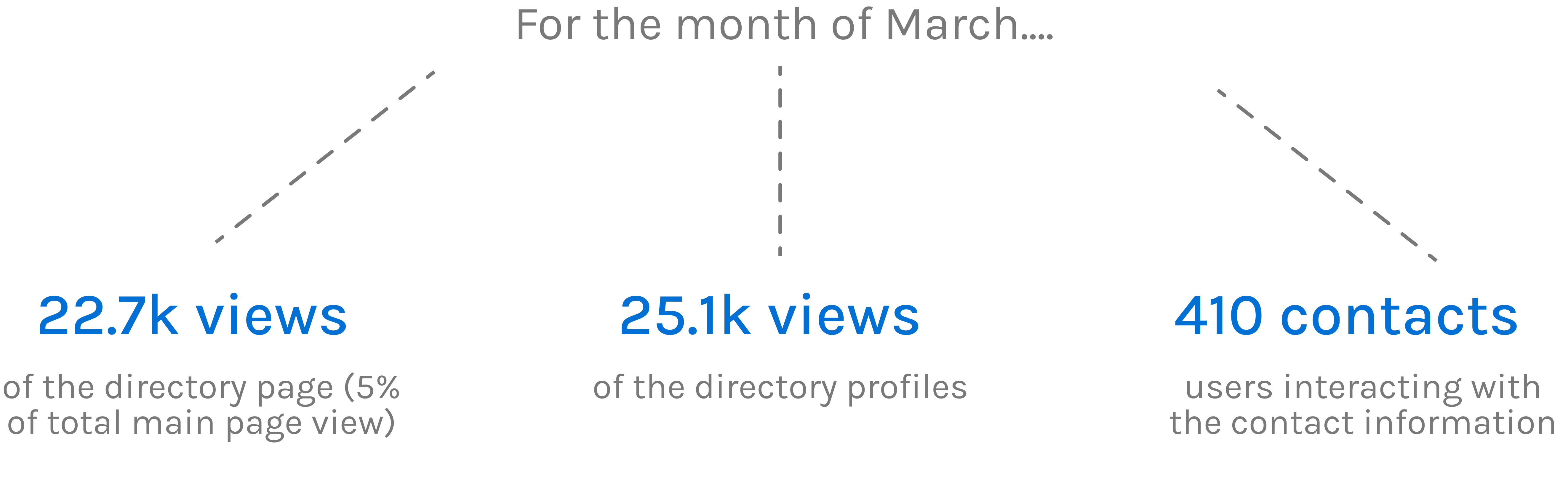
SUCCESS METRICS
For March, I received metrics regarding the interactivity of the mobile directory, showing that users are not only accessing the directory but also actively exploring individual profiles and using the directory to connect with others.
REFLECTIONS
Oh, so many valuable lessons
A SPECIAL THANKS TO...
The mobile team within Justworks as well as my mentor and the product design department for guiding me through the project step by step! And a big thank you to New York City for all the fun times I had over the summer!
LET'S CHAT!