PROJECT OVERVIEW
ROLE
PRODUCT DESIGN INTERN
TEAM
STATE-UNEMPLOYMENT-INSURANCE (SUI)
TIMELINE
MAY-AUGUST 2024
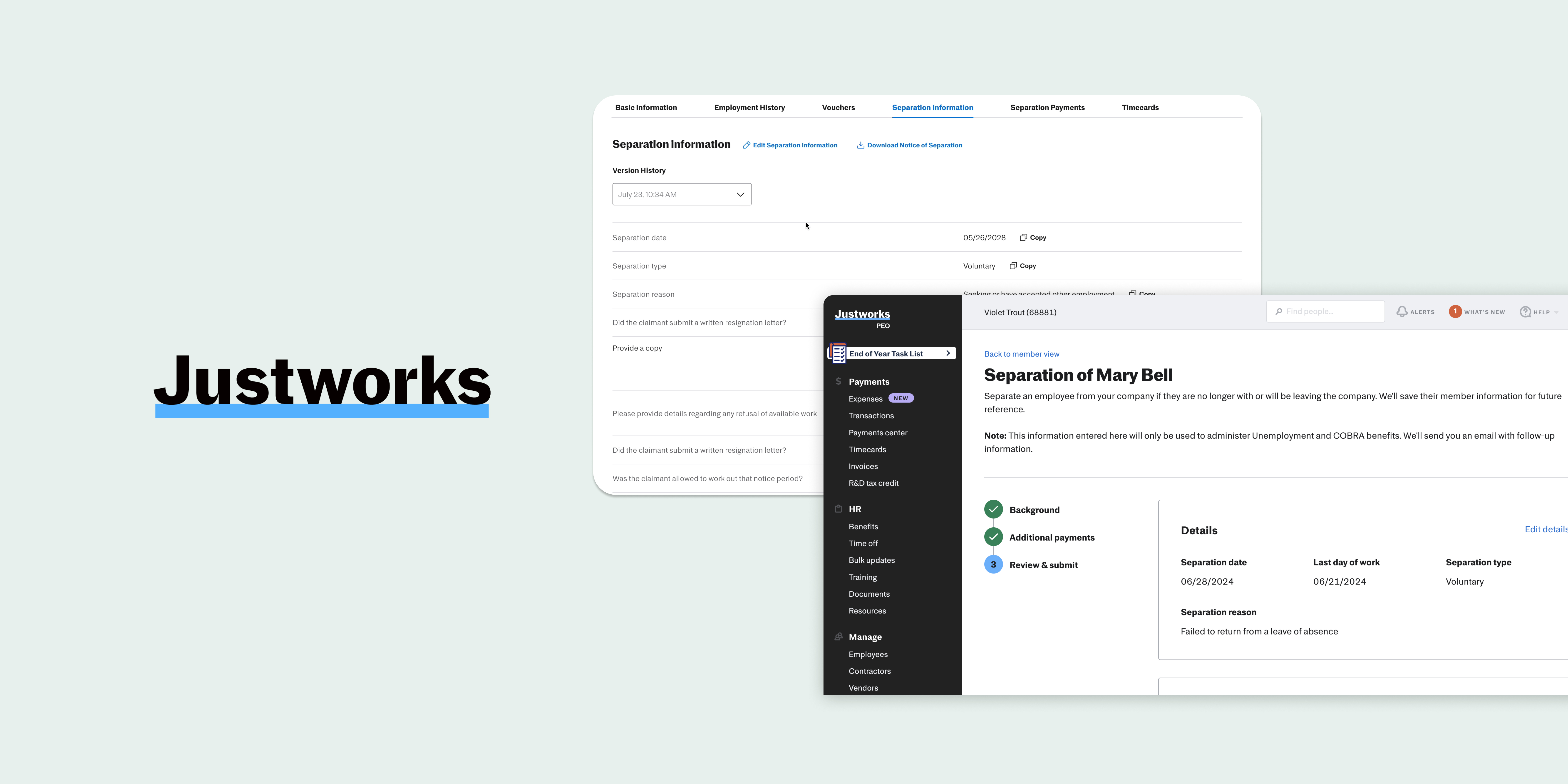
In the summer of 2024, I returned to Justworks for my second product design internship on the Payments & Taxes Team, specifically under the State Unemployment Insurance (SUI) team.
Justworks helps businesses onboard employees, but we also assist with the less pleasant task of off-boarding. Previously, the separation form lacked an editing feature, which hindered the entire process. This project involved collaborating with our customer-facing side as well as our internal team responsible for filing our customers’ unemployment claims, by understanding the use cases and editing permissions of both sides. This is an end-to-end project that involves understanding the complexities of unemployment laws while working within an ambiguous environment, identifying editing needs to create designs that bridge both internal and external teams.
I collaborated with engineers who built the separation form to understand how information is stored and transferred between our customers and the claims-associate team. Along with my PM, I identified the feature requirements and designed an editing feature on both platforms, allowing information to seamlessly flow between them. This feature will be shipped by the end of the year.
WHEN THERE’S ONBOARDING ⬆️ , THERE’S ALSO OFFBOARDING ⬇️
Justworks helps small-medium business (SMBs) onboard employees without them lifting a finger. But we also help with the off boarding-process.
We make a promise we will do their SUI needs (claim management, registration, power of attorney, PEO & Client reporting states, manage beginning to end process for all employees, manage a scaling SUI program)
THE TERMINATION PROCESS AND WHO IS INVOLVED
There are two important roles within the separation process.
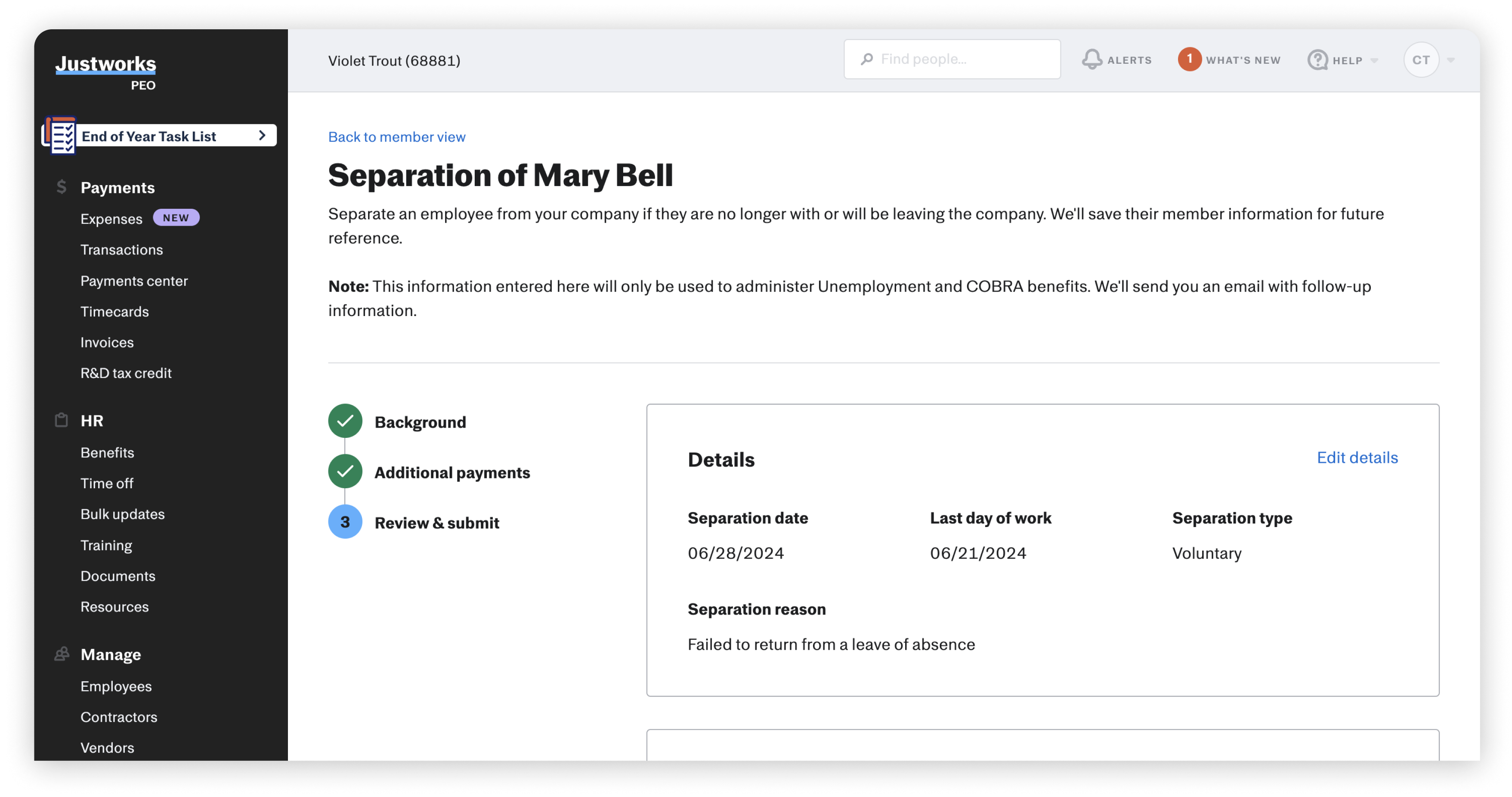
1. ADMINS: OUR CUSTOMER WHO INITIATES THE SEPARATION PROCESS FOR AN EMPLOYEE
Interacts with the form on Justworks
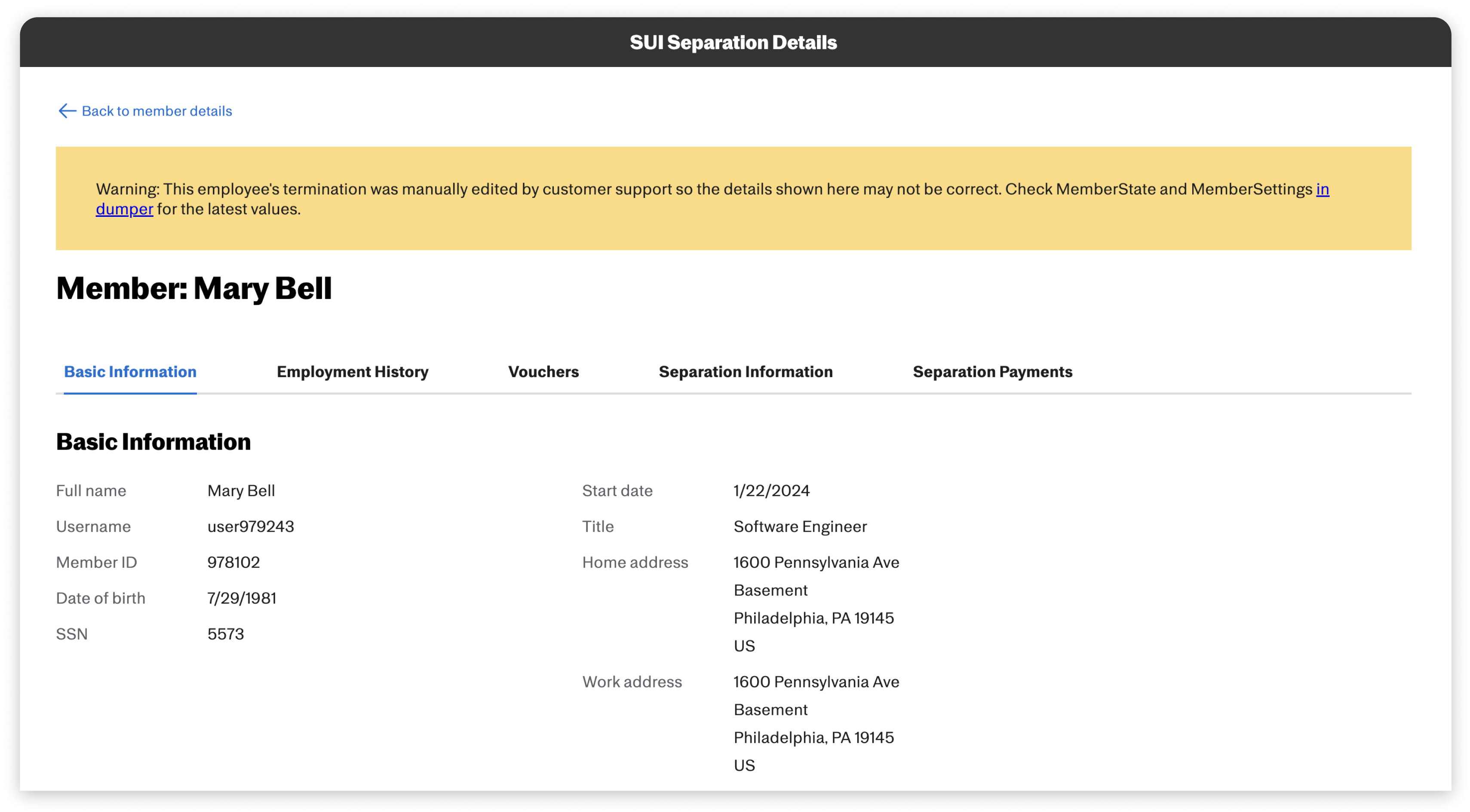
2. CUSTOMER SUPPORT (CS): OUR TEAM WHO TAKES THE INPUT OF OUR CUSTOMER AND FILES THE CLAIM TO THE STATE
Accesses information through CS Tools (internal)
THE PROJECT: INTEGRATE AN EDITING FEATURE FOR BOTH VIEWS
Understanding the impact of this project was one of the most challenging aspects of initiating it. With each state's unemployment laws varying, Customer Support (CS) must handle claims efficiently and straightforwardly while maintaining integrity for our customers. Mistakes are bound to happen, and information is often missing or needs updating. Currently, CS and Admins communicate through an email thread, which makes the entire process less efficient.
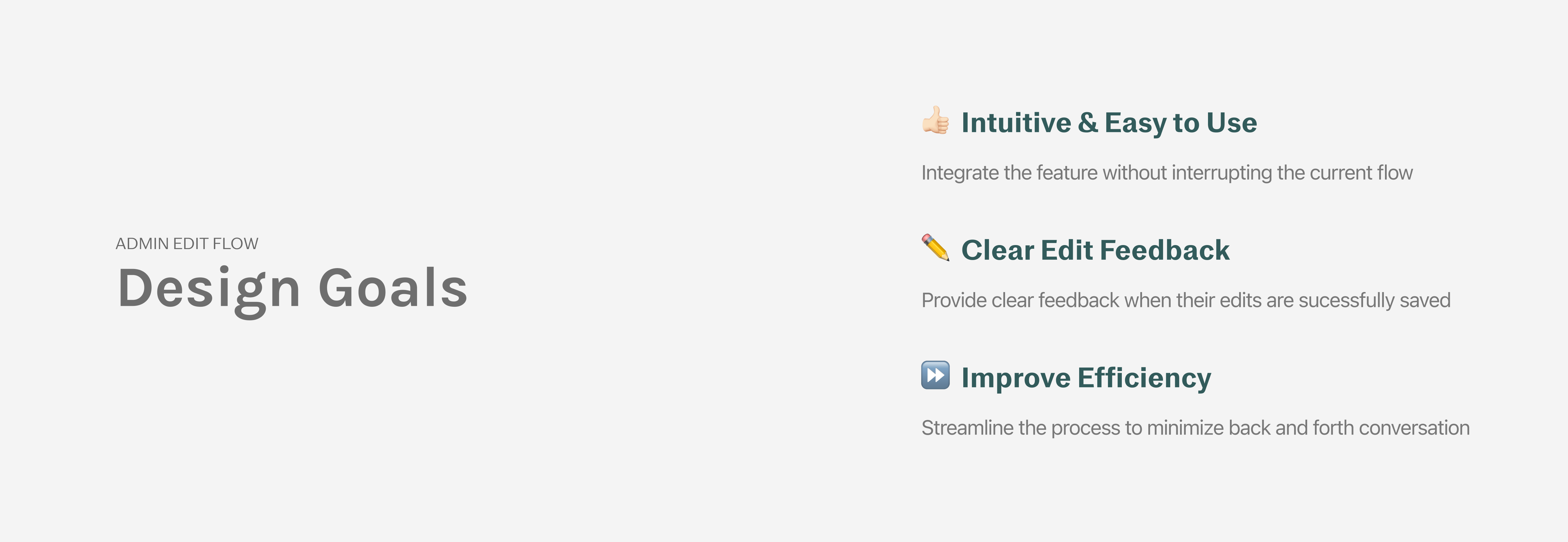
ADMIN’S EDIT FLOW DESIGN GOALS
EXPLORATION: WHERE SHOULD THE ENTRY POINT FOR EDITING LIVE?
Since there is no current editing feature, the separation form cannot be accessed after submission. The first step was determining where the editing feature should be located without disrupting the existing workflow.
1. banner on the top

Not a usual pattern for an action to live in a banner
2. termination status card

Takes too much real estate on the page
3. part of the main actions

Editing separation form is not a main/frequent action an admin would be making on a daily basis
4. part of the main actions + notice

Clear call out, but not cohesive with the current designs
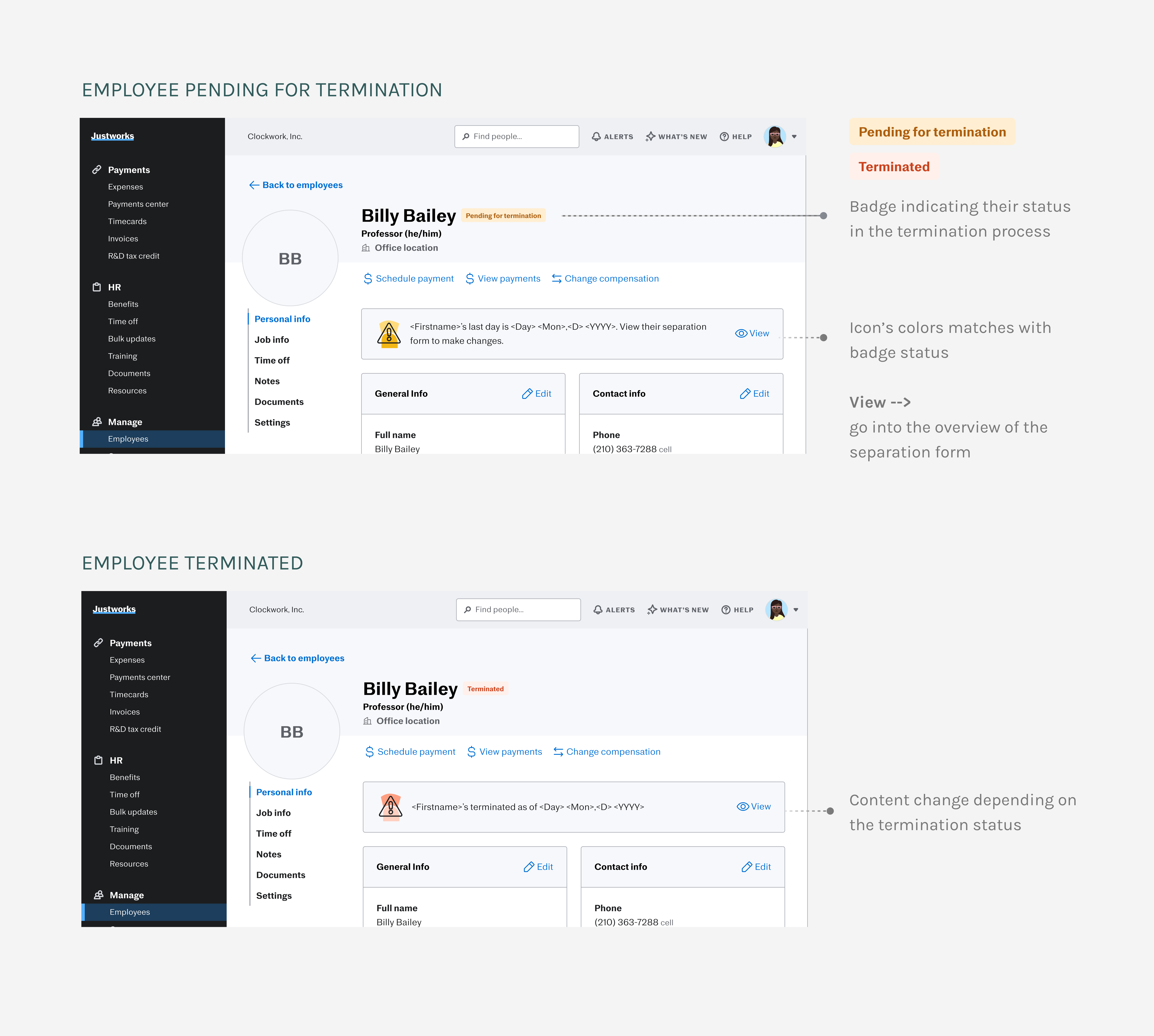
HONING IN BY LOOKING AT DESIGN PATTERNS WITHIN JW’S PLATFORM (INTERNATIONAL TEAM 🌎 )
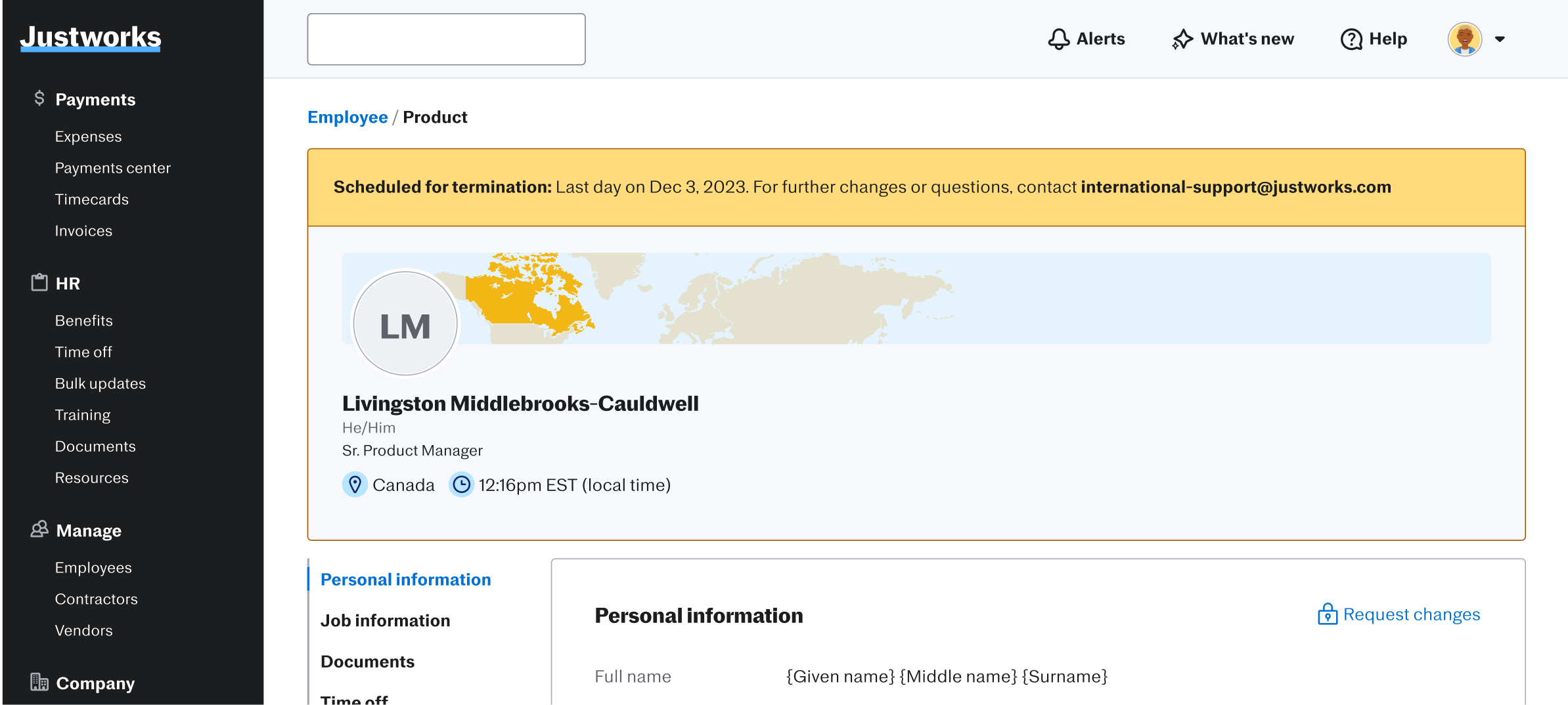
As an admin or manager, given that the employee has a terminated scheduled in the future, I should see a status of their employment status.
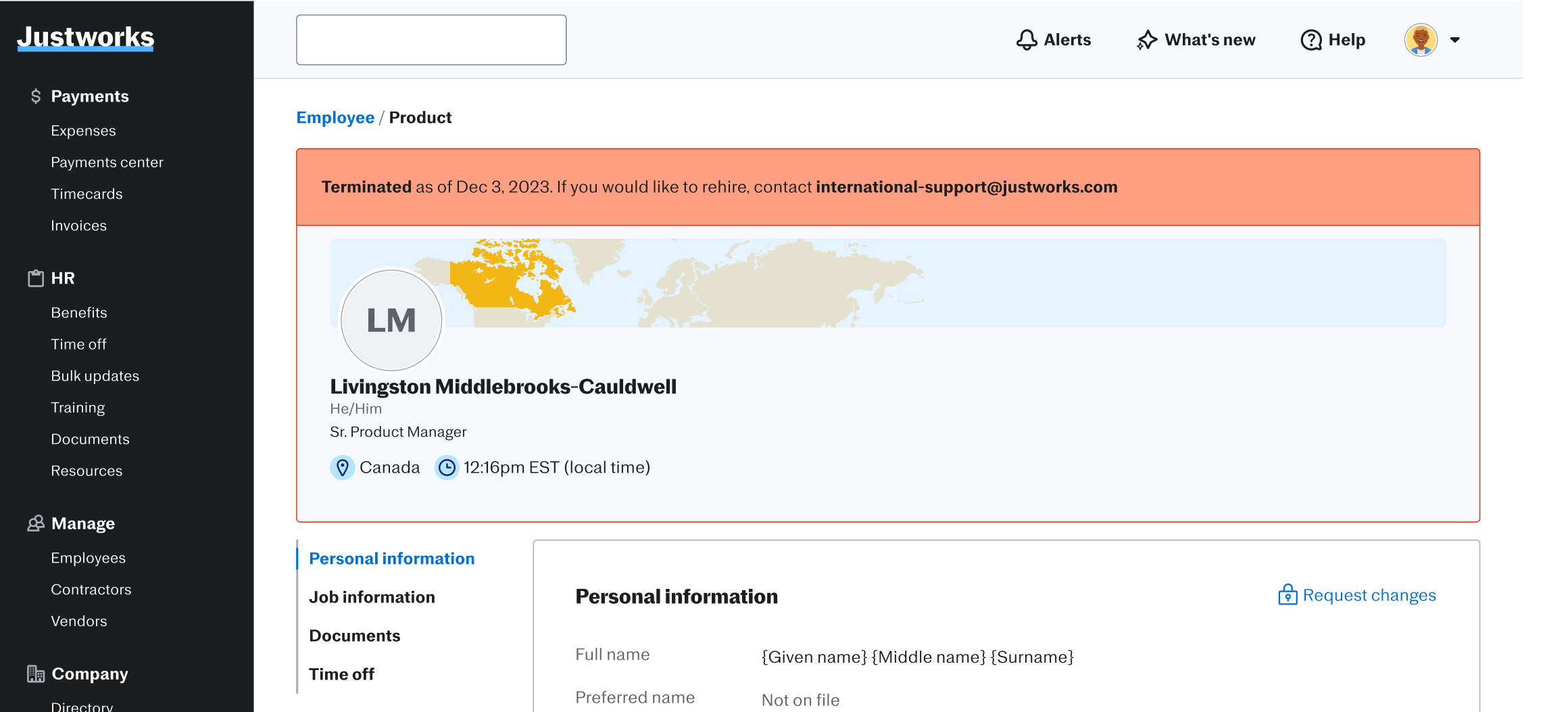
As an admin or manager, given the employee’s last day has passed, I should see that they have been terminated.
Intuitive & easy to use 👍🏻
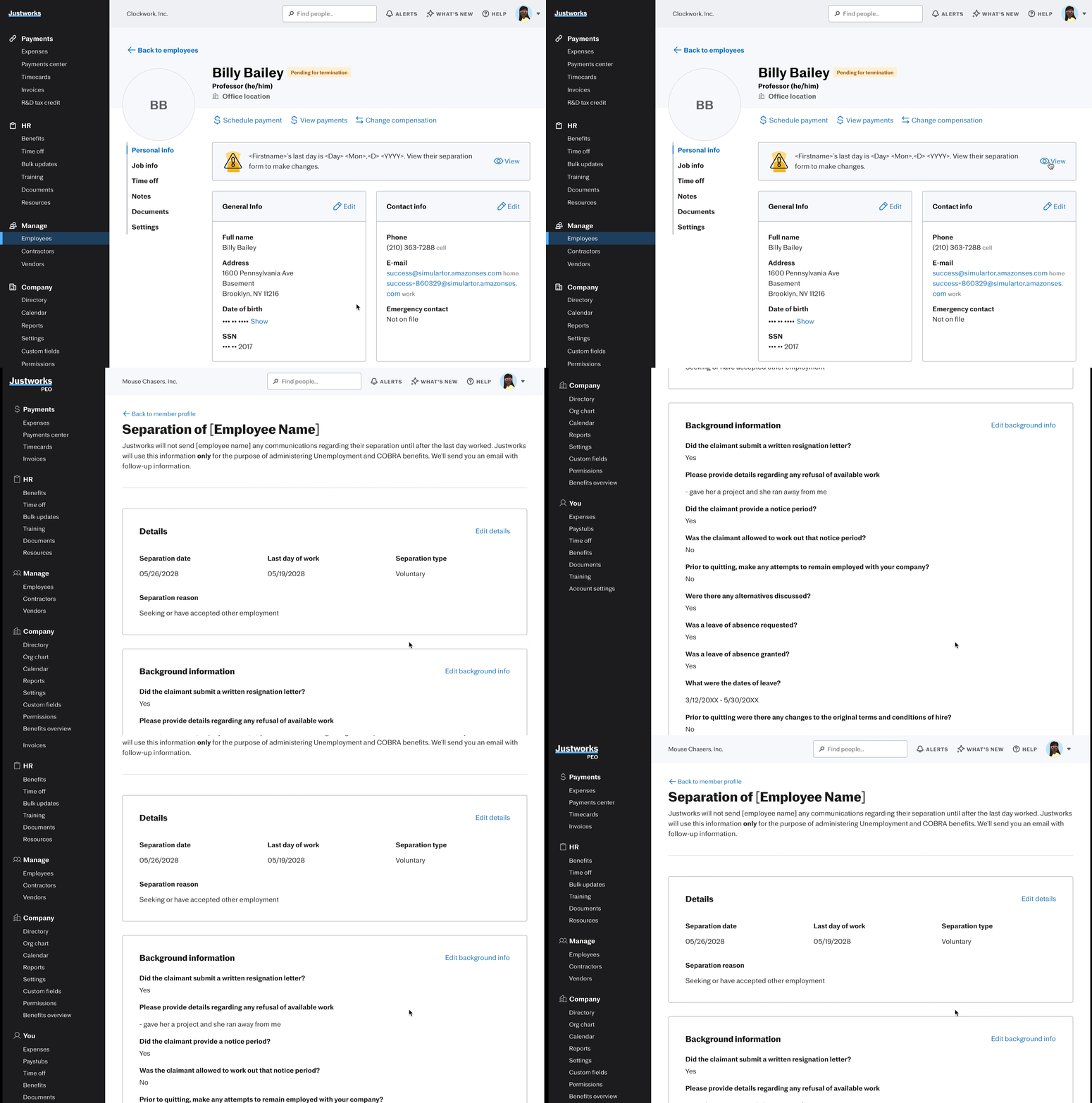
Visual cues differentiate 'pending' from 'terminated' statuses, with form access via a card reflecting the current design system on the EE’s profile page.
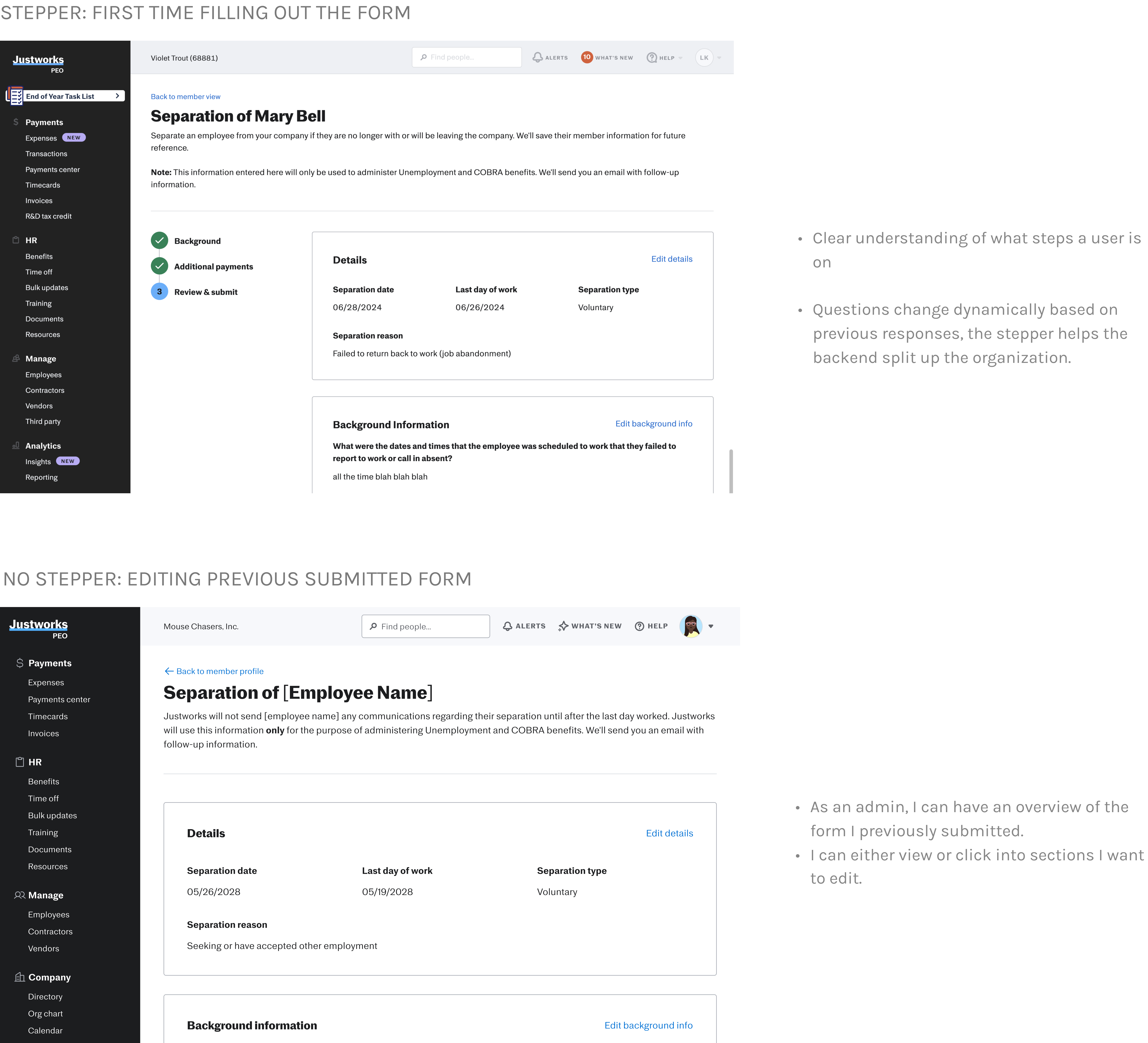
EDITING AND OVERVIEW OF A PREVIOUSLY SUBMITTED FORM
Admins will edit their previously submitted separation forms. Since each state has different termination requirements, it's important to track dynamically changing questions. Understanding how the questionnaire data is managed on the backend is key to integrating this feature.
❗ENGINEERING CONCERN: TAKING INTO ACCOUNT THE DYNAMIC NATURE OF THE QUESTIONNAIRE
Halfway through the internship, I hit a wall regarding what to do next. I spent a lot of time testing iterations, but one thing I overlooked was the complexity of the questionnaire. I focused too much on WHAT the editing flow would look like and forgot HOW it would be integrated.
An attempt to understand the HOW and WHY the questionnaire was built, I set up a meeting with my engineering team and break down the flow with a flow chart of each section.
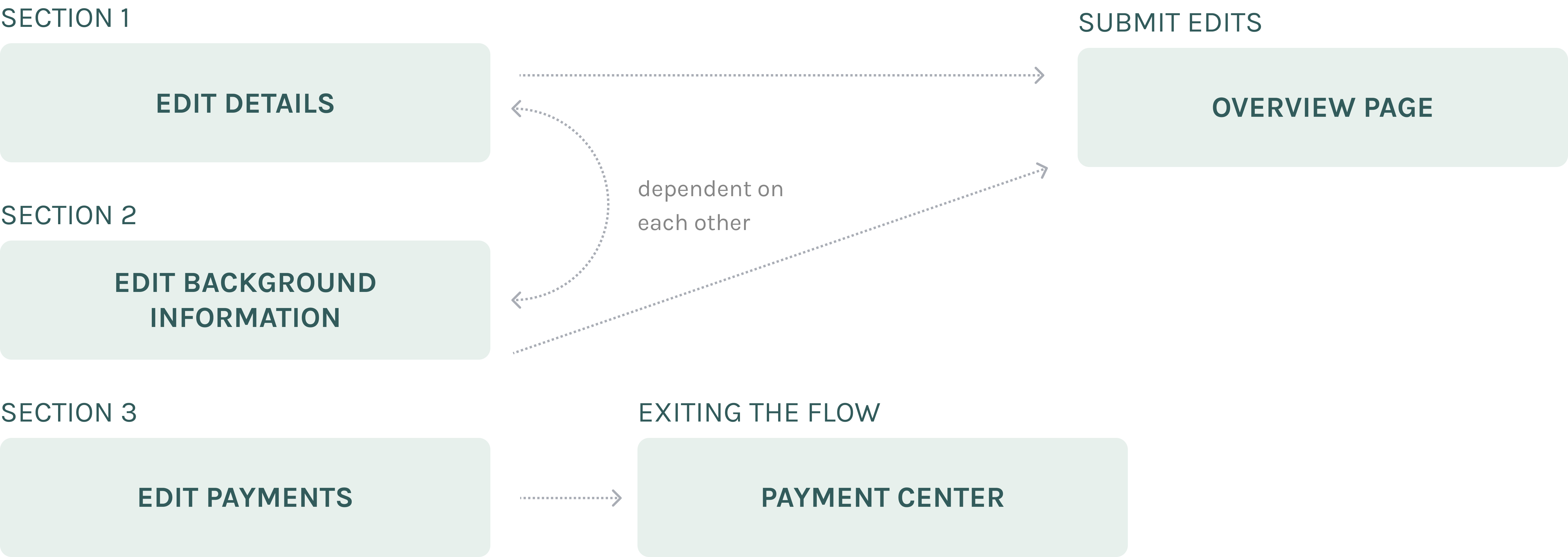
STEPPER REFLECTING THE COMPLEXITY OF EACH SECTION

TACKLING EACH STEP ONE STEP AT A TIME 👣
EDIT DETAILS

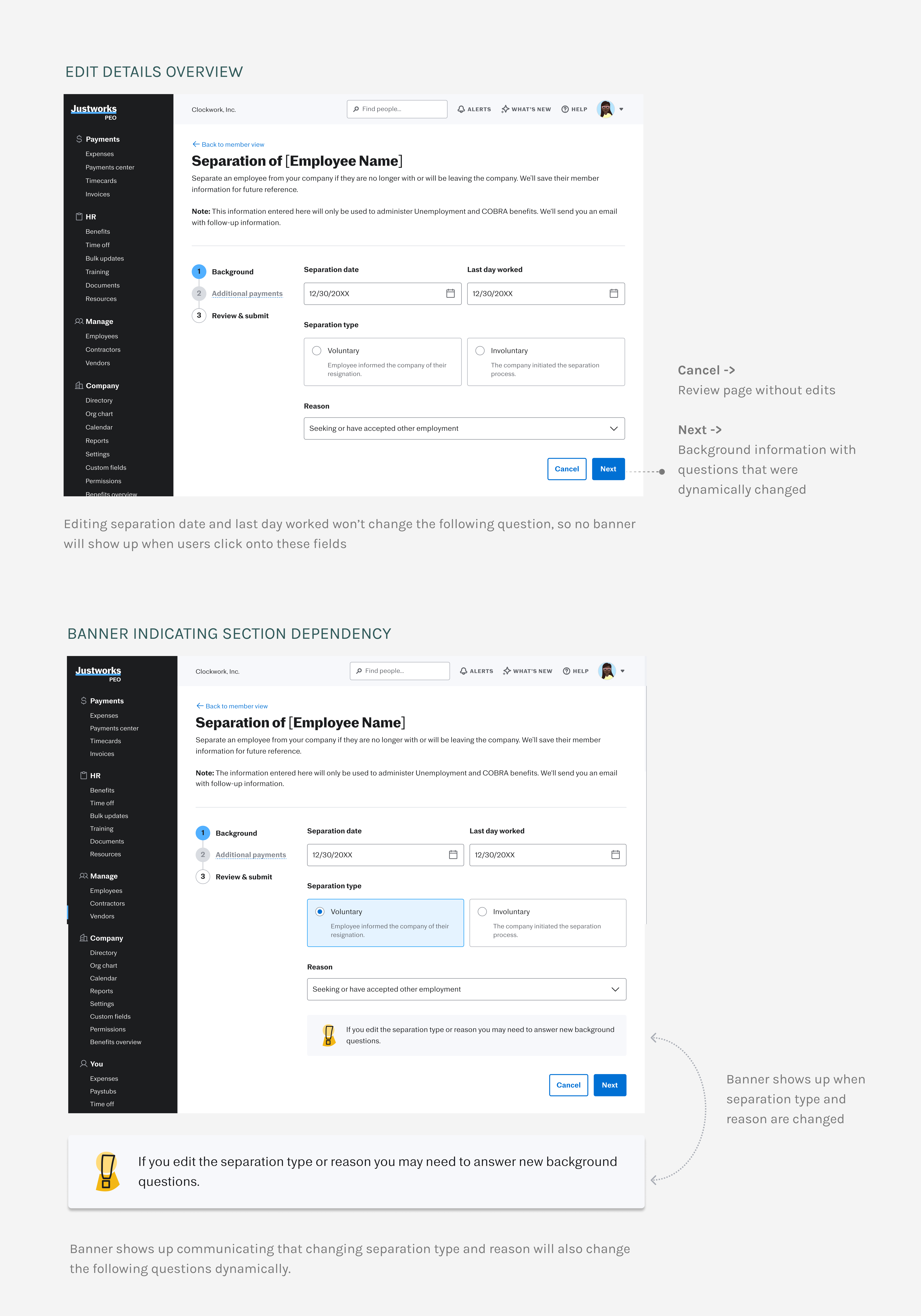
⏩ Improve Efficiency
By informing users of the new questions upfront, we help users understand the editing process better, hence minimize back-and-forth conversations.
EDIT BACKGROUND INFORMATION

EXPLORATION: IN-LINE EDITING
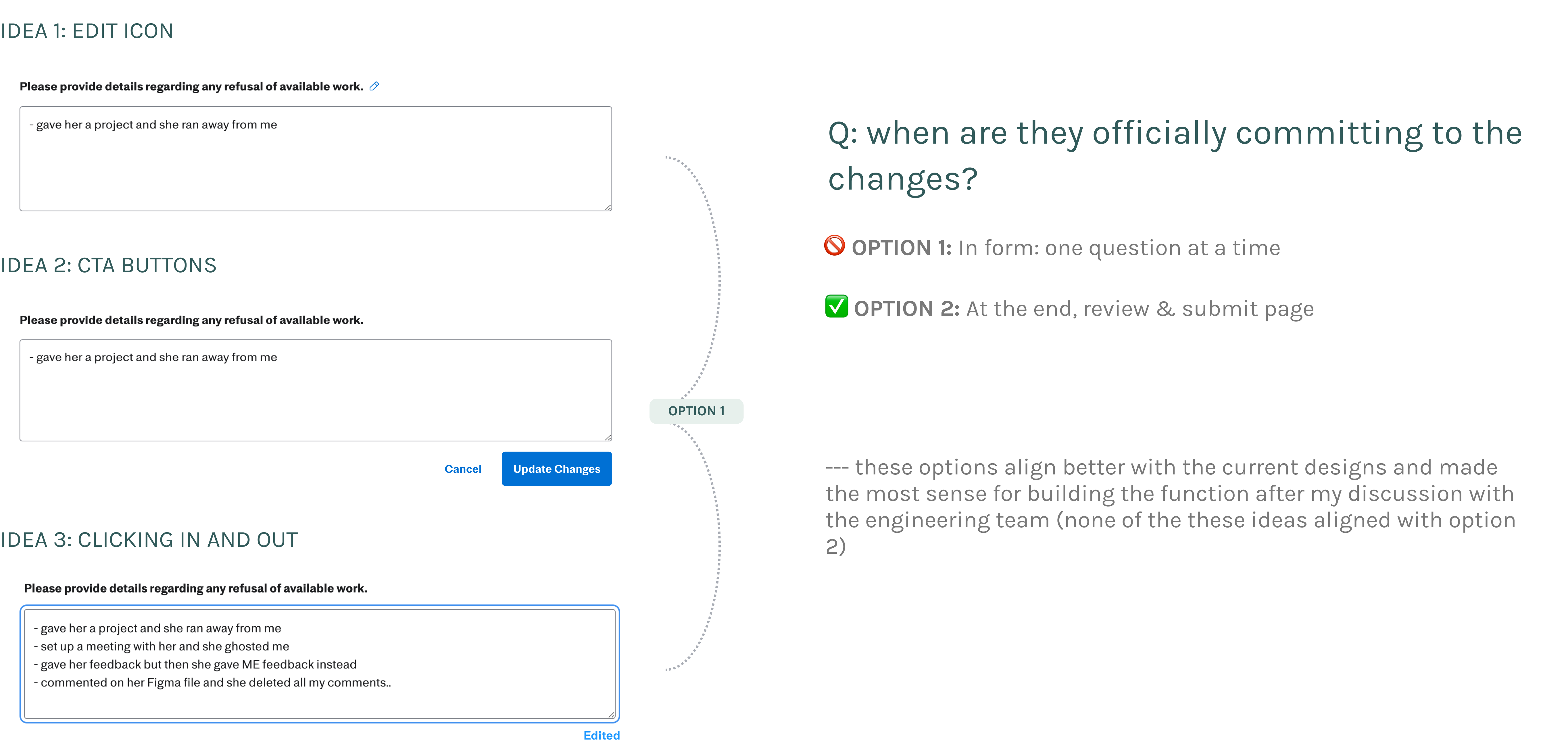
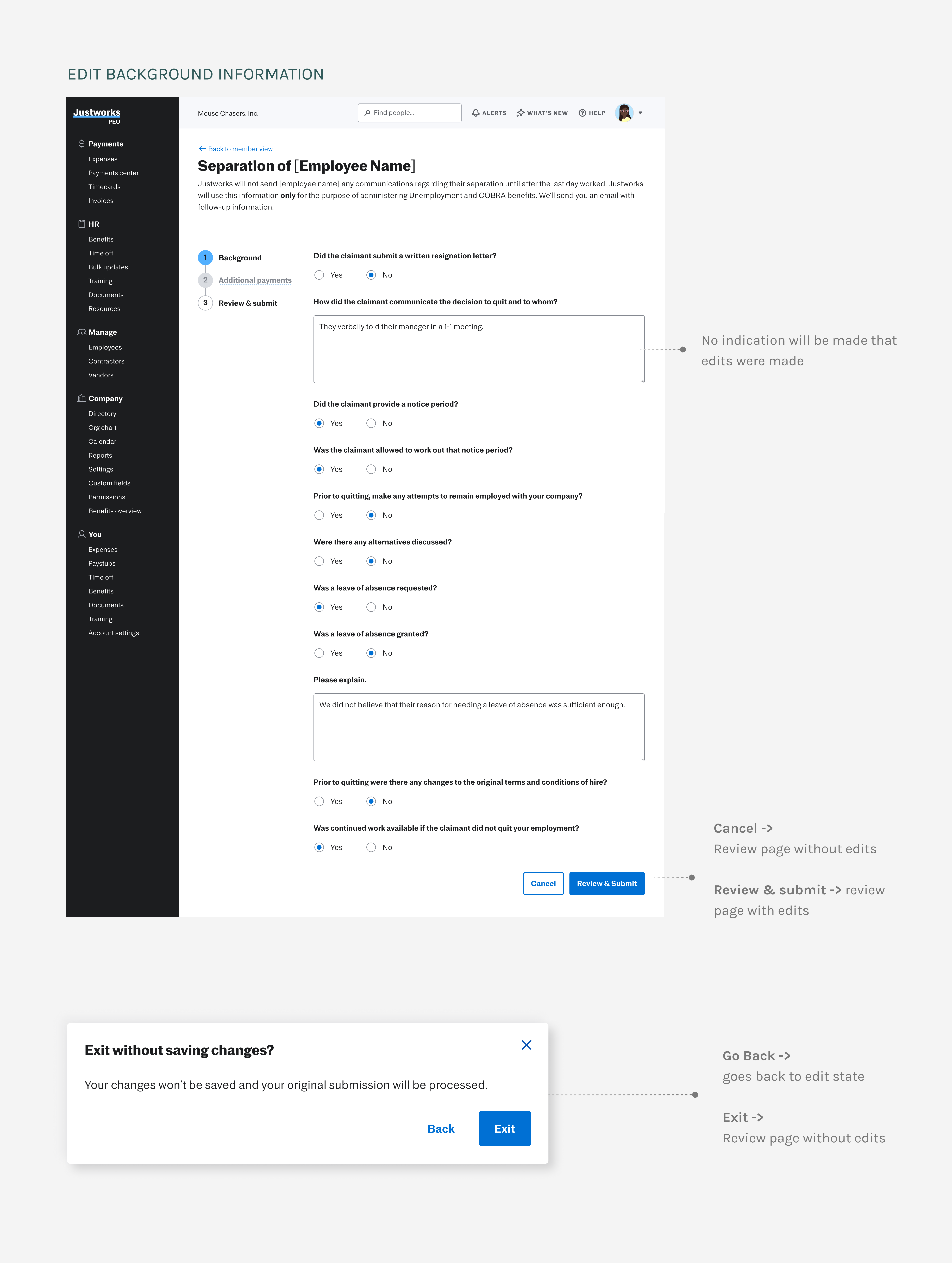
✏️ Clear Edit Feedback
Being certain about decisions: A confirmation modal appears when users attempt to leave the page to ensure they are certain about their decision.
EDIT PAYMENTS
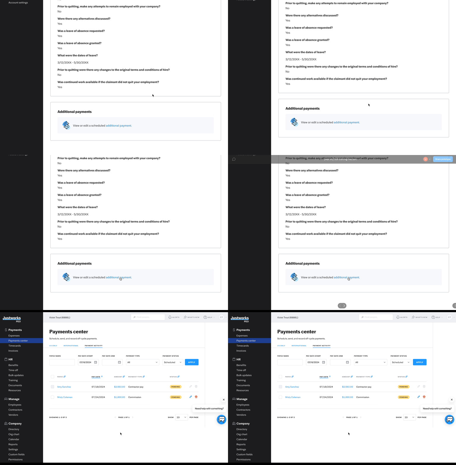
Payments should be disabled.
Payments are complex, so JW created a separate flow for editing within the Payment Center. I iterated on various designs for disabled payments before choosing the most straightforward one
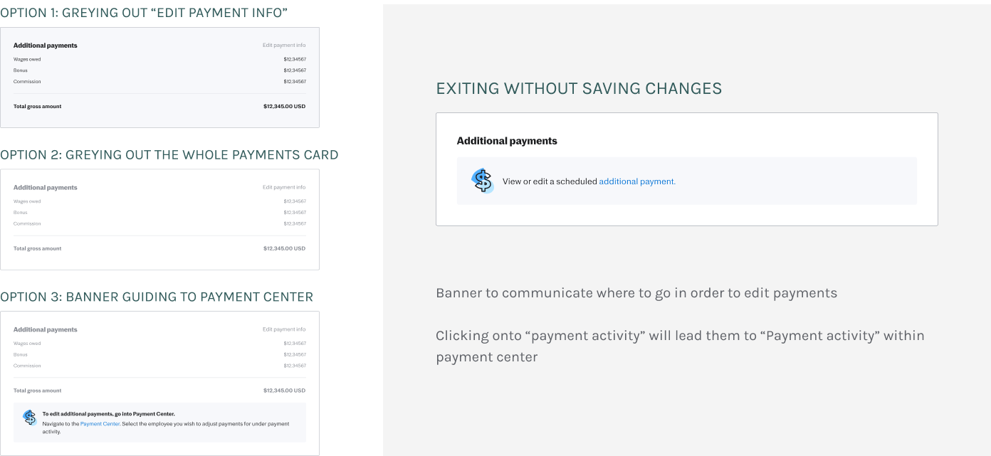
⏩ Improve Efficiency
The Payment Center already includes an edit payment flow; directing users there enables them to explore and better understand the payment editing process on their own.
CONFIRMATION BANNER

✏️ Clear Edit Feedback
Adding a banner at the top will provide clear, immediate feedback on edits, helping users quickly understand and confirm that changes have been made.
CUSTOMER SUPPORT’S EDITING FLOW
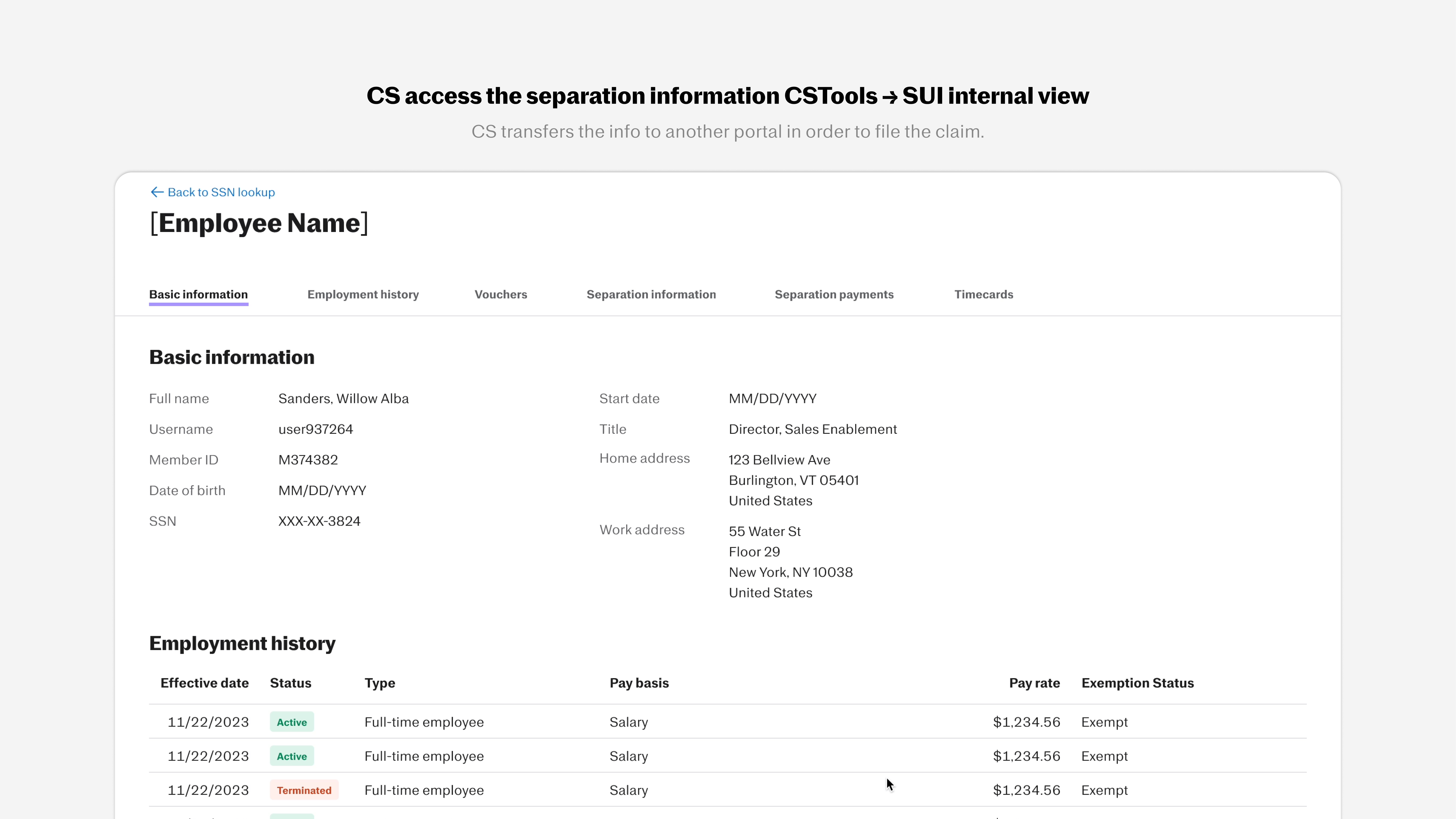
With the customer support platform being internal, I had more freedom for blue-sky designs without strict adherence to JW’s design system. This helped me practice organizing dense, crucial information for easy navigation
ASKING CUSTOMER SUPPORT FOR WHAT THEY NEED
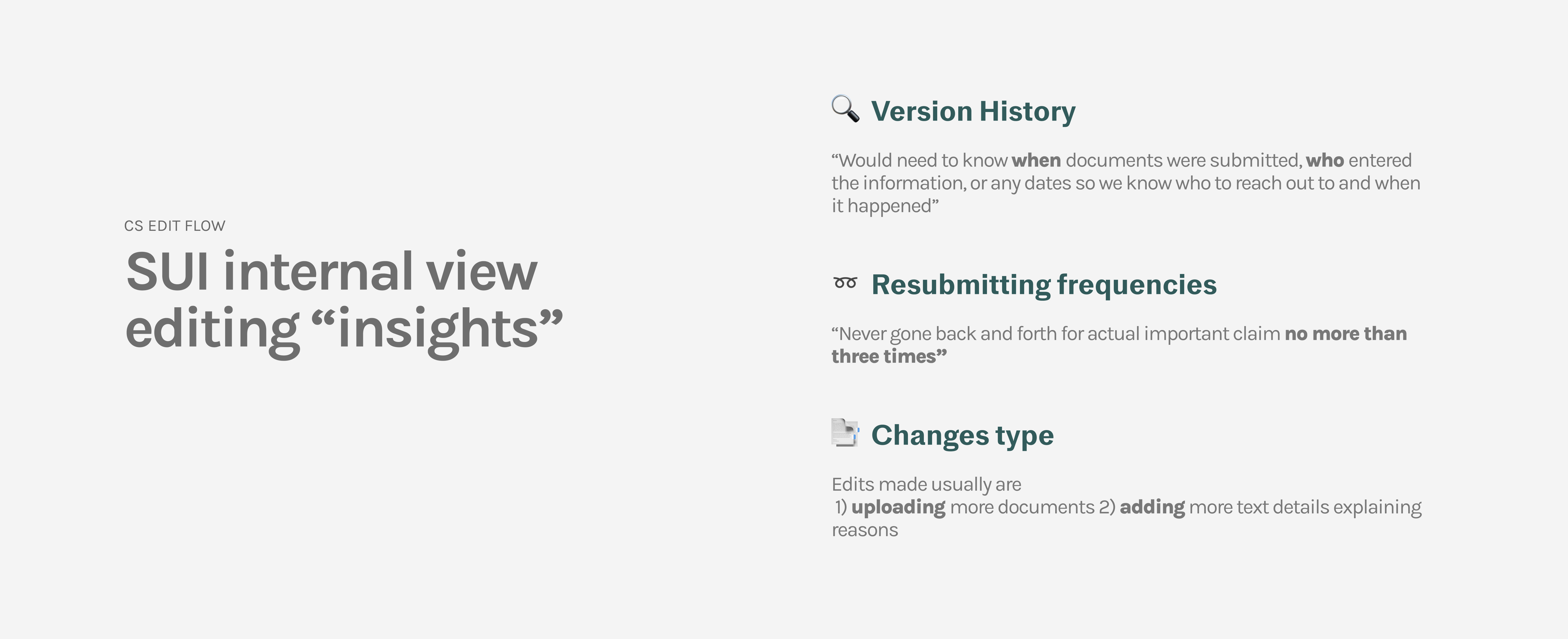
WHAT INFORMATION CS NEEDS TO SEE TO FILE THE CLAIM?

AUDIT LOG (ACCORDION DESIGN)

VERSION HISTORY
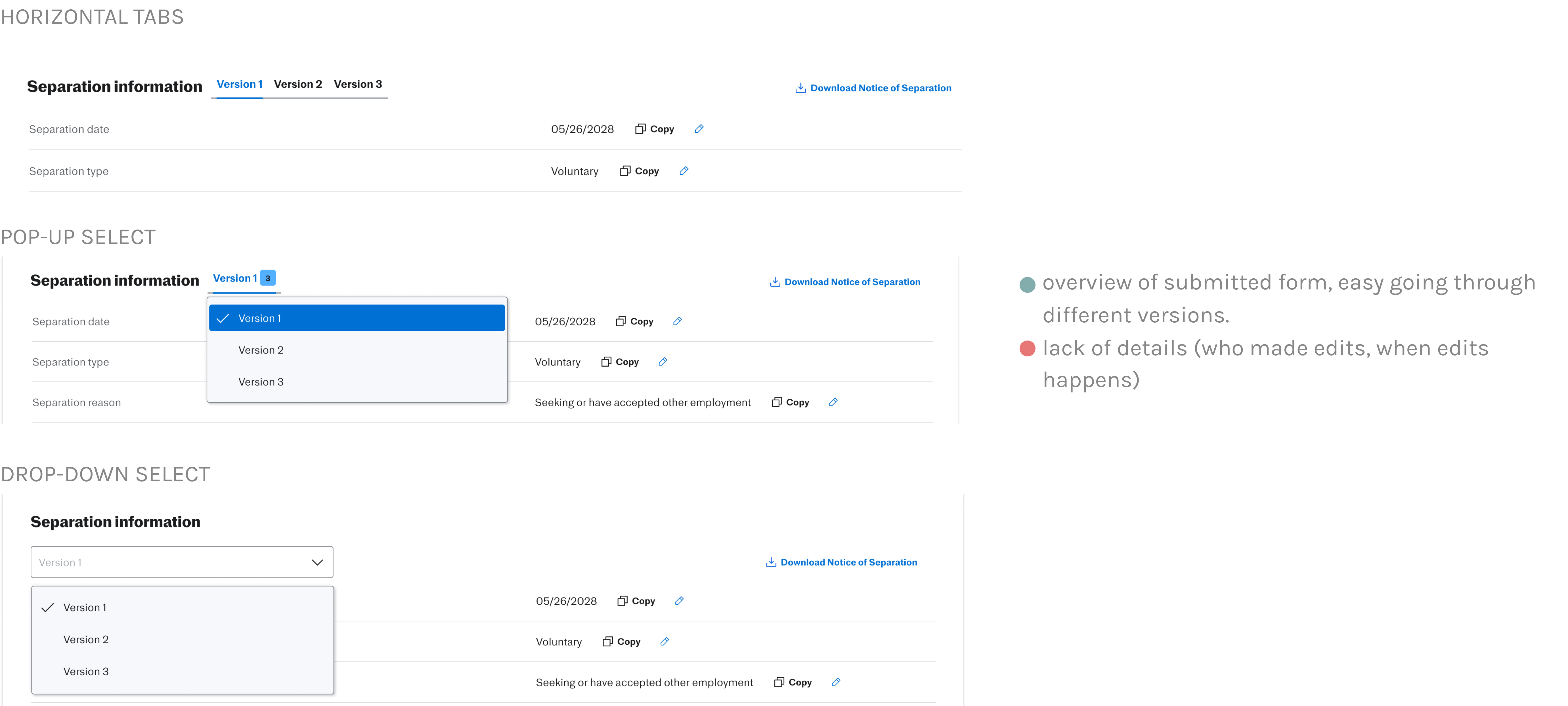
WHY CHOOSE ONE WHEN YOU CAN COMBINE BOTH TOGETHER?

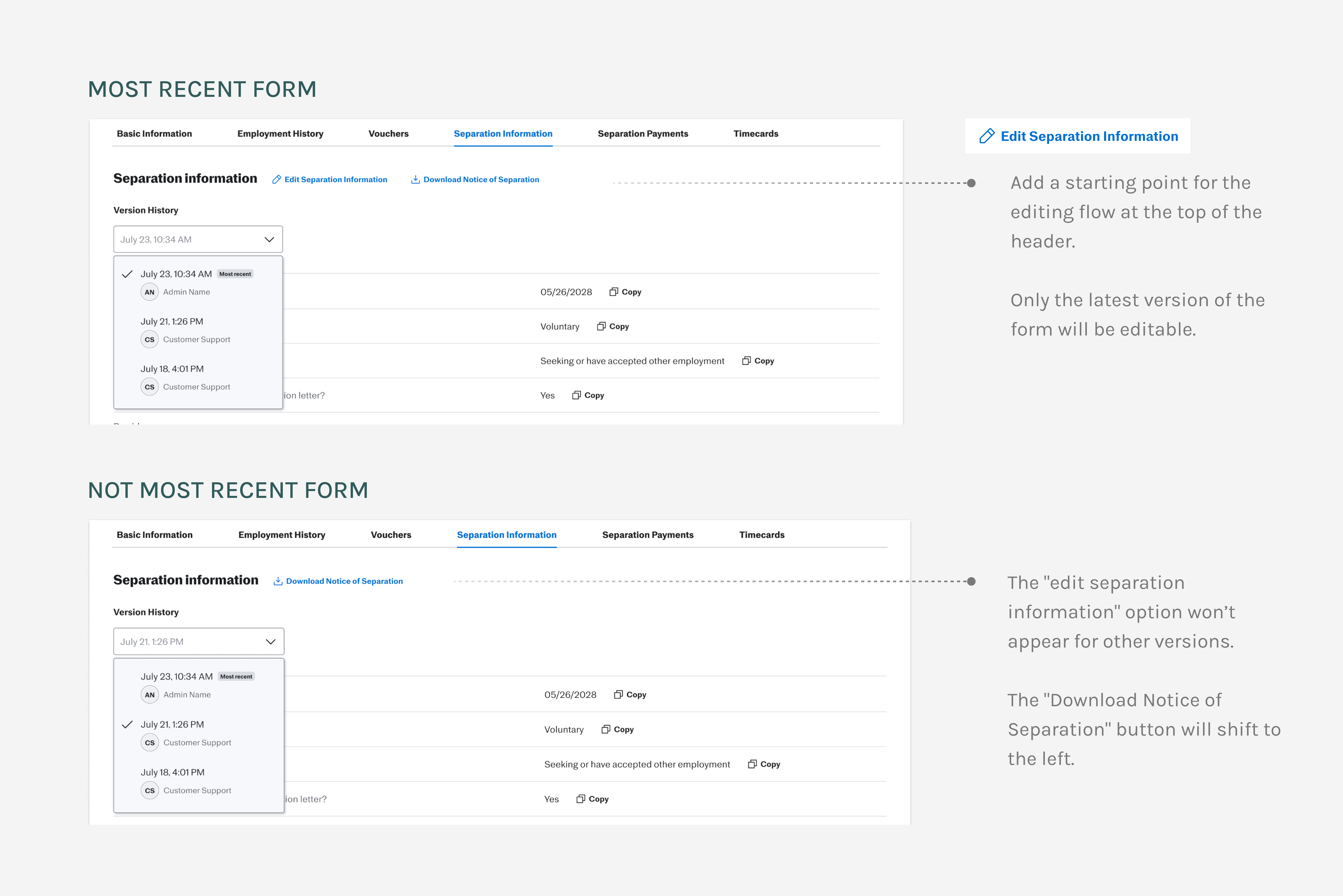
EDIT ENTRY POINT (MOST RECENT VERSION VS NOT)
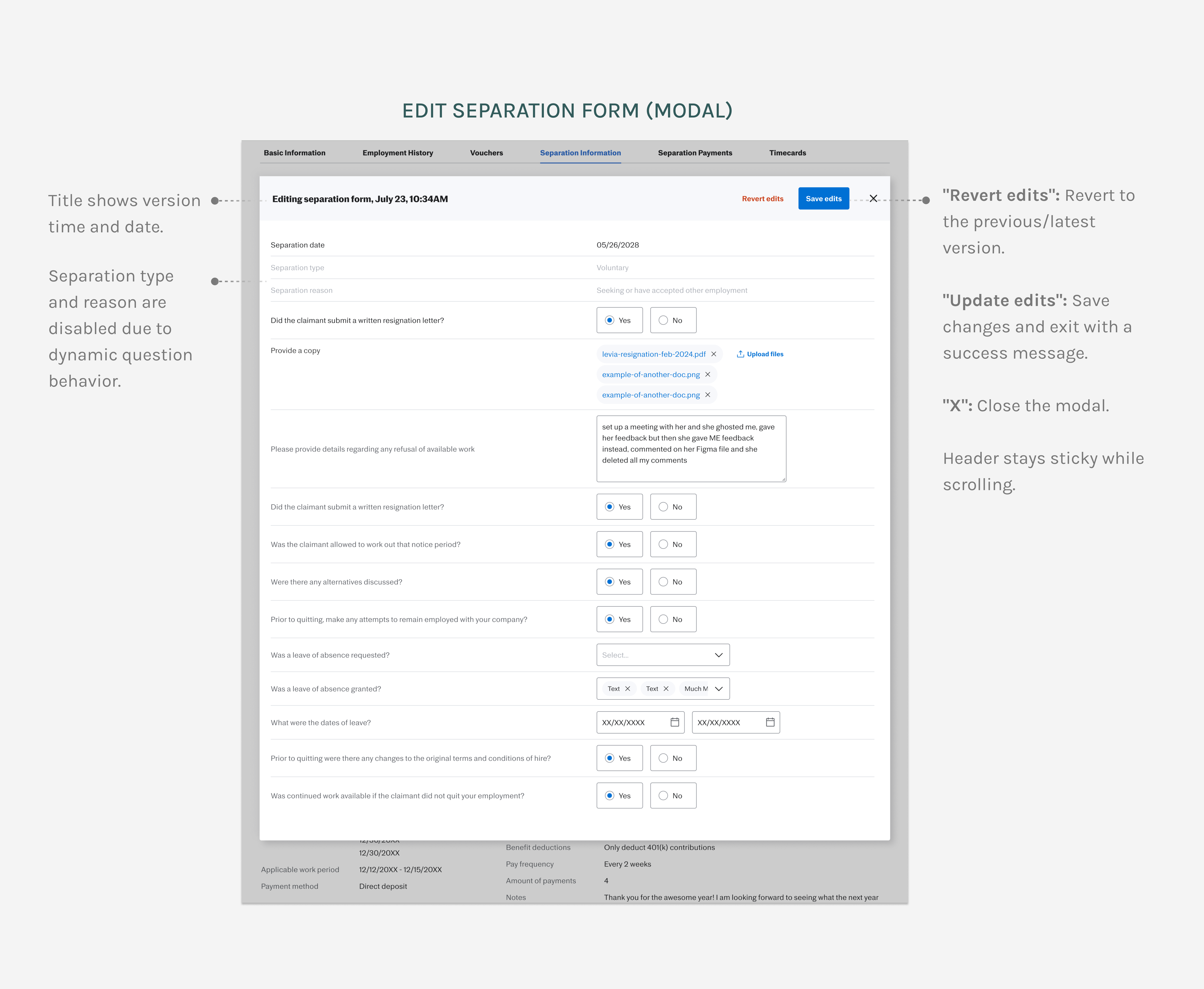
EDITING WITHIN THE SUI INTERNAL PAGE
The internal page will keep on growing in the future with more information/data.
After weighing the options between inline editing and creating a more distinct editing environment, I chose the latter. The current page is a continuous scroll, and as it grows, separating the editing experience ensures clarity and avoids confusion. This approach aligns better with the future scalability of the design.
IN-LINE EDITING USE CASES ✏️
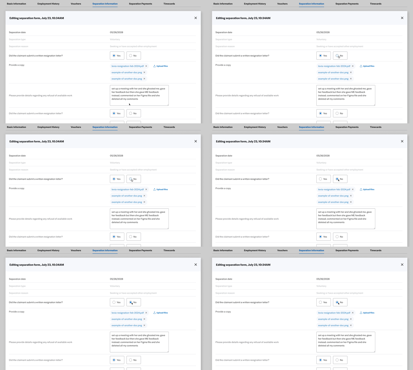
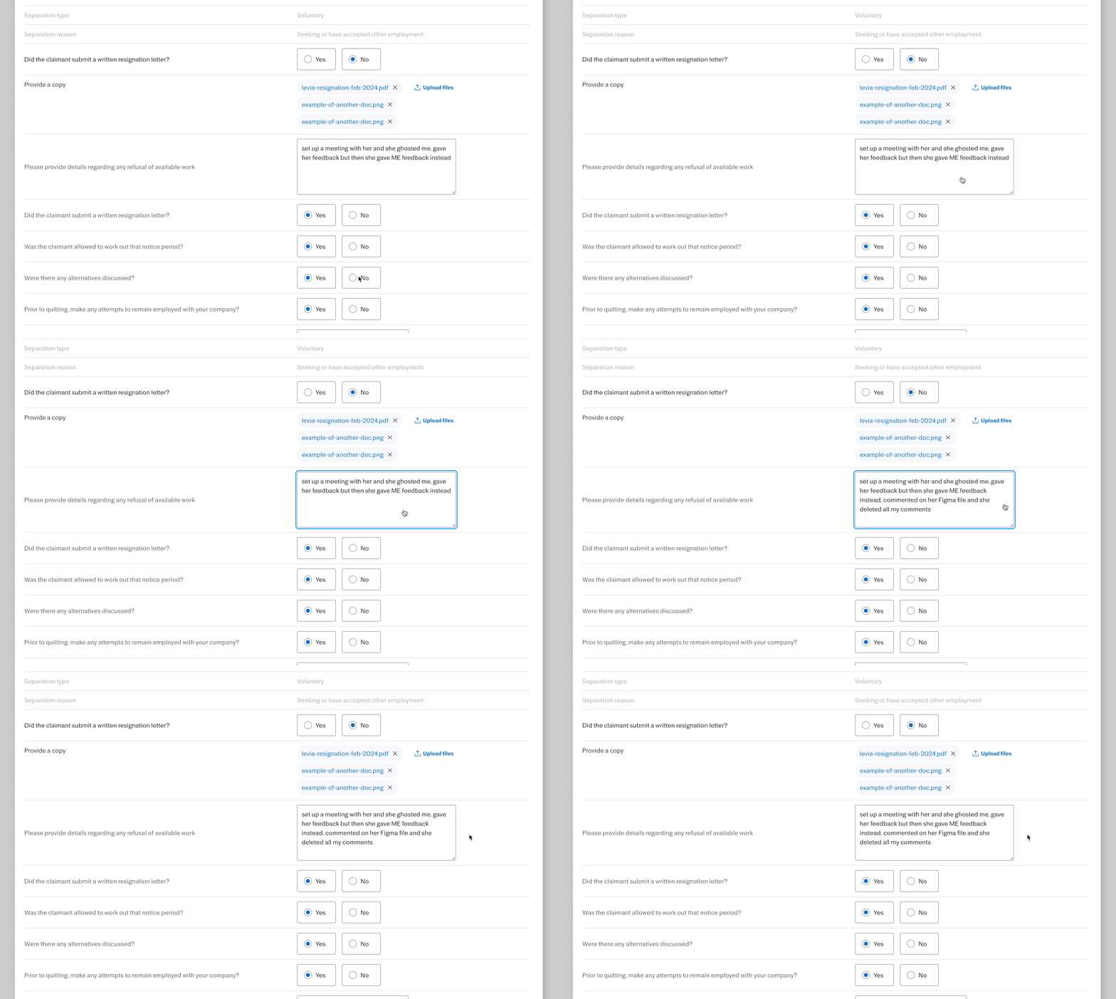
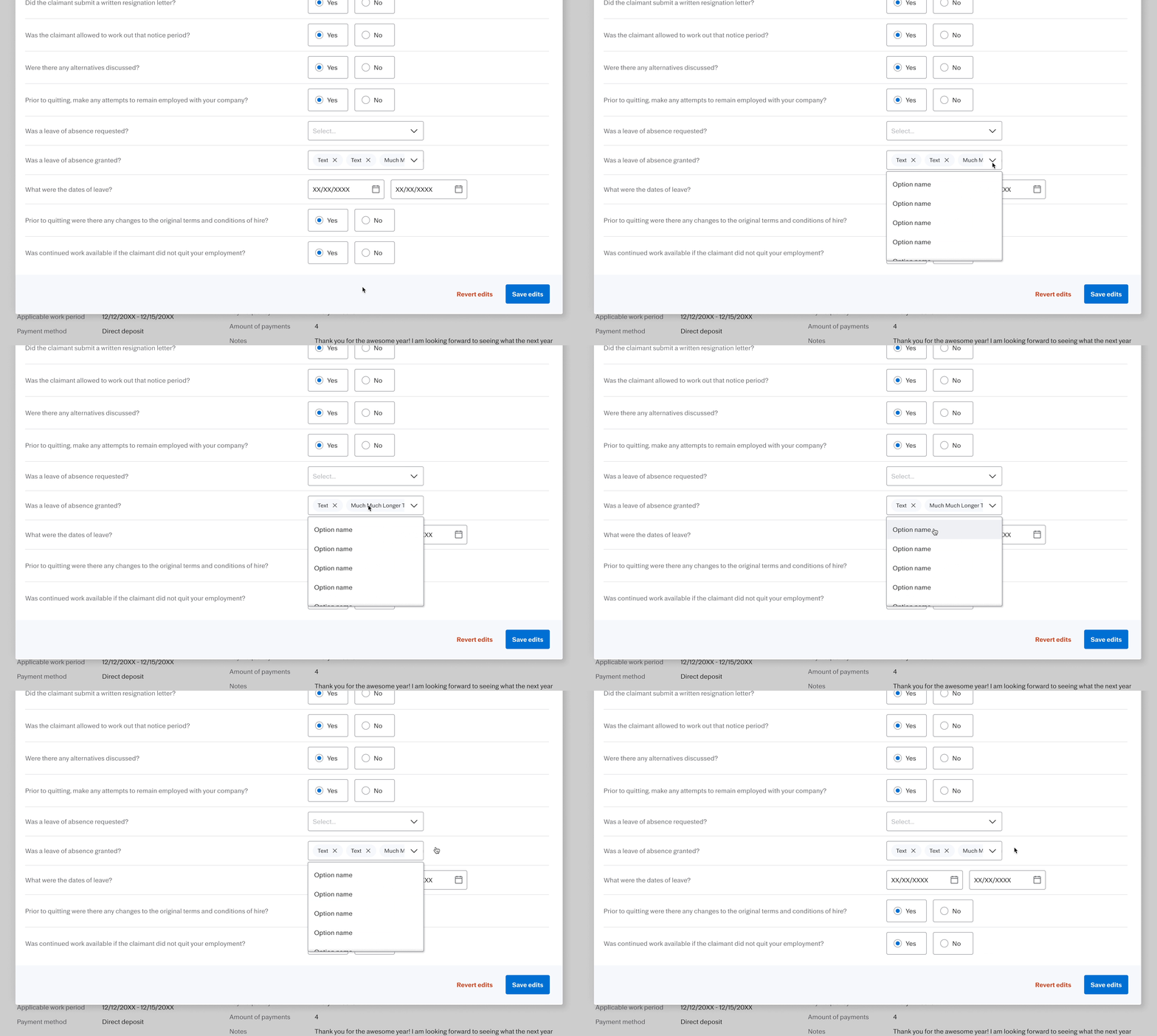
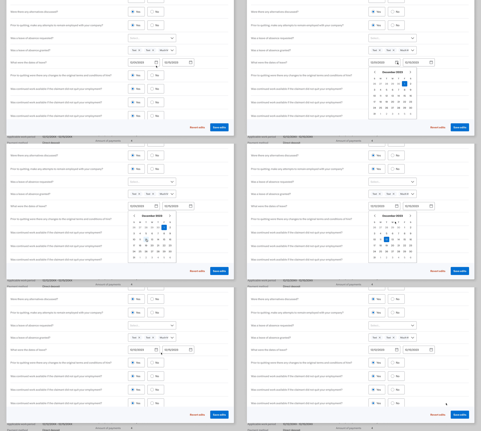
The form includes various editing states: inline text editing, single select, multi-select, date picker, file uploads, and more.
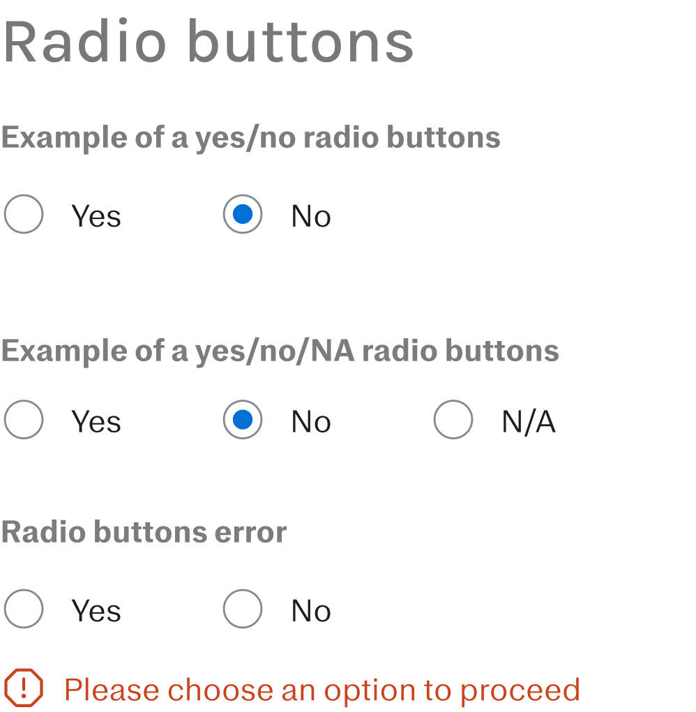
SINGLE SELECT
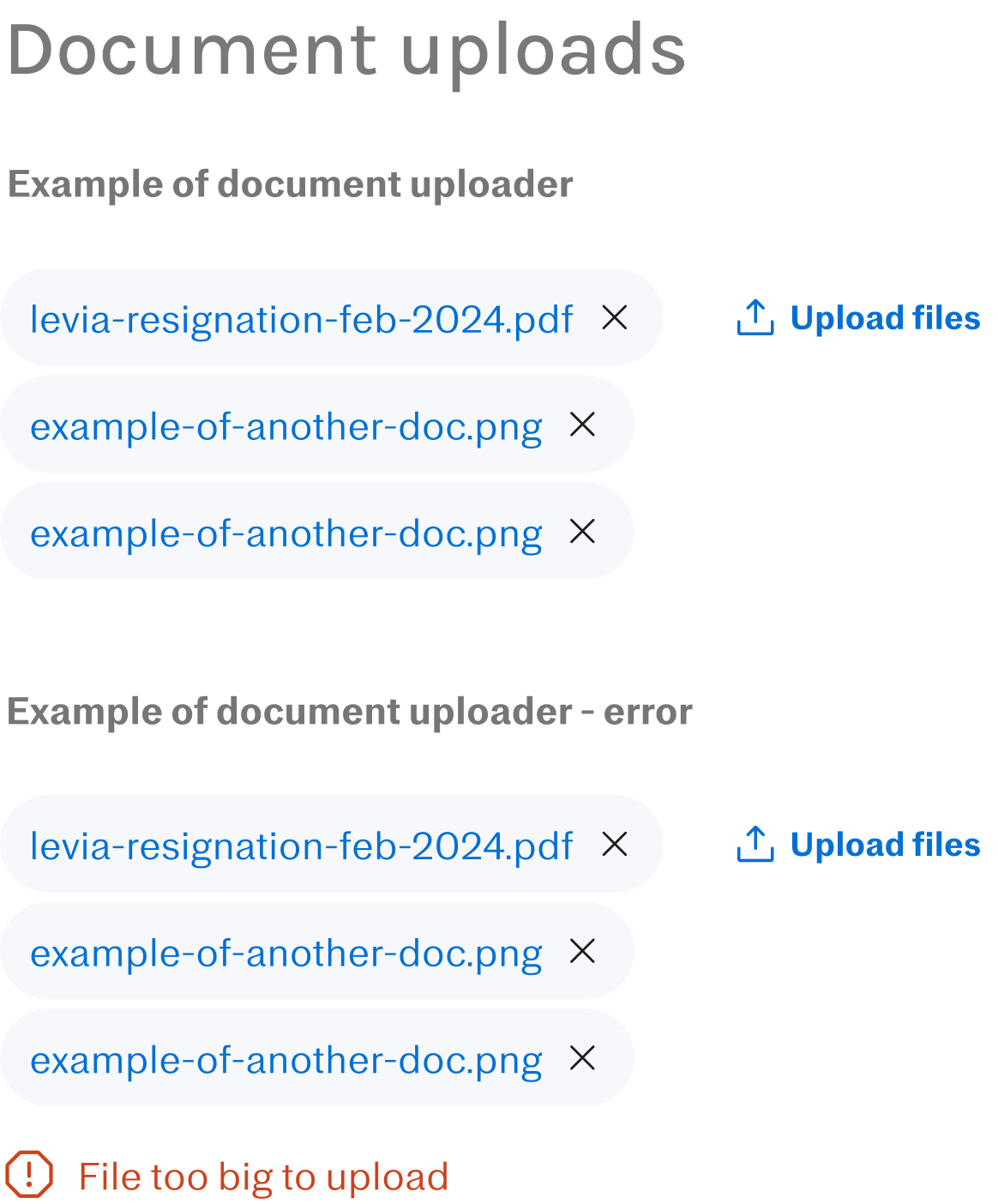
UPLOAD FILES

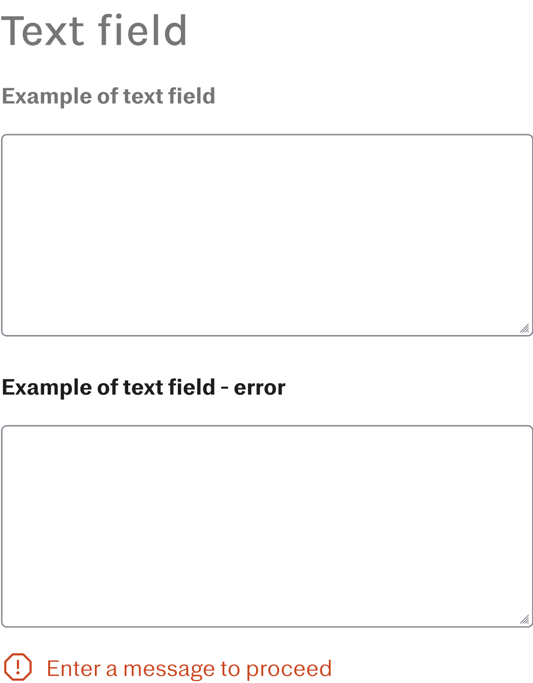
IN-LINE TEXT EDITING
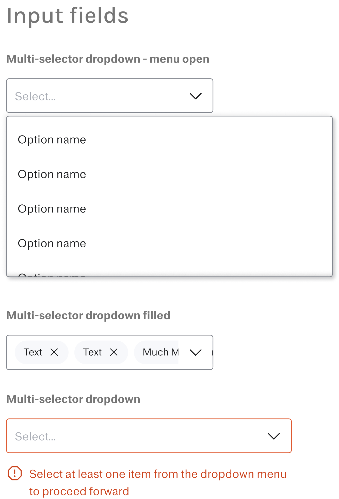
MULTI-SELECT
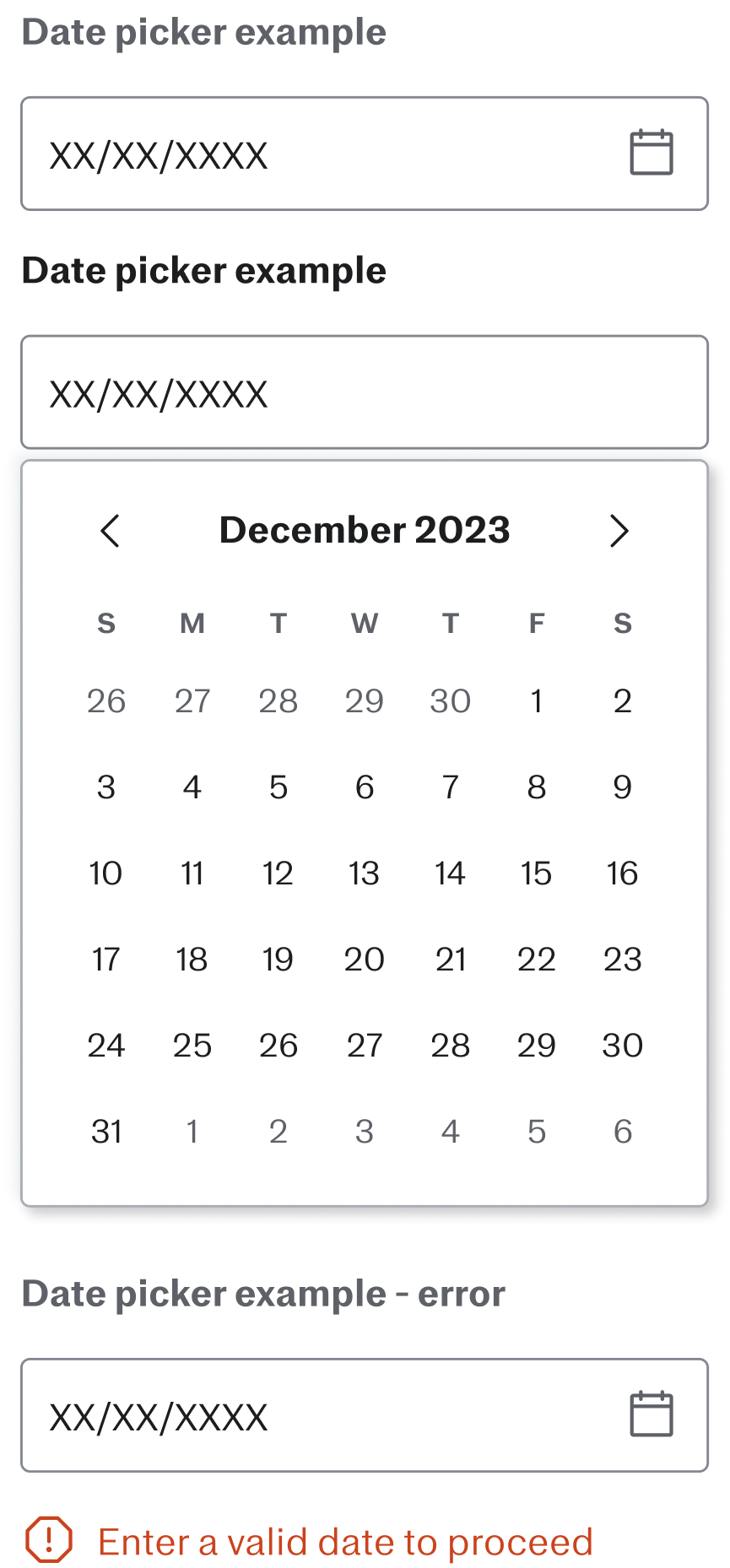
DATE PICKERS
🪄 TA-DA! FINAL DESIGNS
ENTRY POINT

STATUS BADGE
Visual cues for those who are “pending” versus “terminated”
ENTRY POINT
Visual cues for those who are “pending” versus “terminated”
OVERALL VIEW
PREVIEW PAGE
View the previous submitted form. Users can choose to view information, or edit each sections
SECTIONS
The form is divided up by details info, background info, and payments
DETAILS EDIT
SEPARATION REASON & TYPE
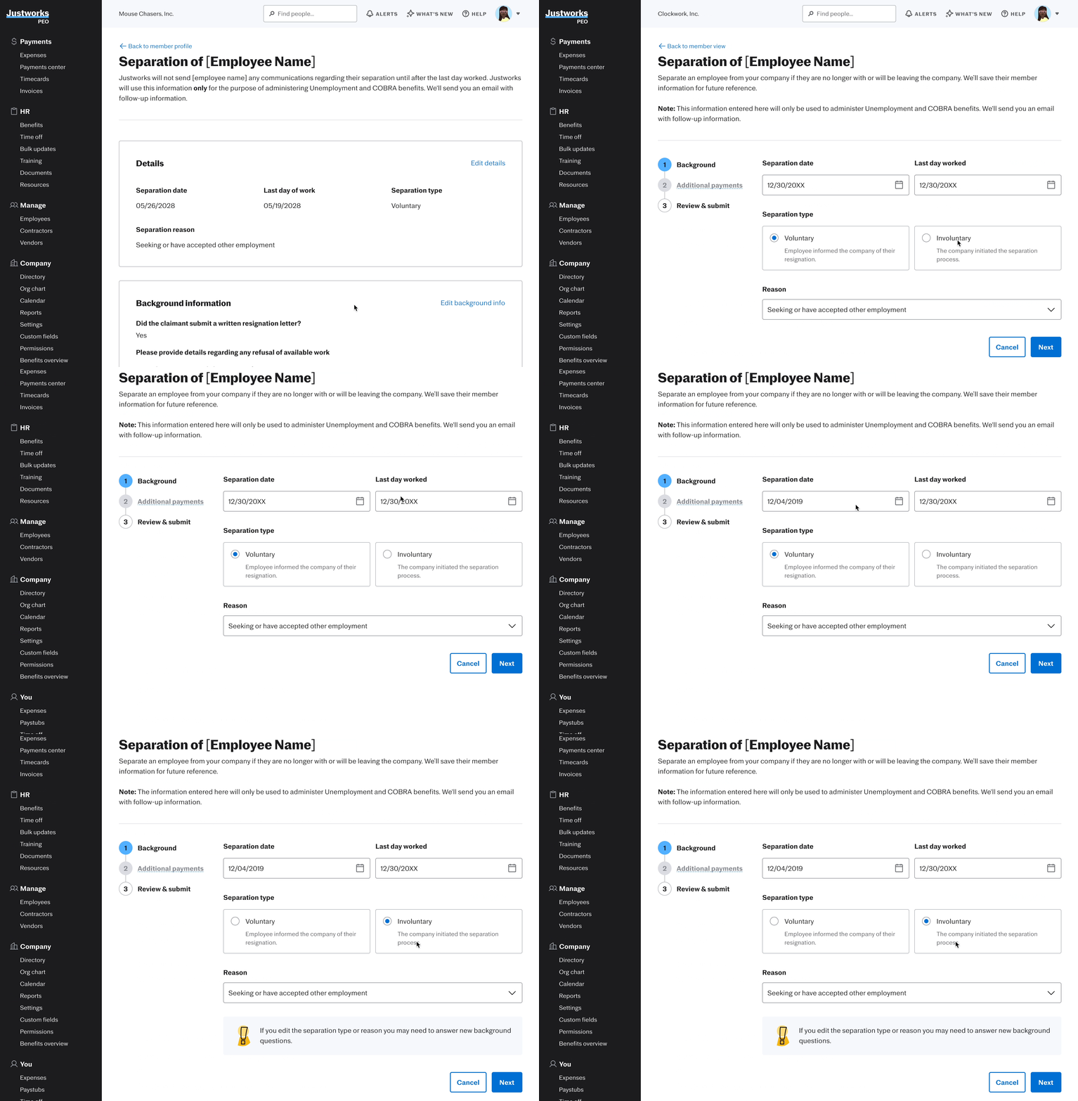
Changing these will dynamically change the questions that come after.
BANNER
Letting users know they will have to fill out a new set of questions
BACKGROUND INFO EDITS

EXIT MODEL
A confirmation modal appears when users attempt to leave the page to ensure they are certain about their decision.
PAYMENT EDITS
PAYMENTS ARE DISABLED
Editing payments will lead users to the Payment Center where they can make edits there
CUSTOMER SUPPORT’S EDITING FEATURE
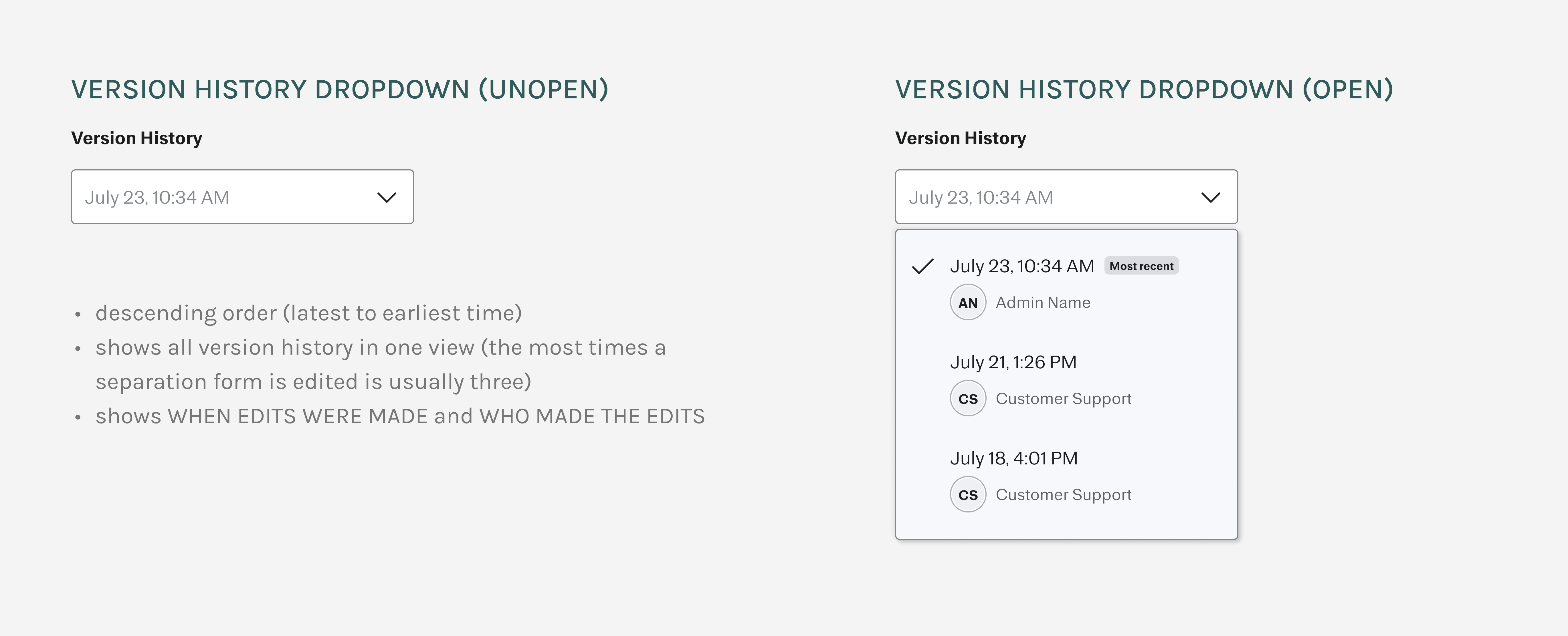
VERSION HISTORY LOG
VERSION HISTORY
Drop down with when edits were made and who made the edits
“Most recent” form is the default
EDITING ACCESS
Editing is only available to the most recent form

IN-LINE EDITING (MODAL)
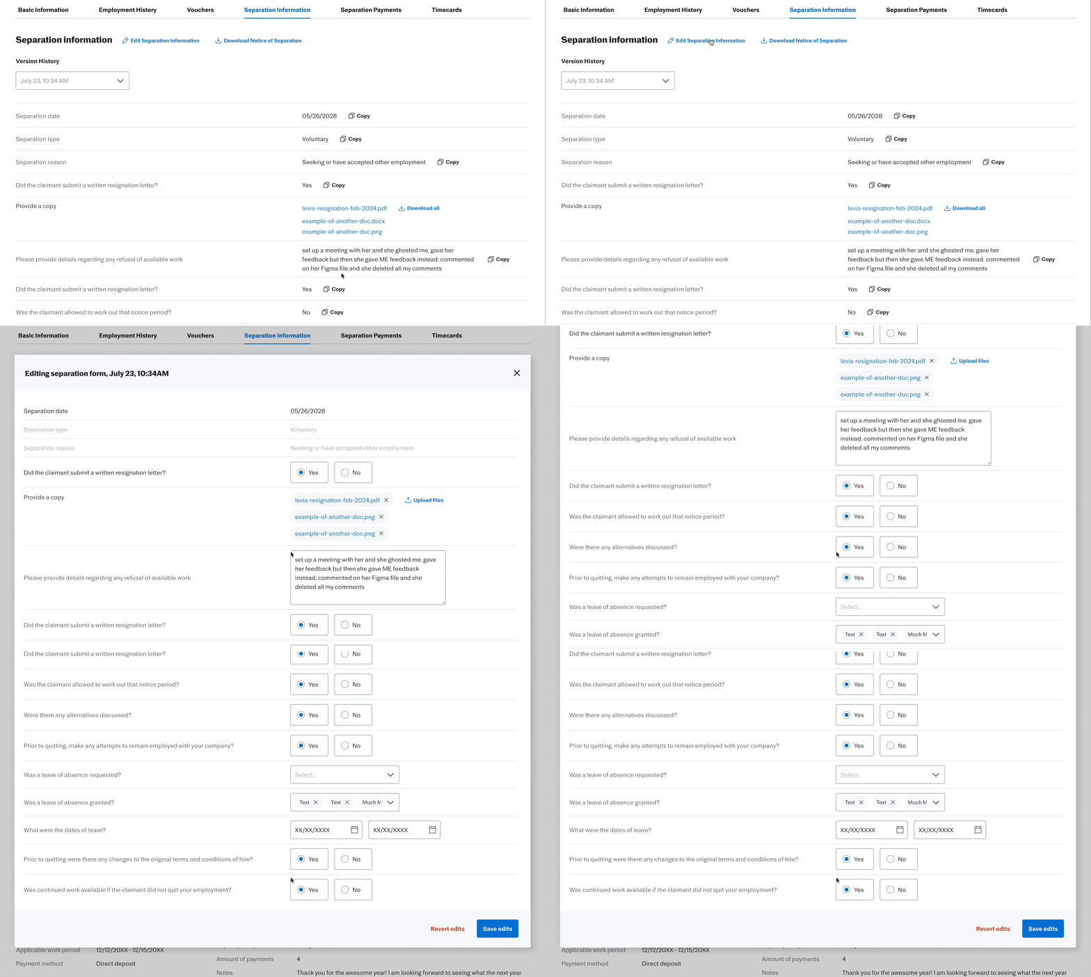
EDIT ENTRY
Lives on top of the section. Only shows up on the “Most recent” form
EDIT MODAL
All questions are in their editable state
SAVE & CLEAR EDITS
CTA at the bottom
TAKEAWAYS
DEALING WITH AMBIGUITY
Ambiguity is overwhelming, but it pushes you to ask questions to tackle those moving parts
AVOIDING POTENTIAL ROADBLOCKS
Having engineers review designs early ensures that technical feasibility is considered from the start that may not be apparent from a design-only perspective.
This was my second time returning to Justworks as their product design intern. I could tell how much I have grown as a designer since last summer. The ambiguity of the project allowed me to keep pushing for more answers, giving me the chance to utilize the resources around me such as my manager, mentor, PM, CS, and engineers to gain insights and feedback. This not only helped me understand the intricacies of SUI but also sharpened my design skills. I also learned the importance of relationship-building, especially when managing conflicting priorities. By developing strong connections with my team and stakeholders, I was able to navigate challenging situations, like engineer reviews and stakeholder meetings, with more confidence.
THE PEOPLE ARE THE BEST PART ❤️


LET'S CHAT!